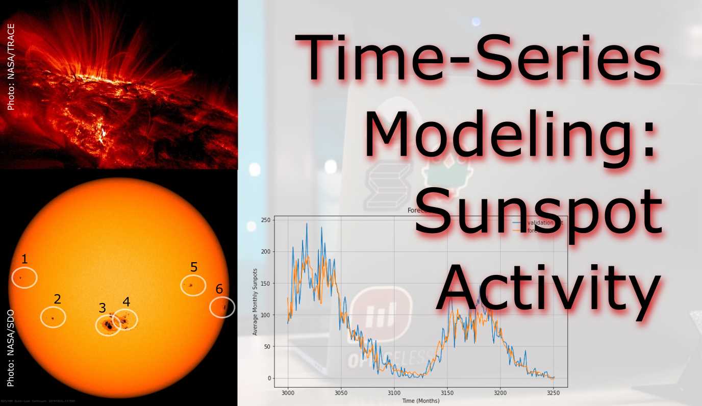
Time Series Modeling - Sunspot Activity
Sunspots have a scientific record reaching back to 1749
- Introduction
- Dataset
- Methodology
- Module Imports
- Step 1: Download, Unzip, Load
- Step 2: Read csv and Explore
- Step 3: Pre-Processing
- Step 4: Train for Learning-Rate Optimization
- Step 5: Train with Optimized Learning Rate
- Step 6: Forecasting and Evaluating
Introduction
For this project we will examine making time series predictions using sunspot records. Sunspots are dark spots on the sun, associated with lower temperature but also marked by intense magnetic activity. They play host to solar flares and hot gassy ejections from the sun’s corona.
As the Sun moves through its natural 11-year cycle, in which its activity rises and falls, sunspots rise and fall in number, too. NASA and NOAA track sunspots in order to determine, and predict, the progress of the solar cycle — and ultimately, solar activity.
Currenly, in 2019/2020, sunspots are at the end of the cycle, but are expected to pick up soon.
Forecasting this dataset is challenging because of high short-term variability as well as long-term irregularities evident in the cycles. For example, maximum amplitudes reached by the low frequency cycle differ a lot, as does the number of high-frequency cycle steps needed to reach that maximum low-frequency cycle height.
Methodically, this project will focus on how how to apply deep learning to time series forecasting with LSTMs, and implement learning rate optimization for the lowest loss possible.
Have a look at the notebook here.
Dataset
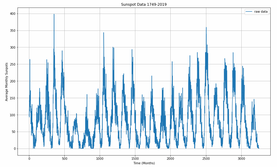
The data used the most up-todate monthly version that contains monthly averages. It contains 270 years worth of data (from 1749 through 2019) and a total of 3252 samples (months). The data can be found here at Kaggle.
Methodology
A Recurrent Neural Network (RNN) is a type of neural network well-suited to time series data. RNNs process a time series step-by-step, maintaining an internal state from time-step to time-step.
In this project, we use an RNN layer called Long Short Term Memory (LSTM).
An important constructor argument for all keras RNN layers is the return_sequences argument. This setting can configure the layer in one of two ways.
Module Imports
import kaggle #api token file required
import os
import shutil
import zipfile
import pandas as pd
import csv
import tensorflow as tf
import numpy as np
import matplotlib.pyplot as plt
Step 1: Download, Unzip, Load
Most conveniently use the Kaggle API for downloading this challenge data set. You will need a Kaggle account and save the API credentials in a specific folder.
!kaggle datasets download -d robervalt/sunspots

# target folder
local_zip = f'{os.getcwd()}\\Data\\sunspots.zip'

# cut and paste
shutil.move(f'{os.getcwd()}\\sunspots.zip', local_zip)

zip_ref = zipfile.ZipFile(local_zip, 'r')
zip_ref.extractall(f'{os.getcwd()}\\data')
zip_ref.close()
Step 2: Read csv and Explore
Pandas dataframes allow for very neat, tabular representation of csv files.
pd.read_csv(f'{os.getcwd()}\\data\\sunspots.csv')
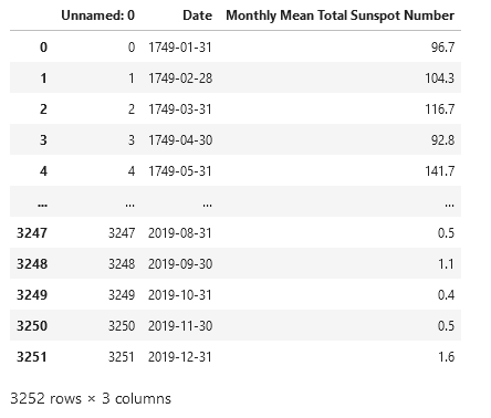
However, for the remainder of the project we will use Numpy arrays. The lines of the csv are read line-by-ine with an iterator. The column headers need to be skipped. We need the running index as time monthly steps and the sunspot counts. Note that the data gets cast into integer and floats.
time_step = []
sunspots = []

with open(f'{os.getcwd()}\\Data\\sunspots.csv') as csvfile:
  reader = csv.reader(csvfile, delimiter=',')
  next(reader) # the next() function skips the first line (header) when looping
  for row in reader:
    sunspots.append(float(row[2]))
    time_step.append(int(row[0]))
For plotting up data later on, define a function that accepts time steps and sun spot values.
def plot_series(time, series, format="-", start=0, end=None, label=None):
    myplot = plt.plot(time[start:end], series[start:end], format, label=label)
    plt.xlabel("Time (Months)")
    plt.ylabel("Average Monthly Sunpots")
    if label != None:
        plt.legend()
    plt.grid(True)
Before plotting, the data gets converted to Numpy arrays.
series = np.array(sunspots)
time = np.array(time_step)

plt.figure(figsize=(15, 9))
plot_series(time, series)
Step 3: Pre-Processing
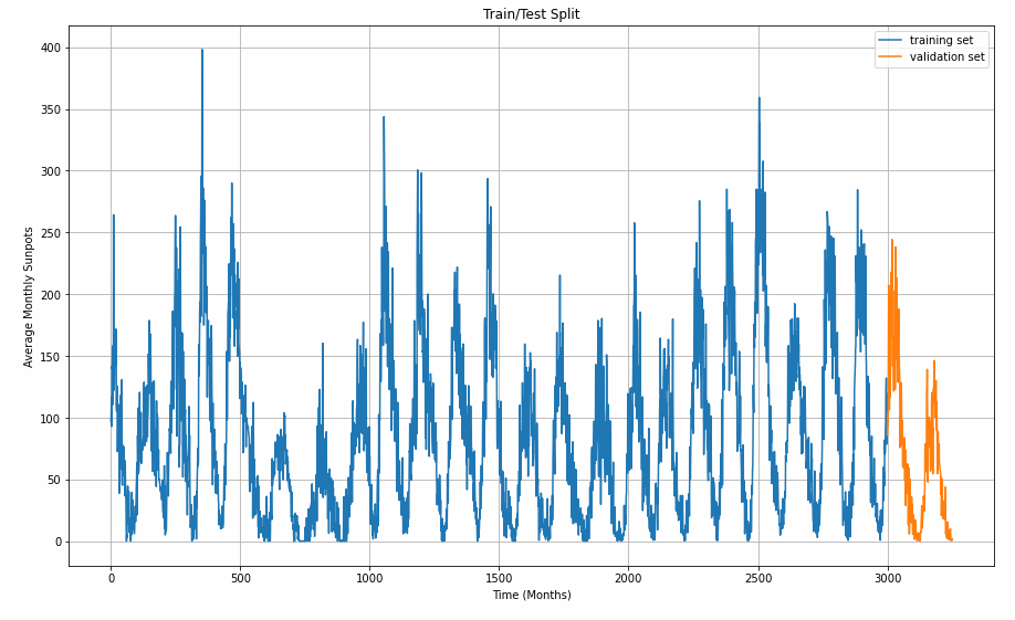
Now that the data set is available as a single chunk of 3251 samples, we want to sub-divide it into a train set and a viladation set. With ther split time set at 3000, the largest chunk will go into training.
split_time = 3000
time_train = time[:split_time]
x_train = series[:split_time]
time_valid = time[split_time:]
x_valid = series[split_time:]

# the window size is important for training results
window_size = 30
batch_size = 32
shuffle_buffer_size = 1000
Graphing helps us understanding the split better.
plt.figure(figsize=(15, 9))
plt.title("Train/Test Split")
plot_series(time_train, x_train, label="training set")
plot_series(time_valid, x_valid, label="validation set")
For training a time series, the algorithm takes in a snippet of samples and predicts the next point coming afterwards. The windowing helper-function does this with our desired window size. The longer the window size, the more history can be learned to forecast the value that comes next. The window_size value influences the model performance and requires optimizing for the sunspot cycles.
def windowed_dataset(series, window_size, batch_size, shuffle_buffer):
    series = tf.expand_dims(series, axis=-1)
    ds = tf.data.Dataset.from_tensor_slices(series)
    ds = ds.window(window_size + 1, shift=1, drop_remainder=True)
    ds = ds.flat_map(lambda w: w.batch(window_size + 1))
    ds = ds.shuffle(shuffle_buffer)
    ds = ds.map(lambda w: (w[:-1], w[1:]))
    return ds.batch(batch_size).prefetch(1)
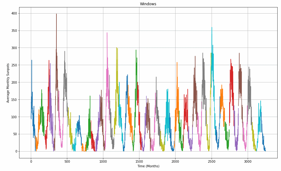
To demonstrate how the windowed_dataset function and the window_size parameter are slicing the data set, have a closer look at the graph below.
window_size = 64

def plot_split(array, window_size):
    number_windows = len(array) // window_size + 1
    return np.array_split(array, number_windows, axis=0)

plt.figure(figsize=(15, 9))
plt.title("Windows")

for series_window,time_window in zip(plot_split(series,window_size), plot_split(time,window_size)):
    plot_series(time_window, series_window)
Step 4: Train for Learning-Rate Optimization
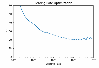
Next task is finding a learning rate that delivers the least loss. With a callback that contains a Learning Rate Scheduler, the learning rate is increased sucessively over the 100 epochs. The model design itself will remain the same later. Fisrst, a 1D-convolutional filter with a width of 5 (2 samples before, two after the selected sample) and then two LSTM layers do the sequence learning work. Two dense layers and an output layer (1 neuron) make up the rest of the network.
The Huber loss makes it necessary to work with larger outputs. That is why the lambda layer was chosen to multiply the output layer’s results by 400. I decided to use the Mean Absolute Error (MAE) as a metric that does not punish for large errors as severely as the Mean Squared Error (MSE)
tf.keras.backend.clear_session()
tf.random.set_seed(51)
np.random.seed(51)
window_size = 64
batch_size = 256
train_set = windowed_dataset(x_train, window_size, batch_size, shuffle_buffer_size)
print(train_set)
print(x_train.shape)

model = tf.keras.models.Sequential([
  tf.keras.layers.Conv1D(filters=32, kernel_size=5,
                      strides=1, padding="causal",
                      activation="relu",
                      input_shape=[None, 1]),
  tf.keras.layers.LSTM(64, return_sequences=True),
  tf.keras.layers.LSTM(64, return_sequences=True),
  tf.keras.layers.Dense(30, activation="relu"),
  tf.keras.layers.Dense(10, activation="relu"),
  tf.keras.layers.Dense(1),
  tf.keras.layers.Lambda(lambda x: x * 400)
  ])

lr_schedule = tf.keras.callbacks.LearningRateScheduler(lambda epoch: 1e-8 * 10**(epoch / 20))

optimizer = tf.keras.optimizers.SGD(lr=1e-8, momentum=0.9)

model.compile(loss=tf.keras.losses.Huber(),
              optimizer=optimizer,
              metrics=["mae"])

history = model.fit(train_set, epochs=100, callbacks=[lr_schedule], verbose=0)
All the epoch’s metrics are saved in the history variable and can be visualized. The graph helps us find a learning rate with lowest loss and assure it is in an area of low volatility. A learning rate of 10e-5 is a safe pick.
# pick lr from graph
plt.semilogx(history.history["lr"], history.history["loss"])
plt.axis([1e-8, 1e-4, 0, 60])
plt.title('Learing Rate Optimization')
plt.xlabel("Learing Rate")
plt.ylabel("Loss")
Step 5: Train with Optimized Learning Rate
Plug in the new learning rate, remove the learning rate scheduler callback, and increase epochs. The network design remains the same as before.
tf.keras.backend.clear_session()
tf.random.set_seed(51)
np.random.seed(51)

train_set = windowed_dataset(x_train, window_size=60, batch_size=100, shuffle_buffer=shuffle_buffer_size)

model = tf.keras.models.Sequential([
  tf.keras.layers.Conv1D(filters=32, kernel_size=5,
                      strides=1, padding="causal",
                      activation="relu",
                      input_shape=[None, 1]),
  tf.keras.layers.LSTM(60, return_sequences=True),
  tf.keras.layers.LSTM(60, return_sequences=True),
  tf.keras.layers.Dense(30, activation="relu"),
  tf.keras.layers.Dense(10, activation="relu"),
  tf.keras.layers.Dense(1),
  tf.keras.layers.Lambda(lambda x: x * 400)
  ])

optimizer = tf.keras.optimizers.SGD(lr=1e-5, momentum=0.9)

model.compile(loss=tf.keras.losses.Huber(),
              optimizer=optimizer,
              metrics=["mae"])

history = model.fit(train_set,epochs=500, verbose=0)
Visualize the training progress.
import matplotlib.image  as mpimg
import matplotlib.pyplot as plt

loss = history.history['loss']
epochs = range(len(loss))

# full graph
plt.plot(epochs, loss, 'r')
plt.title('Training loss')
plt.xlabel("Epochs")
plt.ylabel("Loss")
plt.legend(["Loss"])
plt.figure()

# zoomed graph
zoomed_loss = loss[200:]
zoomed_epochs = range(200,500)

plt.plot(zoomed_epochs, zoomed_loss, 'r')
plt.title('Training loss (zoomed)')
plt.xlabel("Epochs")
plt.ylabel("Loss")
plt.legend(["Loss"])
plt.figure()
Step 6: Forecasting and Evaluating
Define a helper function for forecasting, call it, and plot a zoom-in of one of the cycles. Here, we see the last sun-spot cycle and how the model (orange) at least visually matches the training/validation (blue) data quite well.
def model_forecast(model, series, window_size):
    ds = tf.data.Dataset.from_tensor_slices(series)
    ds = ds.window(window_size, shift=1, drop_remainder=True)
    ds = ds.flat_map(lambda w: w.batch(window_size))
    ds = ds.batch(32).prefetch(1)
    forecast = model.predict(ds)
    return forecast

rnn_forecast = model_forecast(model, series[..., np.newaxis], window_size)
rnn_forecast = rnn_forecast[split_time - window_size:-1, -1, 0]

plt.figure(figsize=(10, 6))
plt.title("Forecast")
plot_series(time_valid, x_valid, label='validation set')
plot_series(time_valid, rnn_forecast, label='forecast')
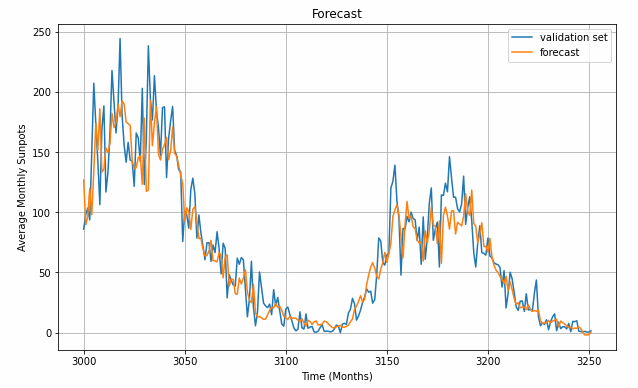
Of course, a quantitative comparison is more accurate in describing the model’s fit to the validation set.
print('Mean Absolute Error (MAE): ',tf.keras.metrics.mean_absolute_error(x_valid, rnn_forecast).numpy())
Mean Absolute Error (MAE): 14.52463
This has been a long post, and necessarily will have left a lot of questions open, first and foremost: How do we obtain good settings for the hyperparameters (learning rate, number of epochs…)? How do we choose the length of the LSTM? Or even, can we have an intuition how well LSTM will perform on a given dataset (with its specific characteristics)? All questions to be tackled in the future.