What to expect from an Online Hackathon

What trade-offs will you have to make?
This year has brought many changes to the workplace, academia, and how we spend our spare time. Many events that would be held in person are now online. This has its perks but also challenges.
I decided to sign up for the 2020 TAMU Datathon at Texas A&M, since I had a great experience last year. And yes, I was accepted again, knowing that the participant pool was doubled since there were no more physical space constraints how many people could be crammed into a hall safely.
So far, so 2019 (read post here). Everything started very similary as the 2019 event: Apply online, sign up for the Slack channel, if possible find team mates in the days prior to the event, spend 24 hours working from Saturday Noon to Sunday Noon.
A few days in advance I found two other participants to form a team. The challenges were not announced until the actual start of the event, so it was difficult to recruit members for skills and I just had to go by who was interested to forge a small group. Three is ideal, I think.
The main divergence comes next: You don’t travel to the event location, but simply get all your information from the hackathon website, the Slack channel, video streams (ceremonies), and perhaps participate in some video calls (e.g., instructional courses by the organizers).
I want to recount the perks and challenges of this experience, and what I took away from it.
Pros
- Have your quiet working hours in the comfort of your home. Sleeping in your own bed instead of a sleeping bag has its perks.
- Use your big-screen workstation instead of a small laptop and become instantly more efficient at what you are doing.
- Reduce interruption and distraction by the hundreds of other hackers.
- Save money and time on travel. You could participate in many more online hackathons than in-person. However, if the hackathon is in town, these savings may be less significant.
- No waiting in line for registration. Otherwise this may take easily an hour.
- The obvious one: don’t get sick.
Cons
- No instant face-to-face interaction with your team members.
- Everyone is doing their own thing and it is cruicial to have regular check-ins and status report.
- Less likely to network with people outside of your team.
- Multi-user environments for data science, such as Google Colab notebooks, are not very mature. Overwrites happen, Colab is much more likely to lose track of work than Git.
- Potentially distracted by visitors, family, etc.
- You have to make your own food. No free dinner and drinks.
Results
Looking at the pros and cons, it may seem that the arguments are more or less balanced. But think again, if you had the choice between in-person and online, then why didn’t we have so many online hackathons until now?
Working remotely in a team can be a big challenge if no rules are established in advance. My impression was that the startup, i.e., search for data, collection, and assessment was the most collaborative part of our project and from then on quieted down. I really think it is important to report frequently what everyone is working on, and help each other out with problems to find solutions or ways to refactor. For example, it may be a good idea to have regular (1-2 hour) Slack voice calls with the team to share results, needs, and plans. In 2019, my team sat together and all worked in their Jupyter notebooks - constantly explaining what each one was doing. This year I wanted to try out Google Colab, since I thought this would improve colaboration and have everyone add to the same file where all progress was instantly visible. But this turned out to be a major pain point. I remember having had several unpleasant situations where cell contents were deleted during lagging syncronization and having to re-write large parts of notebooks. Establishing a Git repository may be the more reliable way to go until synchronization issues are eliminated from Colab.

My Verdict
I assume that hackathons will likely go back to in-person events as soon permissible again. But I also hope that they may become hybrid events, if the double organization of online streaming and local people is not too much to lift. It would allow for remote participants to hack away from the other end of the country and likely increase popularity and participation rates even further. Teams are required to adapt their communication frequency and style for this new mode of colaboration to get get equally good results as in-person.
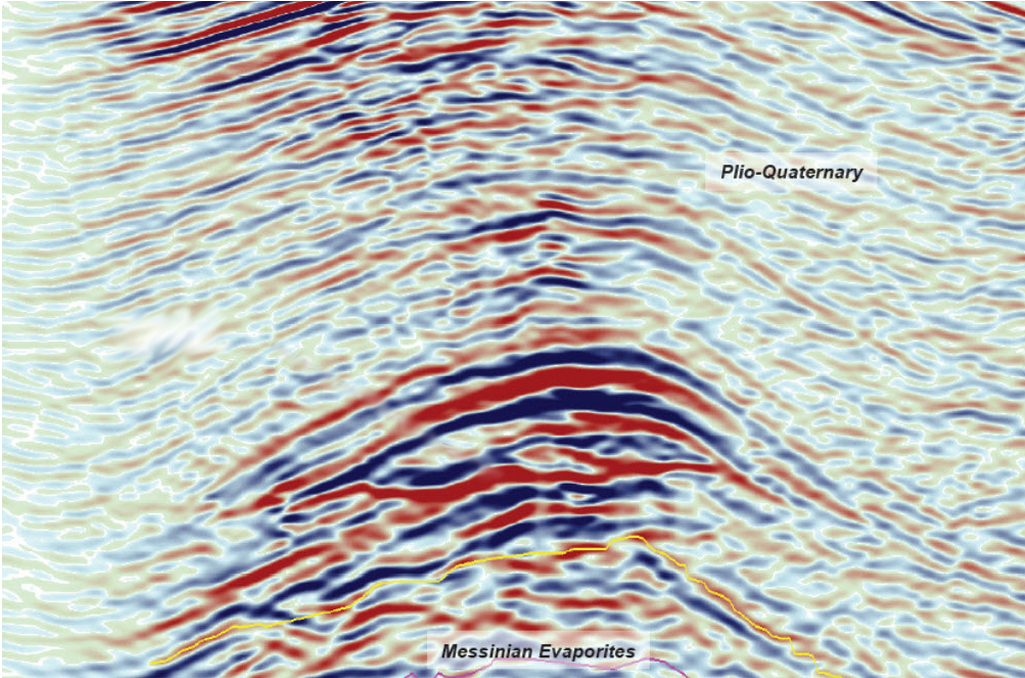
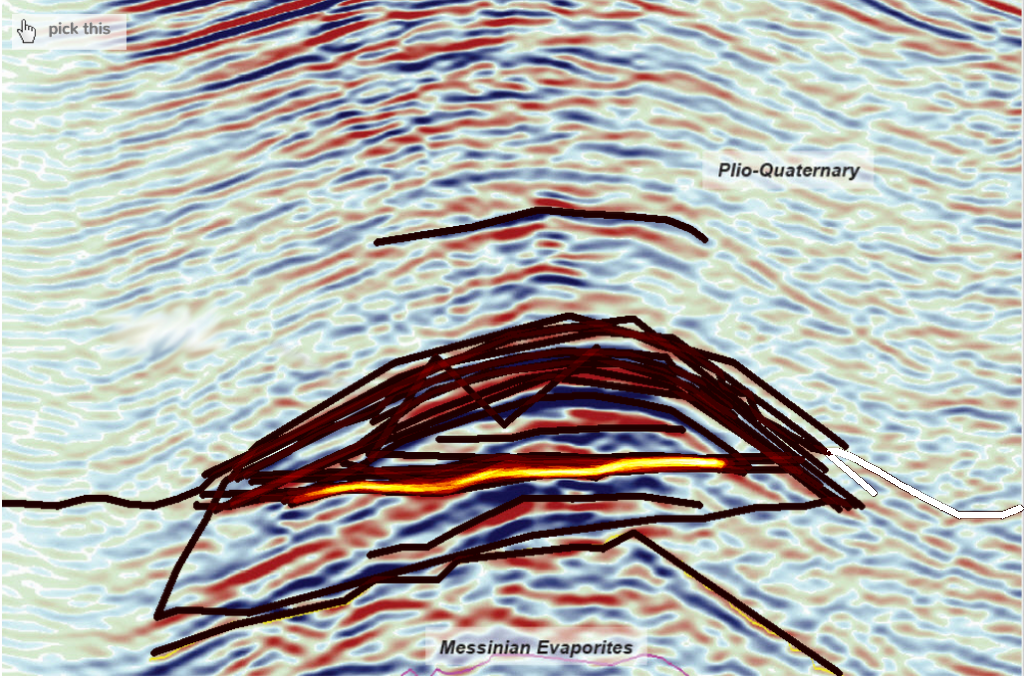
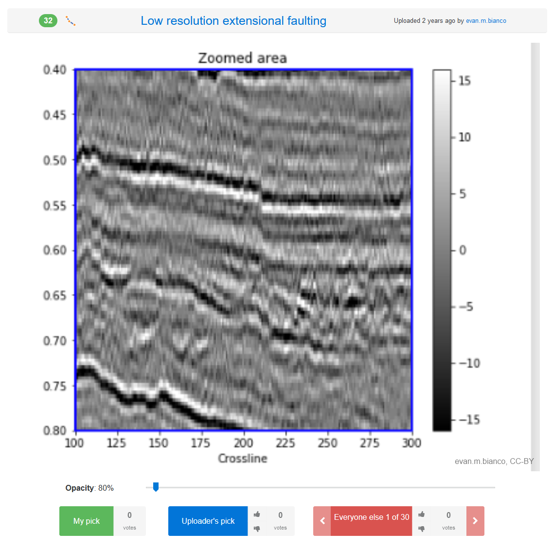
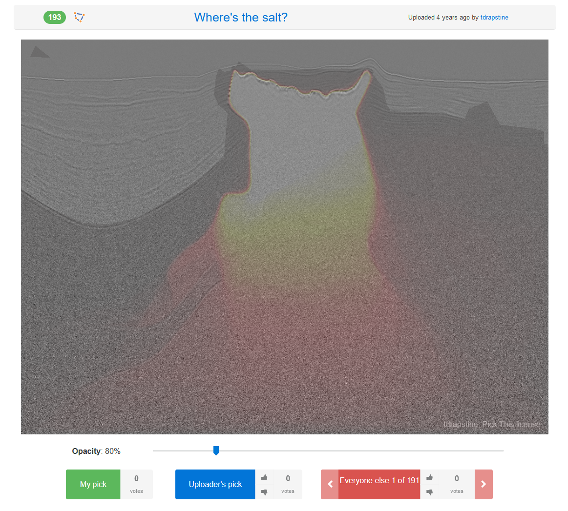
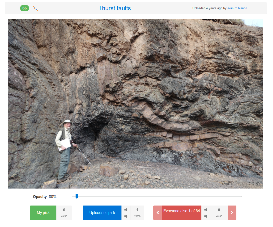
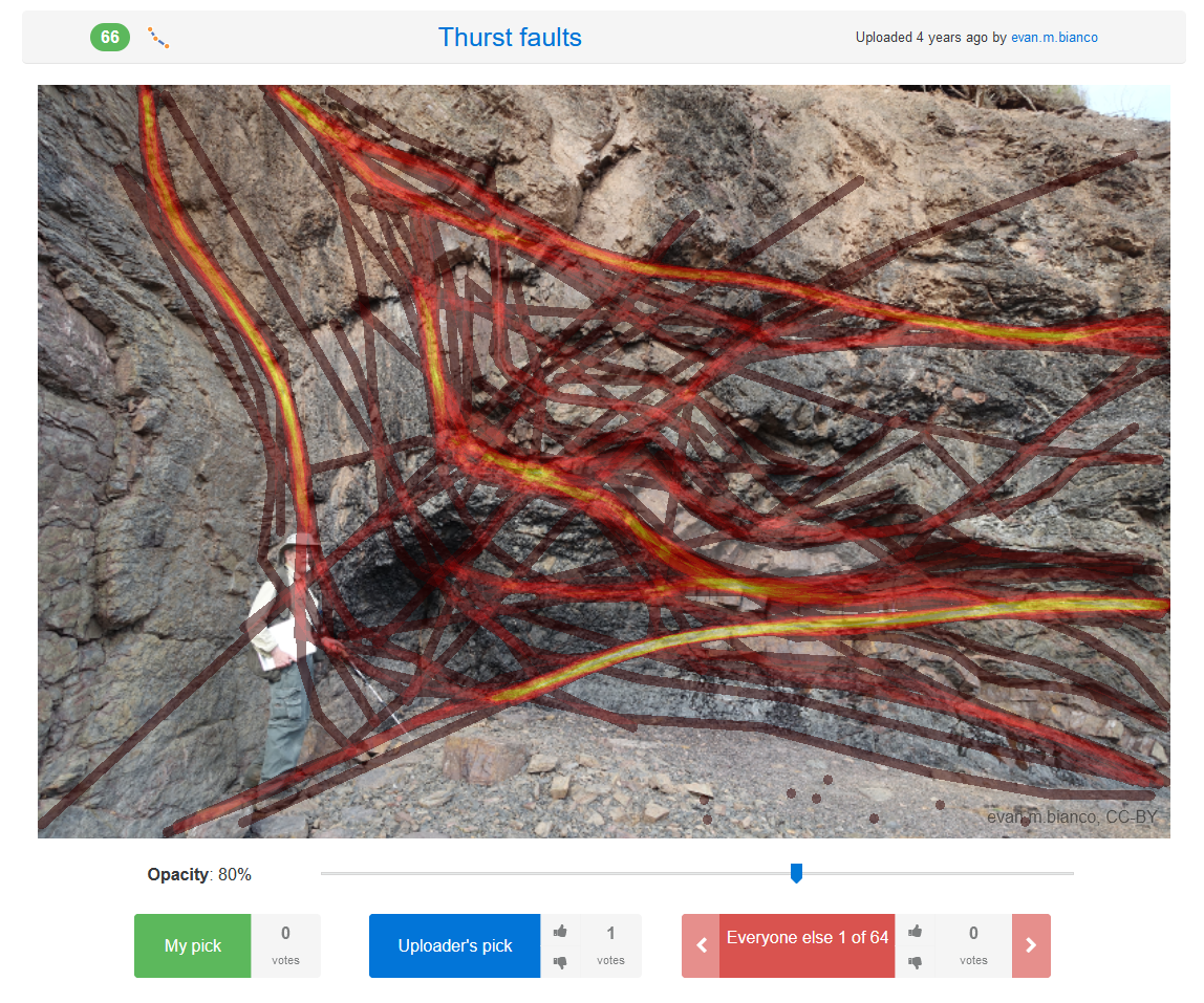
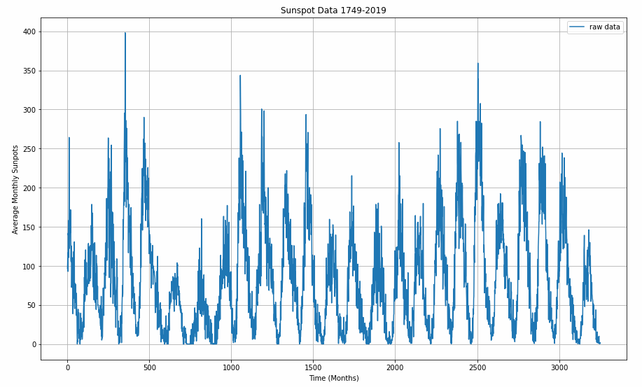
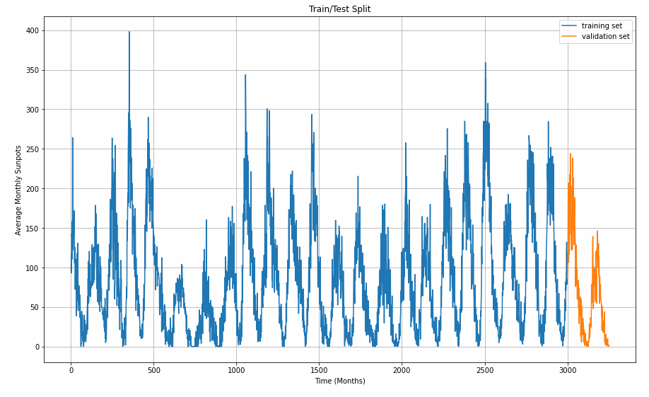
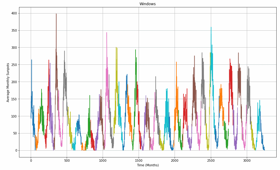
What do you think? Did you participate in any hackathon and what are your experiences? Explore AirBnB listings - what options drive the price? I have been to Berlin for various occasions and will likely visit there again. My stays are a mix of hotel rooms, hostels, and private rooms with AirBnB. Returning there, I would like to optimize my AirBnB booking, and for that reason I am running an analysis on the current listings. The most touristy attractions, including government institutions, are located in ‘Mitte’ central district. My hypothesis is that listings are going to be most expensive in the center. Perhaps you can learn something from this, too and optimize your spending. Caution: these findings are for Berlin specifically and may not carry over to other cities. Find optimal AirBnB website settings that lead to smart booking decisions. What types of listings cost more? Where are prices lowest/highest? etc. A. How are the prices distributed? B. Breakdown of listings by room type. C. What is the median price of a listing by district and room type. D. What is the average difference in a listing price between superhost and non-superhost status for each room type and district? E. Which website options influence the price? (Regression problem: idenfying predictor variables) The Berlin data are very recent and were obtained from Inside AirBnB. Download Date: 17th September 2020. Scraping Date: 30th August 2020. The files loaded are the listings.csv (all active accommodation places for Berlin) and the calender.csv (availability of accommodations with date and price). Inside AirBnB serves a map of all the data set samples: Distribution of samples map. The Jupyter/Python notebook for this analysis can be found here. Figure summary: The price distribution shows that the majority of listings are Private rooms and Entire home/apt. The Private room category has the majority of its listings cheaper than Entire home/apt and also has a shorter tail. The room types Shared room and Hotel room have much fewer counts. Listings in the Shared room category are cheaper than Private rooms. Hotel room counts are almost indistinguishible. Figure summary: The room distribution on AirBnB Berlin is relatively balanced between private rooms (41%) and entire homes/apartments (56%). A much smaller proportion of 1% are shared rooms with other guests, which are hostel style accomodations, and another 1% are listed Hotel rooms. Figure summary: All room types combined, the top four most expensive districts are Pankow, Marzahn-Hellersdorf, Mitte, and Charlottenburg-Wilmersdorf. Marzahn-Hellersdorf is neither a central tourist district “Mitte” nor adjacent, which is counterintuitive. However, the highest prices of Pankow are explained because on its southern end lies the hot neighborhood “Prenzlauer Berg”, which is famous for art, night clubs, etc. The districts Spandau, Neukölln, Reinickendorf, and Lichtenberg are the least expensive. These least expensive districts are on the outer most perimeter of Berlin and have relatively few tourist destinations. Figure summary: Generally, listings of the room type category Hotel (purple) are most expensive of the four types. The category Entire homes/apt (olive) are the most expensive among the non-commercial listings. Private rooms (red) are often 25 USD cheaper than Entire homes/apt. Shared rooms (green) are least expensive. The Hotel category has in many districts the largest range in prices, which may pull the total median of a district higher. The median prices of Private rooms and Shared rooms do not decline in the same pattern as does entire Home/apartments but rather, is much more stable among districs. Generally speaking, within a listing category, there is no extreme variablility across districts. Figure summary: Colored bars indicate the price difference between superhost and non superhost listings. Entire homes/apartments offered by superhosts are more expensive that those offered by non-superhosts in the majority of districts with the exception of Marzahn-Hellersdorf. The largest superhost price premium has to be paid for Entire home/apt in Spandau. The price difference is generally larger for Entire home/apt than Private room, while it is minimized in Pankow, Lichtenberg, and Charlottenburg-Wilmersdorf. Where are Superhosts chaper? None of these bargain-Superhost districts are located near Berlin’s major tourist destinations in Mitte. This means it is probably a valid choice to pick a non-Superhost listing if a cheaper, central location is desired. Counterintuitively, superhosts do not charge a premium everywhere in Berlin. More remote districts are acceptable, then there may be savings possible with superhosts in few, select districts. In a user mindset – which factor or option is going to be most influential on the price of listings that are displayed on the website? Figure Summary: The Random Forest Regressor yielded the most important options driving price variability with a satisfactory model score of R2 = 0.88. They factors are are in descending importance: The month of booking is twice as important than the numer of people accommodated. Districts are not as influential as they are in other cities, such as Paris. As an investigation on the influence of the month I want to visualize the prices per listing type and month. Figure Summary: Private room prices almost double in Spring and Summer (March to July) and are almost on par with the more expensive room types. Entire home/apt listings also increas during this month, but much less pronounced. Hotel rooms have a drop in prices in August, which may or may not be correlated that the data was scraped in August and short-term booking was discounted. Shared rooms show very little variance across the year. I hope you found this helpful and please let me know if you are interested in learning about other aspects of Berlin’s AirBnB data. Thanks to Elizabeth Herdter, from whose Paris AirBnB Analysis I took inspiration and decided to run my own analysis on Berlin. Let the Computer name the Formation Structured data classification is one of the important and typical task in supervised machine learning (ML). Assigning categories to structured data, which can be anything stored in a spereadsheet, relational database content (SQL), csv file etc. Data conetents may be names, dates, addresses, credit card numbers, stock information, geolocation, etc. In this article, I would like to demonstrate how we can do data classification on geophysical data using Python, XGBoost, and a little bit of Scikit-Optimize to predict sedimentological facies. The Society of Exploration Geophysicists (SEG), Matt Hall (Agile), and Brendon Hall (Enthought) ran in 2016 a competition on who can create the best Machine Learning model in classifying sedimentary facies in several wells using wireline measurements. For the dataset provided, a subject-matter expert (e.g., sedimentologist) manually described core sections and gave the facies names, which is calles labeling. This complete dataset can be used to train a Machine Learning Model. Note that in Artificial Intelligence rules are not hard-coded as in traditional programming, rather we give the computer the inputs and outputs, and the let it figure out the rules. These rules can then be used to make predictions on new, unseen, data. In this case we can then use new wireline data to predict sedimentological facies. The dataset, along with instructions were made available online in an article in SEG The Leading Edge “Facies classification using machine learning”. The article included a link to some starter code in a Jupyter notebook with a simple Support Vector Machine model that had to be surpassed in accuracy. In 2017, the results of the SEG competition were published in the SEG Leading Edge journal including all submission files for contestants to learn from each other. Teams were allowed to send new and improved models until the deadline. Two years later Brandon Hall penned a brief lookback on the merits, aftermath, and innovations that have been sparked by the ML contest he co-organized. The goal of this discussion is working through what a good submission did to improve on the starter code, but does not necessarily have to be the winning submission. Since the ML contest took place the XGBoost ensemble learning algorithm has taken on larger popularity. However, it not that easy to use, since there are many, many hyperparameter to tune. For that reason I decided to utilize Scikit Optimize, which was released first in August 2016, and I would like to see what benefits it has over Grid Search or Random Search, which was commonly used at the time of the ML contest. What does the data set look like? Originally, the SEG data were provided by the University of Kansas on the Hugoton and Panoma gas fields in SW Kansas ( Tim Carr and Robert S. Sawin (1996) Hugoton Natural Gas Area of Kansas, Kansas Geological Survey, Public Information Circular (PIC) 5). Encountered facies are interbedded deposits of carbonate (limestone and dolomite) and shale. The train dataset contains over 4000 training samples from ten different wells that were measured at half-foot downhole distances. These samples contain seven features (predictor variables). The seven features are: gamma ray (GR), resistivity (ILD_log10), photoelectric effect (PE), density/neutron porosity difference (DeltaPHI), average density/neutron porosity (PHIND), nonmarine/marine indicator (NM_M), and relative position (RELPOS). The test set was labeled by geologists with the correct facies information. Additionally, a test set of 800 samples was provided containing two wells but without facies labels. Goal is to train a classifier on the training set and predict correct facies on the test set. However, the true test labels remain unknown to the contestants. The published test-set F1 scores were calculated by the organizers. The best submitted classifier had an F1 score of 0.641 on the test set! This is something we can work with and strive to beat. +Only present in test set, cannot be trained. Prerequisites to follow this example are Python version 3 and Jupyter notebook. You can just install Anaconda and it will get everything for you. Also, little bit of Python and ML basics including data classification is required. We will be using XGBoost and Scikit-learn (Python) libraries for our example. Having installed Anaconda, you open the Anaconda Navigator and land on the Home screen. There, click the Install button for JupyterLab to make it accessible in future. Next, update all the libraries includied. Click on the Anaconda home screen on “CMD.exe Prompt” and enter Downloads: The classification problem can be divided into the following steps: Open Jupyter Lab (see screenshot above) and navigate in the file system pane on the left to the folder of the downloaded notebok Import necessary libraries. If you never worked with these then you may have to install them first with First, read the training data from csv to a Pandas dataframe, define the logging parameter names, facies names, and some standardized facies colors. At the end of this cell, impute all missing values (especially in the “PE” parameter) with the average of the parameter. Each parameter compared with each other. Colors pertain to facies type. How abundant are facies across all wells? How complete is the data after imputing? Show the first well in the training set! Augmentation is a crucial step in improving prediction quality. The process takes features and depths and calculates new features with a sliding window moving across depth. The first cell contains the XGBoost classifier controlled by the Scikit-Optimize (Skopt) “BayesSearchCV” function. There are two main differences when performing Bayesian Optimization using Skopt’s BayesSearchCV. When creating your search space you need to make each hyperparameter’s space a probability distribution as opposed to using lists like GridSearchCV. Skopt makes this easy for you with their library skopt.space which lets us import “Real”, “Integer”, and “Categorical” to create the probability distributions. Below you can see examples of using both the categorical and integer functions. For categorical spaces simply input a list inside the function. For Integer spaces input the minimum and maximum values you want BayesSearchCV to explore. The function on_step allows us to implement a form of early stopping (if needed) and also prints out the score after each iteration. The following cell brings everything together and starts the XGBoost algorithm and predicts test and train facies labels. Hyperparameter searching can be tedious, but there are tools that can do the tedious work for you. For example, Bayesian Optimization improves accuracy similarly as a Grid Search or Randomized Search, but automatically improves accuracy within the ranges given in the search space. Note that the Bayesian Optimization starts with randomized hyperparameters. This means it can sometimes require more iterations to arrive at the best accuracy possible. In my experience, the algorithm could reach maximum after 50 iterations, sometimes after 150. Play with the iterations and avoid excessive training durations since it takes longer and longer to improve the score. There will be a point of diminishing returns. The train F1 achieved here was 0.571. The F1 score of predicted test labels vs ground truth test labels was calculated by the organizers. Luckily, the correct test facies labels were provided in the GitHub repo after the contest concluded so we can calculate this by ourselves using the F1 scorer provided in Scikit-Learn. The F1 Scorer receives the variables y_hat_ts and y_ts_true. The test F1 achieved here was 0.42. It is unclear how the organizers calculated the Test F1. Normally, test/validation scores (unknown data) are lower than training scores but here they are higher. What is wrong here? Due to the proprietary nature of many geoscience data, the data size is limited to what was provided in the SEG ML contest, which is a relatively small data set compared to what treasure troves the AI pioneers in the tech sector can dispose of. Many of the algorithms common today work bettter (generalize more reliably) with massive data sets that are much larger than the 4000 samples used here. While Scikit-Optimize and XGBoost did not dramatically improve the accuracy of the model, it does simplify the model setup and resulted in a best score for the training set F1. However, this provides a stepping stone for geoscientists to further explore and apply machine learning techniques to lithofacies prediction, while employing their domain knowledge to further enhance the speed and accuracy of predictive models. Potential applications include validating velocity models for seismic data, fault interpretation and well top interpretation. Thanks to Matt Hall (Agile) and Brendon Hall (Enthought) for organizing the SEG Machine Learning challenge and the Kansas Geological Survey for their data. Hall, B. (2016). Facies classification using machine learning. The Leading Edge, 35(10), 906-909. The final step in the work with seismic data is seismic interpretation. The seismic data acquisition andc analysis worlfow goes through many steps as you can see (abbreviated) in the cover picture. The final step is seismic interpretation. In the scientific field called geophysics, interpretation sounds highly subjective. Very different from the usual statistics, ray and wave phenomena that can be calculated in detail. How can that be right? I would enjoy to say that interpretation is straight forward and seismic data reveals the perfect image of the subsurface for making business decisions. But it is not. Any way we manipulate seismic data has one single purpose: revert the filtering effect, distortion, and noise of the subsurface on our data to make the picture clearer. Of course, each step is based on assumptions. Imagining all the steps geophysicists undertake to improve up the image quality, it is sometimes amazing you can make any use of seismic data at all. After all the pre-processing the geophysicist is left with something like in the image below: This seismic image is easy on the eyes: low noise and great contrast. You can even see some hydrocarbons! At least if the interpreter knows what they are looking at. The upper depositional unit is made up of Pliocene-age sediments. They are layered like pan cakes, which usually indicates some kind of marine or lacustrine deposition history. You see some strong contrasts in an upwards-buckling structure. The rounded structure consists of evaporites (e.g., salt, gypsum, anhydrite). An upward-buckling structure like that is called an anticline and is the most old-fashioned and easiest means of how the hydrocarbon industry (oil and gas) obtains their product. The hydrocarbons are lower density than the rock and water inside the rock formation so that they rise up. In such anticline structures hydrocarbons get trapped below a sealing (non-pearmeable) rock formation and build a reservoir volume. Within this anticline structure you see something that cannot form syn-depositionally: There are two lines crossing at a pointy angle. The convex anticline crosses an almost straight (horizontal) line. This indicates that there has to be something else causing this peculiar shpe. These so-called flat spots can be a direct indicator for hydrocarbons trapped. The Flat Spot is a special Direct Hydrocarbon Indicator (DHI). The gas and oil in the rock posess a very much different accoustic impedance for our seismic signal than the regular rock. Now the really interesting part of the story is, that you (the reader) were very probably able to follow this explanation of the flat spot. But there is a high probability that you and I were not looking at exactly the same flat structure. Seismic interpreters working with a single seismic image will interpret it in different ways. The following image from https://pickthis.io, a social image interpretation web-app, is a stacked graph of ~40 interpreters’s opinions (more overlap = hotter). Science can explain these patterns well, but finding them is still highly subjective. You can see that the heatmap shows many picks along the flat spot described. This is especially interesting as I posed the challenge to pick the “hydrocarbon indication” instead of directly giving out the challenge “find the flat spot”, giving us many more interpretations. This starts becoming a problem when companies require hard volume numbers on how much hydrocarbons are trapped in the structure (or none at all??). These volumes go into larger risk calculations if the company wants to invest in drilling the structure or not. The interpretation is a make-or-break situation and such requires experience and at best multiple sets of eyes. For building up your interpretation experience, I encourage you to sign up with https://pickthis.io and take the challenge for yourself. Note: Only after submitting your interpretation you can see the others’. Be relieved, there is no wrong interpretation, just look at it and get going. If you know your way in geophysical interpretation already, then this is a perfect training opportunity without wagering your company’s exploration budget. Task: Pick the location and extent of the largest normal fault. Description: Seismic section through Penobscot 3D seismic volume. Task: Pick the fault and analyze the structure. Description: Pick the fault along the cross section. Task: Pick a single consolidated salt body from the depth migrated seismic image. Description: Image created by slicing and modifying an openly available 3D depth migrated image of the SEAM Phase 1 salt body. Task: Pick the thrust fault planes. Description: Duplicated and folded strata from the Horton Bluff formation at Rainy Cove, Nova Scotia.. Sunspots have a scientific record reaching back to 1749 For this project we will examine making time series predictions using sunspot records. Sunspots are dark spots on the sun, associated with lower temperature but also marked by intense magnetic activity. They play host to solar flares and hot gassy ejections from the sun’s corona. As the Sun moves through its natural 11-year cycle, in which its activity rises and falls, sunspots rise and fall in number, too. NASA and NOAA track sunspots in order to determine, and predict, the progress of the solar cycle — and ultimately, solar activity. Currenly, in 2019/2020, sunspots are at the end of the cycle, but are expected to pick up soon. Forecasting this dataset is challenging because of high short-term variability as well as long-term irregularities evident in the cycles. For example, maximum amplitudes reached by the low frequency cycle differ a lot, as does the number of high-frequency cycle steps needed to reach that maximum low-frequency cycle height. Methodically, this project will focus on how how to apply deep learning to time series forecasting with LSTMs, and implement learning rate optimization for the lowest loss possible. Have a look at the notebook here. The data used the most up-todate monthly version that contains monthly averages. It contains 270 years worth of data (from 1749 through 2019) and a total of 3252 samples (months). The data can be found here at Kaggle. A Recurrent Neural Network (RNN) is a type of neural network well-suited to time series data. RNNs process a time series step-by-step, maintaining an internal state from time-step to time-step. In this project, we use an RNN layer called Long Short Term Memory (LSTM). An important constructor argument for all keras RNN layers is the return_sequences argument. This setting can configure the layer in one of two ways. Most conveniently use the Kaggle API for downloading this challenge data set. You will need a Kaggle account and save the API credentials in a specific folder. Pandas dataframes allow for very neat, tabular representation of csv files. However, for the remainder of the project we will use Numpy arrays. The lines of the csv are read line-by-ine with an iterator. The column headers need to be skipped. We need the running index as time monthly steps and the sunspot counts. Note that the data gets cast into integer and floats. For plotting up data later on, define a function that accepts time steps and sun spot values. Before plotting, the data gets converted to Numpy arrays. Now that the data set is available as a single chunk of 3251 samples, we want to sub-divide it into a train set and a viladation set. With ther split time set at 3000, the largest chunk will go into training. Graphing helps us understanding the split better. For training a time series, the algorithm takes in a snippet of samples and predicts the next point coming afterwards. The windowing helper-function does this with our desired window size. The longer the window size, the more history can be learned to forecast the value that comes next. The window_size value influences the model performance and requires optimizing for the sunspot cycles. To demonstrate how the windowed_dataset function and the window_size parameter are slicing the data set, have a closer look at the graph below. Next task is finding a learning rate that delivers the least loss. With a callback that contains a Learning Rate Scheduler, the learning rate is increased sucessively over the 100 epochs. The model design itself will remain the same later. Fisrst, a 1D-convolutional filter with a width of 5 (2 samples before, two after the selected sample) and then two LSTM layers do the sequence learning work. Two dense layers and an output layer (1 neuron) make up the rest of the network. The Huber loss makes it necessary to work with larger outputs. That is why the lambda layer was chosen to multiply the output layer’s results by 400. I decided to use the Mean Absolute Error (MAE) as a metric that does not punish for large errors as severely as the Mean Squared Error (MSE) All the epoch’s metrics are saved in the history variable and can be visualized. The graph helps us find a learning rate with lowest loss and assure it is in an area of low volatility. A learning rate of 10e-5 is a safe pick. Plug in the new learning rate, remove the learning rate scheduler callback, and increase epochs. The network design remains the same as before. Visualize the training progress. Define a helper function for forecasting, call it, and plot a zoom-in of one of the cycles. Here, we see the last sun-spot cycle and how the model (orange) at least visually matches the training/validation (blue) data quite well. Of course, a quantitative comparison is more accurate in describing the model’s fit to the validation set. Mean Absolute Error (MAE): 14.52463 This has been a long post, and necessarily will have left a lot of questions open, first and foremost: How do we obtain good settings for the hyperparameters (learning rate, number of epochs…)? How do we choose the length of the LSTM? Or even, can we have an intuition how well LSTM will perform on a given dataset (with its specific characteristics)? All questions to be tackled in the future. GitHub’s initiative to preserve open-source code If you are a GitHub user like me, you might have received a new badge on GitHub called Arctic Code Vault Contributor with a notification as in the cover picture above. The badge is testament that your code in public repos was backed up for really, really, really, really long time to come. Microsoft, which acquired GitHub for $7.5 billion in 2018, is preparing itself and GitHub for the apocalypse. As a reaction, Microsoft and GitHub recently launched a project called “GitHub Archive Program” along with the GitHub Arctic Code Vault. The vault will be co-located with the Arctic World Archive (AWA), a disused coal mine on Svalbard Archipelago north of Norway. The major purpose of this project is to conserve major open-source contributions for future generations by storing them in an archive and save them for a thousand years. Alas, GitHub and Microsoft will not be the sole tenant of AWA. The digitized art and documents from the Vatican, various illustrious meuseums, governments, and companies will have to share space in the mine. The progess was largely orchestrated by piql. Digital file formats are fast-lived and many common digital storage devices have to be replaced after few years (DVDs and BluRays do physically degrade over time!). Tape, SSD, or HDDs neither offer longevity. Instead, the code was printed onto film reels, which perfectly aligns with GitHub’s objectives. The cold permafrost on Svalbard will help slow down the degradation of the film reels. In fact, the coal mine is very close to the Svalbard Global Seed Vault, which has very similar goals, but for rare plant seeds that may get marginalized by modern genetically modified plants. In short: everything public on GitHub. At first the collection includes the source code for the Linux and Android operating systems; the programming languages Python, Ruby, and Rust; web platforms Node, V8, React, and Angular; cryptocurrencies Bitcoin and Ethereum; AI tools TensorFlow and FastAI; and many more. Furthermore, every public repository that was publicly available as of February 2, 2020 was copied and went into storage. That likely includes you. Finally, the question that bugs me is: If you deleted your repo, can you book a flight to Svalbard and get a copy of your backup? :) Official Link: https://archiveprogram.github.com/ Implement an NLP model with a chat GUI A chatbot is smart code that is capable of communicating similar to a human. Chatbots are used a lot in customer interaction, marketing on social network sites and instantly messaging the client. There are two basic types of Natural Language Processing (NLP) chatbot models based on how they are built: Retrieval based. A retrieval-based chatbot uses predefined input patterns and responses. It then uses some type of heuristic approach to select the appropriate response. It is widely used in the industry to make goal-oriented chatbots where we can customize the tone and flow of the chatbot to drive our customers with the best experience. Generative based models are not based on some predefined responses. They are based on seq 2 seq neural networks. It is the same idea as machine translation. In machine translation, we translate the source code from one language to another language but here, we are going to transform input into an output. It needs a large amount of data and it is based on Deep Neural Networks (DNN). We are going to build a chatbot using deep learning techniques following the retrieval-based concept. The chatbot will be trained on the dataset which contains conversation categories (intents), patterns, and responses. The model uses a Deep Neural Network with a single hidden layer to classify which category the input message belongs to and then the chatbot will select a random response from the list of responses, which have similar meaning. Topics the chatbot will be helpful with is helping doctors/patients finding (1) Adverse drug reaction, (2) Blood pressure, (3) Hospitals and (4) Pharmacies. It may be used on websites pertaining to hospital, pharmaceutical online stores etc. or modified to fit completely different purposes. Furthermore, this is just a prototype whose functionality can be greatly expanded in topics it can reply to, depth of conversation, answer variert and so on. The training set and DNN for chatbot inference was created in a separate Jupyter notebook. The model used data from the intents.json file, which contains: Files generated in that notebook are: If you want to follow along and try it out yourself, download the Jupyter notebook containing all the steps shown below. Check if your environment has all the packages installed. The necessary data files for this project are available from this folder. Make sure the paths in the notebook point to the correrct local directories. And of course, you will need to install all the Python packages if you do not have all of them yet. Give it a go and talk with the chatbot yourself! Call all the libraries we need for this project Loading words, model, and replies into objects. For class prediction, we need to provide input in the same way as we did for training. These helper functions perform text preprocessing when the user clicked “Send” and then predict the class. After predicting the class (tag) of the user input, these functions select a random response from the list of intent (i.e. from intents.json file). Code for the Graphical User Interface. The GUI uses the tkinter library, which is an Python interface to the Tk GUI toolkit. Tkinter is Python’s de-facto standard GUI. Tasks of the GUI are: (1) Accept the input message from the user and then (2) use the helper functions to get the response from the bot and then (3) display everything in a window. Here, everything comes together. The different objects on the screen are defined and what functions are executed when they are interacted with. The ChatLog text field’s state is always set to “Normal” for text inserting and afterwards set to “Disabled” so the user cannot interact with it. A drowsiness detector to try out on yourself For this ML/DL project, we will implement a relatively simple drowsiness-detection tool. Drowsiness detection can be done by measuring if someone’s eyes were closed longer than blinking and may be a life-saver in many instances. For example while driving a vehicle for long hours or at night (Wikipedia: Driver drowsiness detection, NYTimes: Sleepy Behind the Wheel? Some Cars Can Tell). Other use cases are more recent applications such as virtual school classes. In either case, we hope people are wide awake during these activities. I will show how to implement a camera system that watches a person and can tell if they are falling asleep. The most accute signs for this are prolonged periods of closed eyes. For the model here I will first use a Haar Cascade object identifier to find face and eyes in real-time footage. From an incoming frame, the eyes will be cropped and fed into a Convolutional Neural Netowk (CNN) model for inference. If closed eyes were predicted for several consecutive frames, a warning chime will sound. When eyes are predicted open again, everything is supposed to go back to normal. Give it a go! Dataset creation. To create the DNN dataset, a script was written that captures eyes from a camera and stored them on local disk. They were labeled “Open” or “Closed”. The data was manually cleaned by removing bad and redundant images. The dataset comprised ~7,000 images of people’s eyes under different lighting conditions. Sorry, this is too big for GitHub. Training. Next, a Deep Neural Network (DNN) model was trained to classify open and closed eyes. See file “Drowsiness_detection_CNN_pre-train.ipynb” and the the final weights and model architecture file “cnnCat2.h5”. Object Detection. The Haar Cascade (example in OpenCV) finds landmarks in image frames and cuts them out. The Haar Cascade algorithm produces similar results as the newer YOLO object detection using image convolution filters but instead uses kernel computation. Kernel computation is very similar to YOLO’s convolution filters. Different kernels are tuned for different landmarks and can be loaded as needed. The “cascade” part of the algorithm is used to narrow down features to the wanted areas and save computation. The kernels we will use here are set to detect eyes and face. Many pre-tuned kernels are shared by OpenCV for different purposes and objects. Link to OpenCV’s kernel repo. If you want to follow along and try it out yourself, download the Jupyter notebook. Check if your environment has all the packages installed. The necessary data files for this project are available from this folder. Make sure the paths in the notebook point to the correrct local directories. And of course, you will need a video camera or webcam plugged into your computer. Call all the libraries we need for this project Load the wav file you want to play on detection. The “haar cascade” xml files are needed to detect objects from the image. In this case, the kernels are tuned to detect the face and eyes of the person. The inference happens in an infinite while-loop that grabs a frame from the webcam feed, identifies the face and eyes, runs a classifier on the eyes, and then calculates a “drowsiness-score”. We can select a score threshold when a sound will be triggered. Effectively, the score will increase with closed eyes and is a measure for how long the eyes were closed. The threshold that has to be reached before sounding the alarm prevents the model from predicting simple blinking as drowsiness. Futhermore, both eyes need to be closed at the same time. When executing the next cell, a window with the video capture will pop up. Quit by hitting ‘q’. To re-start, open the video capture again (execute cell above). Cats Vs. Dogs computer vision with the TensorFlow API Given the somewhat mediocre performance of the previous model for Cats Vs Dogs, it seems warranted to implement new tools that promise performance gains. The classification model used previously suffered from overfitting. That means, the training set was learned very well, but probably so well, that the unknown data in the validation set could not be predicted precisely. If a model can only predict well what it has seen before means that it does not “generalize” well. To improve generalization on the Dogs Vs. Cats set, we can implement two extra measures. Transfer learning, image augmentation, and neuron dropout in some layers. Otherwise, we will keep the setup as before. If details are unclear, read up in Part I We will follow these steps: If you want to follow along on the Jupyter notebook hosted on GitHub click on this link, otherwise keep on reading. Transfer learning is a technique by which we can make use of learned weights of much larger networks. Such networks were trained on millions of images and many classes and are often available to download. What we will do is, download the learned weights of the Inception V3 network and add our own dense layers and outputs on top. Using the Inception V3 transfer learning enables us to “step on the shoulders of giants” and helps us identify shapes, objects etc. in the images we re-train it on afterwards. We are transferring the learned weights into our own network without the heavy training load of millions of images. Here, we will download the weights as an .h5 file. Next, we also have to set up the network itself as the authors of Inception V3 designed it. Luckily, keras has this model already built in in its library. We only have to import it and then fill in the weights from the .h5 file. While training on the cats vs. dogs images, we do NOT want to re-train the entire Inception V3 network. Hence, we set Let’s have a look at the layers of the pre-trained model: Result: In total, there are almost 100 layers of batch normalizations, 2d convolutions, activations etc. etc…. which makes ~ 22 million parameters. We will not use the original output of the network, but replace it with our own dense layers and output neurons. We will define the the last / output layer of the Inception network. Result: As mentioned beforek, we will have to define layers that are attached to the end of the Inception network and are trainable. Four layers will get added. First, a flatten layer that takes the 2d output of the Inception and unravels it into a 1d vector. Second, a trainable fully-connected layer. Third a droput layer, and fourth, an output layer with a single neuron as we had in Part I already. New is the droput. Droput layers are an additional tool for regularization and will delete random neurons. Many adjacent neurons are thought to be trained with similar values and contribute to overfitting. Setting the droput to 0.2 will make sure that 20% of all neurons in this layer will be canceled. The droput percentage is something to tweak. As in Part I, we have to download the Cats Vs. Dogs data set again and unzip it. As before, we define the train, validation, and paths to the two classes so we can feed them to the Image Data Generator and stream the files into the training process. Here, we will use new parameters for the ImageDataGenerator which will augment the images in the folder on-the-fly. On-the-fly means that the generator applies these augmentations during training without saving data to the hard drive. The modifications taking place are mainly distortions of existing images such as rotation, shearing, mirroring, lateral shifts, and zooms. In short, is a very handy way of vastly increasing the number of training examples without having to take more photos. Result: As previously, we pass the image generators for tain and validation to our model and start it! Result: Finally we can check what the new implemented tools did to improve the model by plotting the training history. Remember, in the old model Training Accuracy rose to almost 100% after 15 epochs, while the Validation Accuracy stagnated near ~70%. Result: In the new model, the Validation Accuracy (~95%) is even higher than the Training Accuracy (~90%). This is largely a success. Fine-tuning parameters such as the drop out rate and training epochs may be worth a try to modify. A visible trend in the history losses are increasing too. This means good predictions may be getting worse in higher epochs. Losses keep increasing faster than they are decreases. This remains an issue to be solved. Thanks to Lawrence Moroney (Google) by whom this project was inspired (link to notebook on Google CoLab) and Kaggle for their Cats Vs Dogs dataset. Cats Vs. Dogs computer vision with the TensorFlow API In a previous post about computer vision I wrote how to make binary predictions if a photo contains a cat or no cat Article “Cat Prediction”. This was a much simpler classifier built from ground up. However, not many users would still programm everything from scratch today. It is much easier to make use of a Deep Learning API such as PyTorch, Keras, TensorFlow etc. For this project, we will take that to the next level, recognizing real images of Cats and Dogs in order to classify an incoming image as one or the other using Google’s TensorFlow. This API has many functions already built in so that they only have to be called with a single line of code or even set only a parameter. For example, as part of the task we need to process the data - not least resizing it to be uniform in shape. We will follow these steps: If you want to follow along on the Jupyter notebook hosted on GitHub click on this link, otherwise keep on reading. Let’s start by downloading our example data, a .zip of 2,000 JPG pictures of cats and dogs, and extracting it locally in \Data . Note: The place where your Jupyter file is stored is the working directory. The 2,000 images used in this exercise are excerpted from the “Dogs vs. Cats” dataset available on Kaggle, which contains 25,000 images. Here, we use a subset of the full dataset to decrease training time for practial purposes. The following code will use the OS library to use Operating System libraries, giving you access to the working directory, and the zipfile library allowing you to unzip the data. The contents of the .zip are extracted to the base directory \Data\cats_and_dogs_filtered, which contains train and validation subdirectories for the training and validation datasets, which in turn each contain cats and dogs subdirectories. In Summary: The Training Set are the photos that are used to tell the model that this is what cats and dogs look like. The Validation Set contains images of cats and dogs that the model will not see as part of the training, so we can test how it does in evaluating if an image contains a cat or a dog. The practical thing about TensorFlow: We do not explicitly label the images as cats or dogs. We will use the ImageGenerator, which is used to read images from subdirectories, and automatically label the data contained with the name of that subdirectory. So we will have a ‘Training’ directory containing a ‘Cats’ directory and a ‘Dogs’ one. The ImageGenerator will label the images appropriately for us and saving us time. First we have to define the paths to all these directories: Now, let’s see what the file names look like in the cats and dogs train directories (file naming conventions are the same in the validation directory): Result: Let’s find out the total number of cat and dog images in the train and validation directories: Result: For both cats and dogs, we have 1,000 training images and 500 validation images. Now let’s take a look at a few pictures to get a better sense of what the cat and dog datasets look like. First, configure the matplot parameters: Now, display a batch of eight cat and eight dog pictures. Each time this code is called, a new set of pictures will appear. Result: The images are in color and come in a variety of shapes. Before training a Neural network with them we will need to tweak the images. We will see that in the next section. Ok, now that you have an idea for what your data looks like, the next step is to define the model that will be trained to recognize cats or dogs from these images. First of all, we need to import TensorFlow and best check for the installed version. This simple neural network will start with images of the size 150 x 150 pixels and three color values (RGB). It will contain three convolutional layers followed by pooling layers, which reduce the number of pixels. Then the 2D images will be flattened out to a single row of pixels that become neurons. After that, a fully connected layer (dense) with ReLu and then already the output layer with a single neuron that will indicate 1 or 0 for cat or dog. Activation for that final neuron will be a sigmoid function. The model layout can be shown by calling the summary method. Result: The “output shape” column shows how the size of the feature map evolves in each successive layer. The convolution layers reduce the size of the feature maps by a bit due to lack of padding, and each pooling layer halves the dimensions. Next, we will set more model configurations. We will train the model with the binary_crossentropy loss, because it is a binary classification problem (cat,dog) and our final activation is a sigmoid. We will use the rmsprop optimizer with a learning rate of 0.001. During training, we will want to monitor classification “accuracy”. Let’s configure the data generators that will read pictures in our source folders, convert them to float32 tensors, and feed them including labels to the neural network. Training images and validation images will be separate generators. The generators will yield batches of 20 images of size 150x150 and their labels (binary). Statistical modeling data should usually be normalized to make it more amenable to processing by the network. In our case, we will preprocess our images by normalizing the pixel values to be in the 0 to 1 range. Originally all values are in the 0 to 255 range. In Keras this can be done via the Let’s train on all 2,000 images available, for 15 epochs, and validate on all 1,000 test images. TensorFlow will print four metrics per epoch – Loss, Accuracy, Validation Loss and Validation Accuracy. The Loss and Accuracy are a great indication of progress of Training. It’s making a guess as to the classification of the training data, and then measuring it against the known label, calculating the result. Accuracy is the portion of correct guesses. The Validation Accuracy is the measurement with the data that has not been used in training. As expected this would be a bit lower. Result: To get a feel for what kind of features the convolutional network has learned, one fun thing to do is to visualize how an input gets transformed as it goes through the network. Let’s pick a random cat or dog image from the training set, and then generate a figure where each row is the output of a layer, and each image in the row is a specific filter in that output feature map. Rerun this cell to generate intermediate representations for a variety of training images. Result: Let’s now take a look at actually making predictions using the model. I chose five cat photos and five dog photos from https://unsplash.com/, and fed them to the model, giving an indication of whether the object is a dog (1) or a cat (0). Some of the photos are not as straight forward, since objects surrounding the animal are present, such as hands, leafs, larger background areas etc and may be relatively hard to classify. The photos are in the upload_cats_and_dogs folder and were re-named by me to indicate their contents. Since we are not using the image generator, we have to manually reduce the size to our model’s image processing size (150x150 pixels). Result: The pictures I uploaded were not predicted entirely correctly. All the dogs were correctly classified as “dog”, but only two out of five cats were classified “cat”. Let’s plot the Training/Validation accuracy and loss as collected during training: Result: As the graph above shows, we are strongly overfitting our Training Set. Our Training accuracy (in blue) gets close to 100%, while our Validation accuracy (in orange) stalls as ~71%. The validation loss reaches its minimum after only five epochs and then increases steadily. Since we have a relatively small number of training examples (2000), overfitting should be our greatest concern. Overfitting happens when a model exposed to too few examples learns patterns that do not generalize to new data, i.e., when the model starts using irrelevant features for making predictions. Overfitting is the central problem in machine learning: given that we are fitting the parameters of our model to a given dataset, how can we make sure that the representations learned by the model will be applicable to data never seen before? How do we avoid learning things that are specific to the training data? In the next post, I will look at ways to prevent overfitting in this classification model. Thanks to Lawrence Moroney (Google) by whom this project was inspired (link to notebook on Google CoLab) and Kaggle for their Cats Vs Dogs dataset. Smart AirBnB booking in Berlin

Purpose of this Analysis
 Image Source: mapsland.com
Data Source
Analysis Steps
Results
A. How are the prices distributed?

B. What is the room type breakdown?

C. What is the median listing price by room type and district?


Image Source: modified after mapsland.com
D. What is the difference in price between super host and non super host listings?

E. Which website options influence the price?


Analysis Summary
Acknowledgements
Sedimentary Facies Machine Learning - XGBoost with Intelligent Bayesian Optimization

Introduction
Facies Description Label Adjacent facies 1 Nonmarine sandstone SS 2 2 Nonmarine coarse siltstone CSiS 1,3 3 Nonmarine fine siltstone FSiS 2 4 Marine siltstone and shale SiSh 5 5 Mudstone MS 4,6 6 Wackestone WS 5,7,8 7 Dolomite D 6,8 8 Packstone-grainstone PS 6,7,9 9 Phylloid-algal bafflestone BS 7,8 11 Marine sandstone+ N/A 4,6,8 
conda update --all --y. This will online-update all the pre-installed libraries. But you will need more for this project that will install in the latest version.Let’s get going!
!conda install matplotlib for example.%matplotlib inline
import seaborn as sns
import matplotlib.pyplot as plt
import matplotlib as mpl
import numpy as np
import pandas as pd
from sklearn.impute import SimpleImputer
from sklearn import preprocessing
from xgboost.sklearn import XGBClassifier
from skopt import BayesSearchCV
from skopt.space import Real, Categorical, Integer
from scipy.signal import medfilt
from sklearn.metrics import f1_score
from classification_utilities import make_facies_log_plot
from classification_utilities import compare_facies_plot
Step 1: Load
data = pd.read_csv('facies_vectors.csv')

# Define groups of parameters
# Wireline measurements -> lnput features
feature_names = ['GR', 'ILD_log10', 'DeltaPHI', 'PHIND', 'PE', 'NM_M', 'RELPOS']
# Geological descriptins -> labels
facies_names = ['SS', 'CSiS', 'FSiS', 'SiSh', 'MS', 'WS', 'D', 'PS', 'BS']
# Color codes
facies_colors = ['#F4D03F', '#F5B041','#DC7633','#6E2C00', '#1B4F72','#2E86C1', '#AED6F1', '#A569BD', '#196F3D']

# Store features and labels
X = data[feature_names].values
y = data['Facies'].values

# Store well labels and depths
well = data['Well Name'].values
depth = data['Depth'].values

# Fill 'PE' missing values with mean
imp = SimpleImputer(missing_values=np.nan, copy=False, strategy="mean")
imp.fit(X)
X = imp.transform(X)
Step 2: Explore
Data Exploration: Feature distribution
def plot_feature_stats(X, y, feature_names, facies_colors, facies_names):

    # Remove NaN
    nan_idx = np.any(np.isnan(X), axis=1)
    X = X[np.logical_not(nan_idx), :]
    y = y[np.logical_not(nan_idx)]

    # Merge features and labels into a single DataFrame
    features = pd.DataFrame(X, columns=feature_names)
    labels = pd.DataFrame(y, columns=['Facies'])
    for f_idx, facies in enumerate(facies_names):
        labels[labels[:] == f_idx] = facies
    data = pd.concat((labels, features), axis=1)

    # Plot features statistics
    facies_color_map = {}
    for ind, label in enumerate(facies_names):
        facies_color_map[label] = facies_colors[ind]

    sns.pairplot(data, hue='Facies', palette=facies_color_map, hue_order=list(reversed(facies_names)))
plot_feature_stats(X, y, feature_names, facies_colors, facies_names)

Data Exploration: Facies distribution
# workaround to increase figure size
mpl.rcParams['figure.figsize'] = (20.0, 10.0)
inline_rc = dict(mpl.rcParams)

# Data Exploration: Facies per well
for w_idx, w in enumerate(np.unique(well)):
    # Define plot ID in mosaic
    ax = plt.subplot(3, 4, w_idx+1)

    # Define histogram settings
    hist = np.histogram(y[well == w], bins=np.arange(len(facies_names)+1)+.5)
    plt.bar(np.arange(len(hist[0])), hist[0], color=facies_colors, align='center')

    # Cosmetic settings
    ax.set_xticks(np.arange(len(hist[0])))
    ax.set_xticklabels(facies_names)
    ax.set_title(w)

Data Exploration: Features per well present
for w_idx, w in enumerate(np.unique(well)):
    # Define plot ID in mosaic
    ax = plt.subplot(3, 4, w_idx+1)

    # Define histogram settings
    hist = np.logical_not(np.any(np.isnan(X[well == w, :]), axis=0))
    plt.bar(np.arange(len(hist)), hist, color=facies_colors, align='center')

    # Cosmetic settings
    ax.set_xticks(np.arange(len(hist)))
    ax.set_xticklabels(feature_names)
    ax.set_yticks([0, 1])
    ax.set_yticklabels(['miss', 'hit'])
    ax.set_title(w)

make_facies_log_plot(data[data['Well Name'] == 'SHRIMPLIN'], pred_column='Facies', facies_colors=facies_colors)

Step 3: Augmentation
# Feature windows concatenation function
def augment_features_window(X, N_neig):

    # Parameters
    N_row = X.shape[0]
    N_feat = X.shape[1]

    # Zero padding
    X = np.vstack((np.zeros((N_neig, N_feat)), X, (np.zeros((N_neig, N_feat)))))

    # Loop over windows
    X_aug = np.zeros((N_row, N_feat*(2*N_neig+1)))
    for r in np.arange(N_row)+N_neig:
        this_row = []
        for c in np.arange(-N_neig,N_neig+1):
            this_row = np.hstack((this_row, X[r+c]))
        X_aug[r-N_neig] = this_row

    return X_aug


# Feature gradient computation function
def augment_features_gradient(X, depth):

    # Compute features gradient
    d_diff = np.diff(depth).reshape((-1, 1))
    d_diff[d_diff==0] = 0.001
    X_diff = np.diff(X, axis=0)
    X_grad = X_diff / d_diff

    # Compensate for last missing value
    X_grad = np.concatenate((X_grad, np.zeros((1, X_grad.shape[1]))))

    return X_grad


# Feature augmentation function
def augment_features(X, well, depth, N_neig=1):

    # Augment features
    X_aug = np.zeros((X.shape[0], X.shape[1]*(N_neig*2+2)))
    for w in np.unique(well):
        w_idx = np.where(well == w)[0]
        X_aug_win = augment_features_window(X[w_idx, :], N_neig)
        X_aug_grad = augment_features_gradient(X[w_idx, :], depth[w_idx])
        X_aug[w_idx, :] = np.concatenate((X_aug_win, X_aug_grad), axis=1)

    # Find padded rows
    padded_rows = np.unique(np.where(X_aug[:, 0:7] == np.zeros((1, 7)))[0])

    return X_aug, padded_rows
4. Train, then Predict Test Facies
search_space = {"colsample_bylevel": Real(0.6,1),
                "colsample_bytree":Real(0.6, 0.8),
                "gamma": Real(0.01,5),
                "learning_rate": Real(0.0001, 1),
                "max_delta_step": Real(0.1, 10),
                "max_depth": Integer(3, 15),
                "min_child_weight": Real(1, 500),
                "n_estimators": Integer(10,200),
                "reg_alpha": Real(0.1,100),
                "reg_lambda": (0.1, 100),
                "subsample": (0.4, 1.0)
                }

def on_step(optim_result):
    """
    Callback meant to view scores after
    each iteration while performing Bayesian
    Optimization in Skopt"""
    score = XGB_bayes_search.best_score_
    print("best train score: {}".format(score))


# Train and test a classifier
def train_and_test(X_tr, y_tr, X_ts, well_ts):

    # Feature normalization
    scaler = preprocessing.RobustScaler(quantile_range=(25.0, 75.0)).fit(X_tr)
    X_tr = scaler.transform(X_tr)
    X_ts = scaler.transform(X_ts)

    # Train classifier
    clf = XGBClassifier()
    global XGB_bayes_search
    XGB_bayes_search = BayesSearchCV(clf, search_space, n_iter=75, scoring="f1_weighted", n_jobs=-1, cv=5)

    XGB_bayes_search.fit(X_tr, y_tr, callback=on_step)

    # Test classifier
    y_ts_hat = XGB_bayes_search.predict(X_ts)

    # Clean isolated facies for each well
    for w in np.unique(well_ts):
        y_ts_hat[well_ts==w] = medfilt(y_ts_hat[well_ts==w], kernel_size=5)

    return y_ts_hat
# Load testing data
test_data = pd.read_csv('validation_data_nofacies.csv')

# Prepare training data
X_tr = X
y_tr = y

# Augment features
X_tr, padded_rows = augment_features(X_tr, well, depth)

# Removed padded rows
X_tr = np.delete(X_tr, padded_rows, axis=0)
y_tr = np.delete(y_tr, padded_rows, axis=0)

# Prepare test data
well_ts = test_data['Well Name'].values
depth_ts = test_data['Depth'].values
X_ts = test_data[feature_names].values

# Augment features
X_ts, padded_rows = augment_features(X_ts, well_ts, depth_ts)

# Predict test labels
y_ts_hat = train_and_test(X_tr, y_tr, X_ts, well_ts)
# Add prediction to test_data for plotting
test_data['Prediction'] = y_ts_hat

# Predict train labels,
y_tr_hat = XGB_bayes_search.predict(X_tr)
# Add prediction to data for plotting
data = data.join(pd.DataFrame(y_tr_hat), how='inner')
data.rename(columns={0: "Prediction"}, inplace=True)

print("\nBest score: {}\nBest params: {}".format(XGB_bayes_search.best_score_,XGB_bayes_search.best_params_))
Step 5: Evaluate
# F1 score on test wells

y_ts_true = pd.read_csv('blind_stuart_crawford_core_facies.csv')
# rename columns for merging
y_ts_true.rename(columns={'Depth.ft': 'Depth', 'LithCode': 'Facies'}, inplace=True)
# remove facies "11", since that was not in training
y_ts_true = y_ts_true[y_ts_true!=11]

test_data = test_data.merge(y_ts_true, on='Depth', how='inner')
test_data.dropna(inplace=True)
print("F1_weighted: ",f1_score(test_data['Facies'], test_data['Prediction'], average='weighted'))
Place Team Train F1 Score Test F1 Score N/A ChristianHallerX 0.571 0.478 1 LA_Team (Mosser, de la Fuente) ??? 0.641 2 ispl (Bestagini, Tuparo, Lipari) 0.564 0.640 3 SHandPR 0.560 0.631 4 HouMath 0.563 0.630 5 esaTeam 0.566 0.629 # Compare true and predicted facies on first TREAINING well
compare_facies_plot(data[data['Well Name'] == 'SHRIMPLIN'], pred_column='Prediction', facies_colors=facies_colors)

# Compare true and predicted facies on first TEST well
compare_facies_plot(test_data[test_data['Well Name'] == 'STUART'], pred_column='Prediction', facies_colors=facies_colors)

# Compare true and predicted facies on second TEST well
compare_facies_plot(test_data[test_data['Well Name'] == 'CRAWFORD'], pred_column='Prediction', facies_colors=facies_colors)

Conclusion
Acknowledgements:
References
Friedman, J. H. (2000) Greedy function approximation: A gradient boosting machine: Annals of Statistics, 29, 1189–1232. Seismic Interpretation ... the Art and Science

Introduction
A Paleontologist, a Geologist, and a Geophysicist are interviewing for a job.
First, the Paleontologist is asked in to the Hiring Manager's office and the Paleontologist is shown a piece of paper with some wrtiting.
The Hiring Manager asks: "What do you see?" The Paleontologist quips "The number 4"

The Hiring Manager is continues the interview and then asks the Geologist into his office.
The Hiring Manager asks: "What do you see?" The Geologist looks at the paper and after short deliberation replies: "4.0".

Finally, the Hiring Manager beckons the Geophysicist into the office and hands him the paper.
He asks: "Geophysicist, what do you see?". The Geophysicist looks at the sheet for a long time, turns it upside down, thinks.
The Geophysicist leans forward and whispers: "What do you want it to be?"
Flat Spots
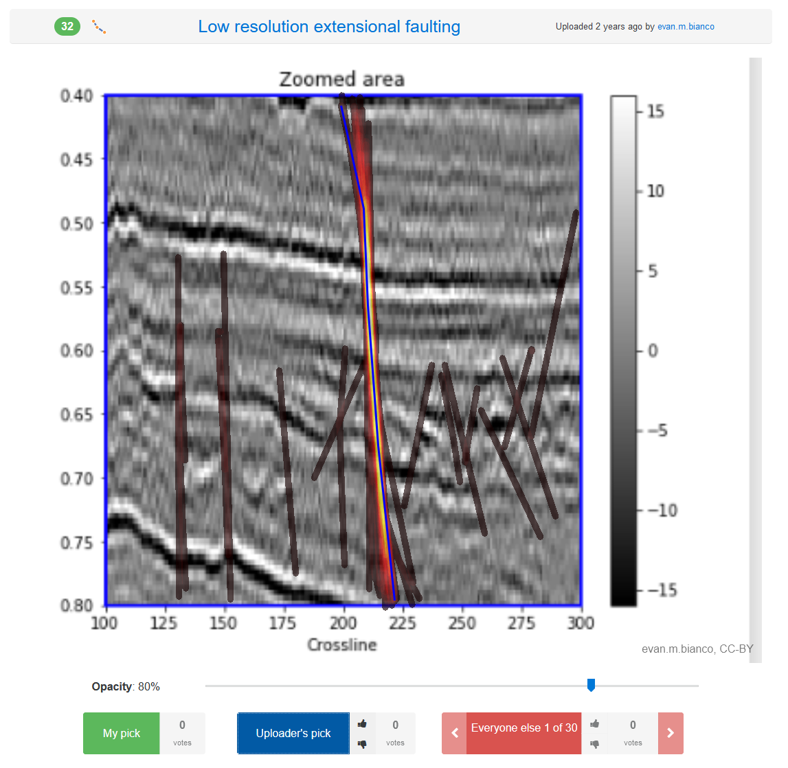
Joshua Doubek / pickthis.io Click me!
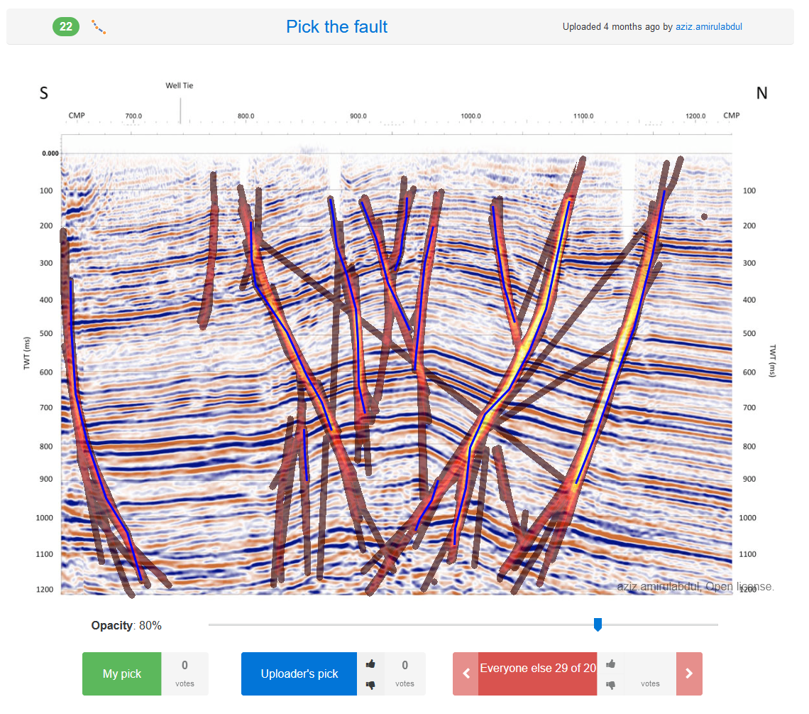
Joshua Doubek / pickthis.ioSome Examples from pickthis.io
Low resolution extensional faulting
Evan M. Bianco / pickthis.io
Click me!
Evan M. Bianco / pickthis.ioPick the fault
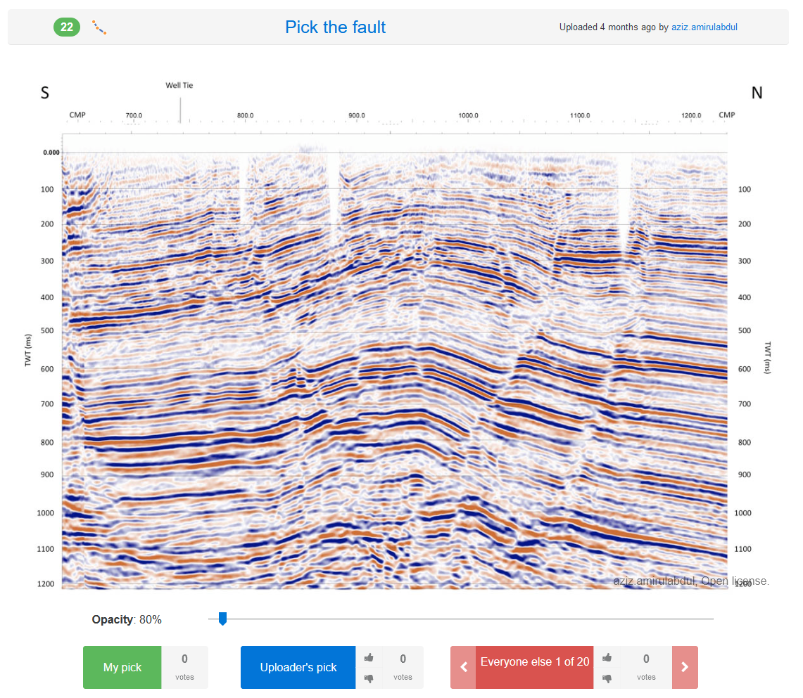
Aziz Amirul Abdul / pickthis.io
Click me!
Aziz Amirul Abdul / pickthis.ioWhere’s the salt?
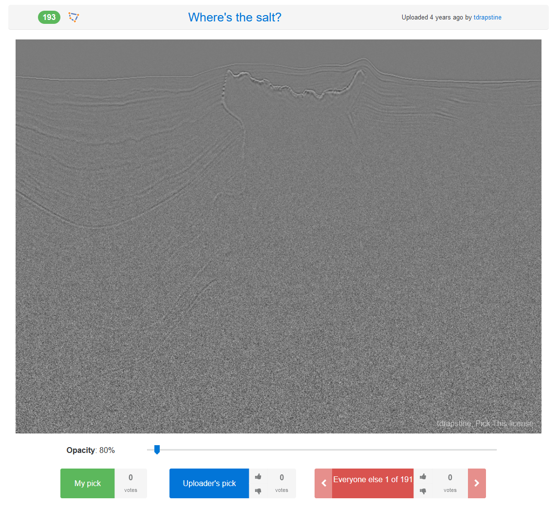
tdrapstine / pickthis.io
Click me!
tdrapstine / pickthis.ioThrust faults
Evan M. Bianco / pickthis.io
Click me!
Evan M. Bianco / pickthis.io Time Series Modeling - Sunspot Activity
Introduction
Dataset
Methodology
Module Imports
import kaggle #api token file required
import os
import shutil
import zipfile
import pandas as pd
import csv
import tensorflow as tf
import numpy as np
import matplotlib.pyplot as plt
Step 1: Download, Unzip, Load
!kaggle datasets download -d robervalt/sunspots

# target folder
local_zip = f'{os.getcwd()}\\Data\\sunspots.zip'

# cut and paste
shutil.move(f'{os.getcwd()}\\sunspots.zip', local_zip)

zip_ref = zipfile.ZipFile(local_zip, 'r')
zip_ref.extractall(f'{os.getcwd()}\\data')
zip_ref.close()
Step 2: Read csv and Explore
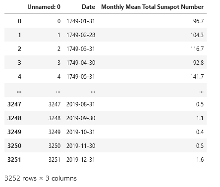
pd.read_csv(f'{os.getcwd()}\\data\\sunspots.csv')
time_step = []
sunspots = []

with open(f'{os.getcwd()}\\Data\\sunspots.csv') as csvfile:
  reader = csv.reader(csvfile, delimiter=',')
  next(reader) # the next() function skips the first line (header) when looping
  for row in reader:
    sunspots.append(float(row[2]))
    time_step.append(int(row[0]))
def plot_series(time, series, format="-", start=0, end=None, label=None):
    myplot = plt.plot(time[start:end], series[start:end], format, label=label)
    plt.xlabel("Time (Months)")
    plt.ylabel("Average Monthly Sunpots")
    if label != None:
        plt.legend()
    plt.grid(True)
series = np.array(sunspots)
time = np.array(time_step)

plt.figure(figsize=(15, 9))
plot_series(time, series)
Step 3: Pre-Processing
split_time = 3000
time_train = time[:split_time]
x_train = series[:split_time]
time_valid = time[split_time:]
x_valid = series[split_time:]

# the window size is important for training results
window_size = 30
batch_size = 32
shuffle_buffer_size = 1000
plt.figure(figsize=(15, 9))
plt.title("Train/Test Split")
plot_series(time_train, x_train, label="training set")
plot_series(time_valid, x_valid, label="validation set")
def windowed_dataset(series, window_size, batch_size, shuffle_buffer):
    series = tf.expand_dims(series, axis=-1)
    ds = tf.data.Dataset.from_tensor_slices(series)
    ds = ds.window(window_size + 1, shift=1, drop_remainder=True)
    ds = ds.flat_map(lambda w: w.batch(window_size + 1))
    ds = ds.shuffle(shuffle_buffer)
    ds = ds.map(lambda w: (w[:-1], w[1:]))
    return ds.batch(batch_size).prefetch(1)
window_size = 64

def plot_split(array, window_size):
    number_windows = len(array) // window_size + 1
    return np.array_split(array, number_windows, axis=0)

plt.figure(figsize=(15, 9))
plt.title("Windows")

for series_window,time_window in zip(plot_split(series,window_size), plot_split(time,window_size)):
    plot_series(time_window, series_window)
Step 4: Train for Learning-Rate Optimization
tf.keras.backend.clear_session()
tf.random.set_seed(51)
np.random.seed(51)
window_size = 64
batch_size = 256
train_set = windowed_dataset(x_train, window_size, batch_size, shuffle_buffer_size)
print(train_set)
print(x_train.shape)

model = tf.keras.models.Sequential([
  tf.keras.layers.Conv1D(filters=32, kernel_size=5,
                      strides=1, padding="causal",
                      activation="relu",
                      input_shape=[None, 1]),
  tf.keras.layers.LSTM(64, return_sequences=True),
  tf.keras.layers.LSTM(64, return_sequences=True),
  tf.keras.layers.Dense(30, activation="relu"),
  tf.keras.layers.Dense(10, activation="relu"),
  tf.keras.layers.Dense(1),
  tf.keras.layers.Lambda(lambda x: x * 400)
  ])

lr_schedule = tf.keras.callbacks.LearningRateScheduler(lambda epoch: 1e-8 * 10**(epoch / 20))

optimizer = tf.keras.optimizers.SGD(lr=1e-8, momentum=0.9)

model.compile(loss=tf.keras.losses.Huber(),
              optimizer=optimizer,
              metrics=["mae"])

history = model.fit(train_set, epochs=100, callbacks=[lr_schedule], verbose=0)
# pick lr from graph
plt.semilogx(history.history["lr"], history.history["loss"])
plt.axis([1e-8, 1e-4, 0, 60])
plt.title('Learing Rate Optimization')
plt.xlabel("Learing Rate")
plt.ylabel("Loss")
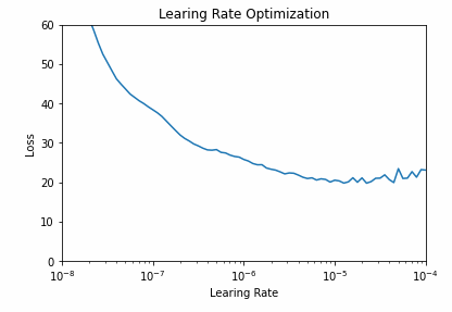
Step 5: Train with Optimized Learning Rate
tf.keras.backend.clear_session()
tf.random.set_seed(51)
np.random.seed(51)

train_set = windowed_dataset(x_train, window_size=60, batch_size=100, shuffle_buffer=shuffle_buffer_size)

model = tf.keras.models.Sequential([
  tf.keras.layers.Conv1D(filters=32, kernel_size=5,
                      strides=1, padding="causal",
                      activation="relu",
                      input_shape=[None, 1]),
  tf.keras.layers.LSTM(60, return_sequences=True),
  tf.keras.layers.LSTM(60, return_sequences=True),
  tf.keras.layers.Dense(30, activation="relu"),
  tf.keras.layers.Dense(10, activation="relu"),
  tf.keras.layers.Dense(1),
  tf.keras.layers.Lambda(lambda x: x * 400)
  ])

optimizer = tf.keras.optimizers.SGD(lr=1e-5, momentum=0.9)

model.compile(loss=tf.keras.losses.Huber(),
              optimizer=optimizer,
              metrics=["mae"])

history = model.fit(train_set,epochs=500, verbose=0)
import matplotlib.image  as mpimg
import matplotlib.pyplot as plt

loss = history.history['loss']
epochs = range(len(loss))

# full graph
plt.plot(epochs, loss, 'r')
plt.title('Training loss')
plt.xlabel("Epochs")
plt.ylabel("Loss")
plt.legend(["Loss"])
plt.figure()

# zoomed graph
zoomed_loss = loss[200:]
zoomed_epochs = range(200,500)

plt.plot(zoomed_epochs, zoomed_loss, 'r')
plt.title('Training loss (zoomed)')
plt.xlabel("Epochs")
plt.ylabel("Loss")
plt.legend(["Loss"])
plt.figure()
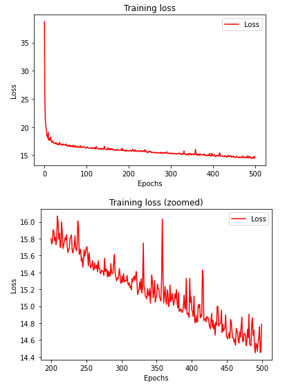
Step 6: Forecasting and Evaluating
def model_forecast(model, series, window_size):
    ds = tf.data.Dataset.from_tensor_slices(series)
    ds = ds.window(window_size, shift=1, drop_remainder=True)
    ds = ds.flat_map(lambda w: w.batch(window_size))
    ds = ds.batch(32).prefetch(1)
    forecast = model.predict(ds)
    return forecast

rnn_forecast = model_forecast(model, series[..., np.newaxis], window_size)
rnn_forecast = rnn_forecast[split_time - window_size:-1, -1, 0]

plt.figure(figsize=(10, 6))
plt.title("Forecast")
plot_series(time_valid, x_valid, label='validation set')
plot_series(time_valid, rnn_forecast, label='forecast')
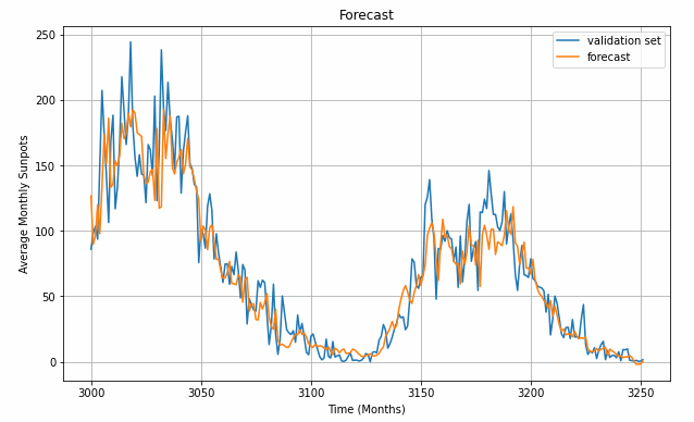
print('Mean Absolute Error (MAE): ',tf.keras.metrics.mean_absolute_error(x_valid, rnn_forecast).numpy())
Is your Code going into the Freezer?

Introduction
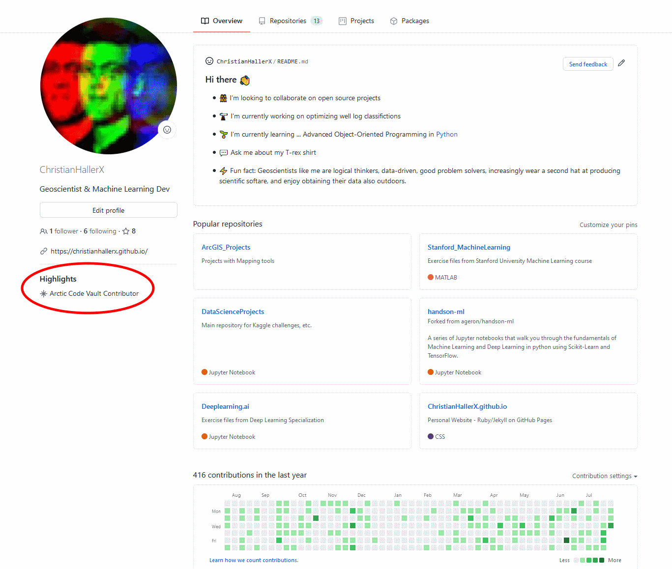
What is the purpose of this badge and why did you receive it?
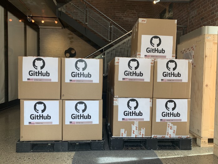
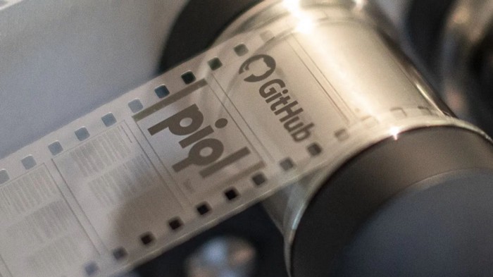
Source: GitHubHow did GitHub go about preparing your repo for eternity?
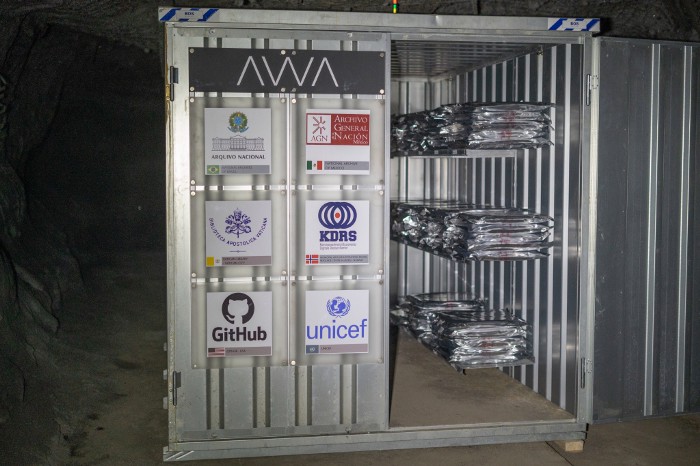
Source: GitHubWhat exactly does GitHub store in the Arctic World Archive?
Source: GitHub How to train your NLP chatbot. Spoiler... NLTK

Introduction
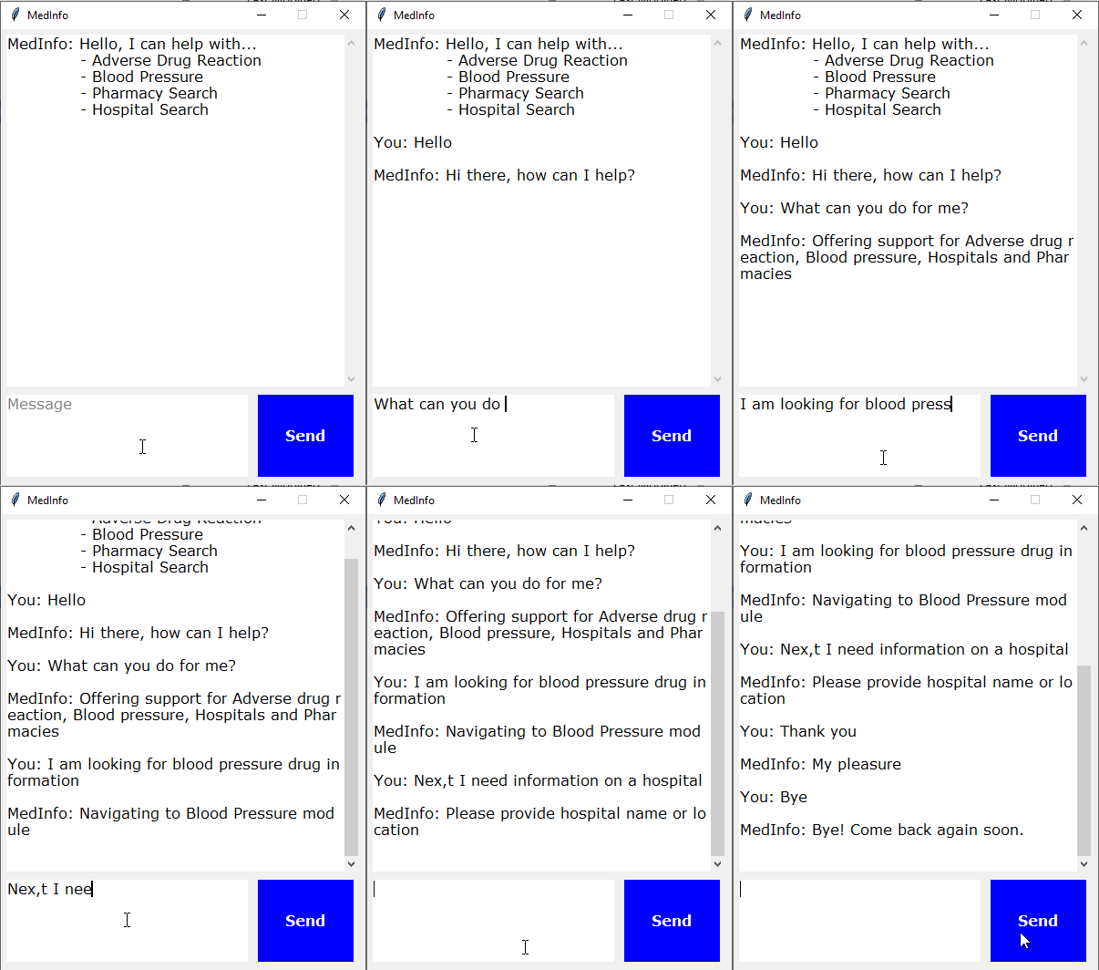
Scope of this chatbot
Prerequisites
Step 1: Imports
import nltk
from nltk.stem import WordNetLemmatizer
import pickle
import numpy as np
from keras.models import load_model
import json
import random
import os

lemmatizer = WordNetLemmatizer()
Step 2: Load Files
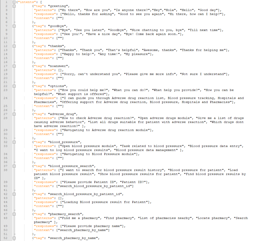
intents = json.loads(open(f'{os.getcwd()}\\Data\\chatbot_data\\intents.json').read())
words = pickle.load(open(f'{os.getcwd()}\\Data\\chatbot_data\\words.pkl','rb'))
classes = pickle.load(open(f'{os.getcwd()}\\Data\\chatbot_data\\classes.pkl','rb'))
model = load_model(f'{os.getcwd()}\\Data\\chatbot_data\\chatbot_model.h5')
Step 3: Preprocessing the input - Some helper functions
def clean_up_sentence(sentence):

    # tokenize input pattern - split words into array
    sentence_words = nltk.word_tokenize(sentence)

    # stem each word - create short form for word
    sentence_words = [lemmatizer.lemmatize(word.lower()) for word in sentence_words]

    return sentence_words


# return bag of words array: 0 or 1 for each word in the bag that exists in the sentence
def bow(sentence, words, show_details=True):

    # tokenize the pattern
    sentence_words = clean_up_sentence(sentence)

    # bag of words - matrix of N words, vocabulary matrix
    bag = [0]*len(words)

    for s in sentence_words:
        for i,w in enumerate(words):
            if w == s:
                # assign 1 if current word is in the vocabulary position
                bag[i] = 1
                if show_details:
                    print ("found in bag: %s" % w)

    return(np.array(bag))


def predict_class(sentence, model):

    # filter out predictions below a threshold
    p = bow(sentence, words,show_details=False)
    res = model.predict(np.array([p]))[0]
    ERROR_THRESHOLD = 0.25
    results = [[i,r] for i,r in enumerate(res) if r>ERROR_THRESHOLD]

    # sort by strength of probability
    results.sort(key=lambda x: x[1], reverse=True)
    return_list = []

    for r in results:
        return_list.append({"intent": classes[r[0]], "probability": str(r[1])})

    return return_list
Step 4: Selecting a response
def getResponse(ints, intents_json):
    tag = ints[0]['intent']
    list_of_intents = intents_json['intents']
    for i in list_of_intents:
        if(i['tag']== tag):
            result = random.choice(i['responses'])
            break
    return result

def chatbot_response(text):
    ints = predict_class(text, model)
    res = getResponse(ints, intents)
    return res
Step 5: GUI
import tkinter
from tkinter import *

# send function: add entry to chat window and get chatbot response
def send():
    # get written message and save to variable
    msg = EntryBox.get("1.0",'end-1c').strip()
    # remove message from entry box
    EntryBox.delete("0.0",END)

    if msg == "Message":
        # if the user clicks send before entering their own message, "Message" gets inserted again
        # no prediction/response
        EntryBox.insert(END, "Message"
        pass
        # if user clicks send and proper entry
    elif msg != '':
        # activate chat window and insert message
        ChatLog.config(state=NORMAL)
        ChatLog.insert(END, "You: " + msg + '\n\n')
        ChatLog.config(foreground="black", font=("Verdana", 12 ))

        # insert bot response to chat window
        res = chatbot_response(msg)
        ChatLog.insert(END, "MedInfo: " + res + '\n\n')

        # make window read-only again
        ChatLog.config(state=DISABLED)
        ChatLog.yview(END)

def clear_search(event):
    EntryBox.delete("0.0",END)
    EntryBox.config(foreground="black", font=("Verdana", 12))
Execute this Cell to start the chatbot GUI
base = Tk()
base.title("MedInfo")
base.geometry("400x500")
base.resizable(width=FALSE, height=FALSE)

# create chat window
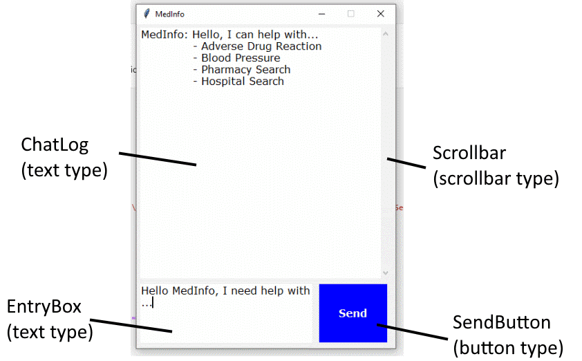
ChatLog = Text(base, bd=0, bg="white", height="8", width="50", font="Arial",)

# initial greeting in chat window
ChatLog.config(foreground="black", font=("Verdana", 12 ))
ChatLog.insert(END, "MedInfo: Hello, I can help with... \n\t- Adverse Drug Reaction \n\t- Blood Pressure \n\t- Pharmacy Search \n\t- Hospital Search\n\n")

# disable window = read-only
ChatLog.config(state=DISABLED)

# bind scrollbar to ChatLog window
scrollbar = Scrollbar(base, command=ChatLog.yview, cursor="heart")
ChatLog['yscrollcommand'] = scrollbar.set

# create Button to send message
SendButton = Button(base, font=("Verdana",12,'bold'), text="Send", width="9", height=5,
                    bd=0, bg="blue", activebackground="gold",fg='#ffffff',
                    command= send )

# create the box to enter message
EntryBox = Text(base, bd=0, bg="white",width="29", height="5", font="Arial")

# display a grey text in EntryBox that's removed upon clicking or tab focus
EntryBox.insert(END, "Message")
EntryBox.config(foreground="grey", font=("Verdana", 12))
EntryBox.bind("<Button-1>", clear_search)
EntryBox.bind("<FocusIn>", clear_search)

# place components at given coordinates in window (x=0 y=0 top left corner)
scrollbar.place(x=376,y=6, height=386)
ChatLog.place(x=6,y=6, height=386, width=370)
EntryBox.place(x=6, y=401, height=90, width=265)
SendButton.place(x=282, y=401, height=90)

base.mainloop()
Falling Asleep? Detect Closed Eyes in Real Time
Introduction
Prerequisites (I prepared this in advance)
Imports
import cv2
import os
from keras.models import load_model
import numpy as np
from pygame import mixer
Alarm Setup
mixer.init()
sound = mixer.Sound(f'{os.getcwd()}\\Data\\drowsiness_data\\Electronic_Chime-KevanGC-495939803.wav')

sound.play()
Load OpenCV Haar kernels used to detect facial landmarks
face = cv2.CascadeClassifier(f'{os.getcwd()}\\Data\\drowsiness_data\\haarcascade_frontalface_alt.xml')
leye = cv2.CascadeClassifier(f'{os.getcwd()}\\Data\\drowsiness_data\\haarcascade_lefteye_2splits.xml')
reye = cv2.CascadeClassifier(f'{os.getcwd()}\\Data\\drowsiness_data\\haarcascade_righteye_2splits.xml')
Load the CNN model and start video stream
model = load_model(f'{os.getcwd()}\\Data\\drowsiness_data\\cnncat2.h5')
path = os.getcwd()

# Capture accesses the video feed. The "0" is the number of your video device, in case you have multiple.
cap = cv2.VideoCapture(0)
if cap.isOpened() == True:
    print("Video stream open.")
else:
    print("Problem opening video stream.")

font = cv2.FONT_HERSHEY_COMPLEX_SMALL

# starting value for closed-eyes inferences
score = 0
threshold = 6
thicc = 2
rpred = [99]
lpred = [99]
Start prediction cycle
# Infinite loop of capturing, infering, and scoring
while(True):
    ret, frame = cap.read()
    height,width = frame.shape[:2]

    # convert frame to grayscale
    gray = cv2.cvtColor(frame, cv2.COLOR_BGR2GRAY)

    # Apply Haar Cascade object detection in OpenCV to gray frame
    faces = face.detectMultiScale(gray,minNeighbors=5,scaleFactor=1.1,minSize=(25,25))
    left_eye = leye.detectMultiScale(gray)
    right_eye =  reye.detectMultiScale(gray)

    # draw black bars top and bottom
    cv2.rectangle(frame, (0,height-50) , (width,height) , (0,0,0) , thickness=cv2.FILLED )

    # draw face box
    for (x,y,w,h) in faces:
        cv2.rectangle(frame, (x,y) , (x+w,y+h) , (100,100,100) , 1 )

    # take detected RIGHT eye, preprocess and make CNN prediction
    for (x,y,w,h) in right_eye:
        r_eye = frame[y:y+h,x:x+w]
        r_eye = cv2.cvtColor(r_eye,cv2.COLOR_BGR2GRAY)
        r_eye = cv2.resize(r_eye,(24,24))
        r_eye = r_eye/255
        r_eye =  r_eye.reshape(24,24,-1)
        r_eye = np.expand_dims(r_eye,axis=0)
        rpred = model.predict_classes(r_eye)
        break

    # take detected LEFT eye, preprocess and make CNN prediction
    for (x,y,w,h) in left_eye:
        l_eye = frame[y:y+h,x:x+w]
        l_eye = cv2.cvtColor(l_eye,cv2.COLOR_BGR2GRAY)
        l_eye = cv2.resize(l_eye,(24,24))
        l_eye = l_eye/255
        l_eye =l_eye.reshape(24,24,-1)
        l_eye = np.expand_dims(l_eye,axis=0)
        lpred = model.predict_classes(l_eye)
        break


    # labeling for frame, if BOTH eyes close, print CLOSED and adding/subtracting from score tally
    if(rpred[0]==0 and lpred[0]==0):
        score += 1
        cv2.putText(frame,"Closed",(10,height-20), font, 1,(255,255,255),1,cv2.LINE_AA)
        # prevent a runaway score beyond threshold
        if score > threshold + 1:
            score = threshold
    else:
        score -= 1
        cv2.putText(frame,"Open",(10,height-20), font, 1,(255,255,255),1,cv2.LINE_AA)

    # SCORE HANDLING
    # print current score to screen
    if(score < 0):
        score = 0
    cv2.putText(frame,'Drowsiness Score:'+str(score),(100,height-20), font, 1,(255,255,255),1,cv2.LINE_AA)

    # threshold exceedance
    if(score>threshold):
        # save a frame when threshold exceeded and play sound
        cv2.imwrite(os.path.join(path,'closed_eyes_screencap.jpg'),frame)
        try:
            sound.play()
        except:  # isplaying = False
            pass

        # add red box as warning signal and make box thicker
        if(thicc<16):
            thicc += 2
        # make box thinner again, to give it a pulsating appearance
        else:
            thicc -= 2
            if(thicc<2):
                thicc=2
        cv2.rectangle(frame, (0,0), (width,height), (0,0,255), thickness=thicc)

    # draw frame with all the stuff with have added
    cv2.imshow('frame',frame)

    # break the infinite loop when pressing q
    if cv2.waitKey(1) & 0xFF == ord('q'):
        break

# close stream capture and close window
cap.release()
cv2.destroyAllWindows()
Result
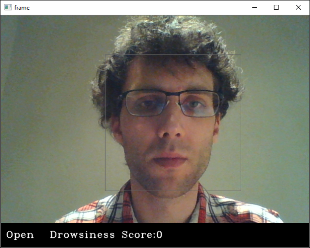
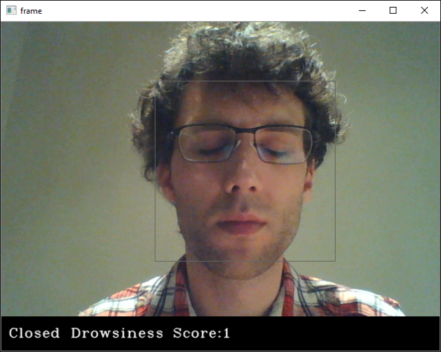
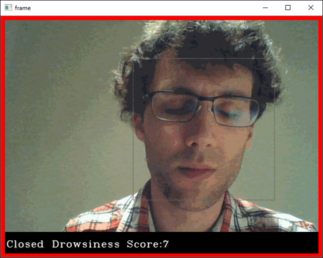
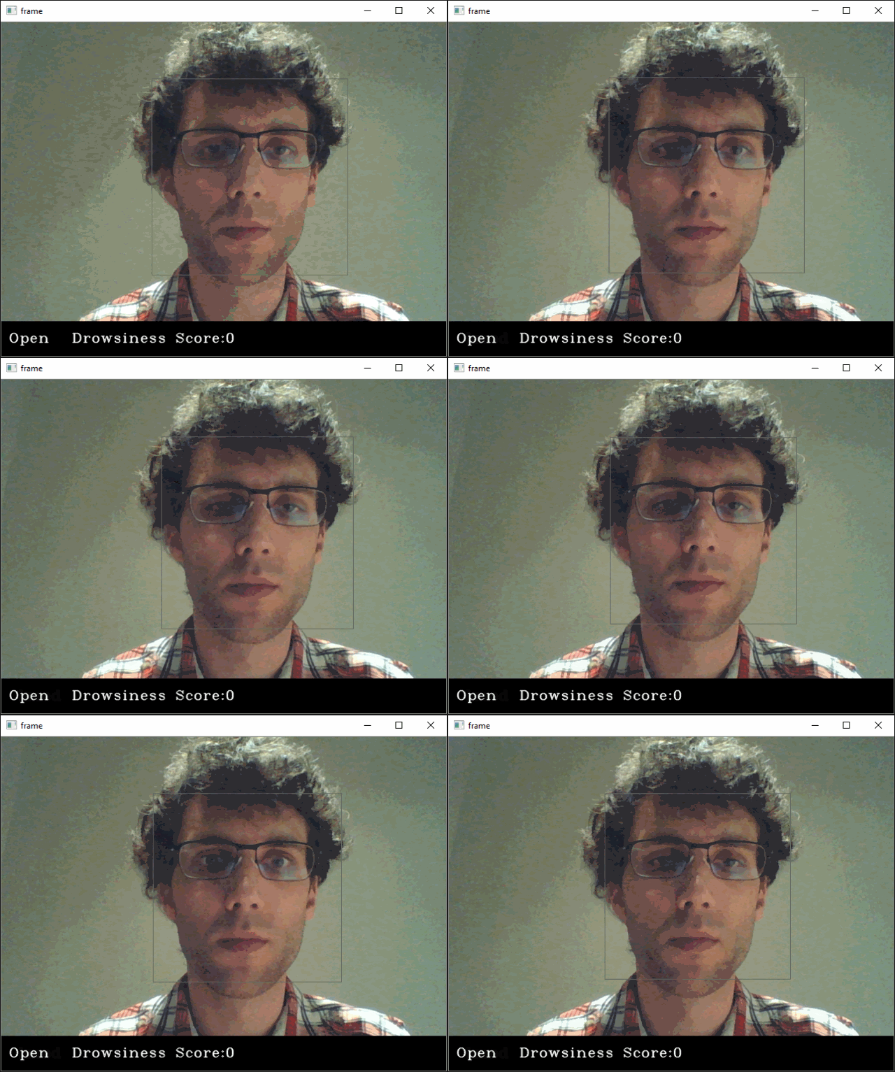
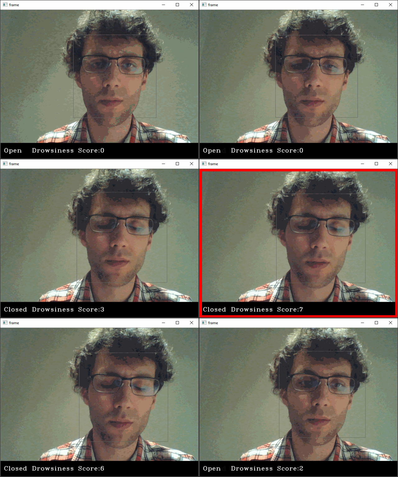
Cats vs. Dogs in TensorFlow Part II
Introduction
Step 1: Transfer Learning
import os
import wget

url = 'https://storage.googleapis.com/mledu-datasets/inception_v3_weights_tf_dim_ordering_tf_kernels_notop.h5'
wget.download(url, out=f'{os.getcwd()}\\Data\\inception_v3_weights_tf_dim_ordering_tf_kernels_notop.h5')
layer.trainable = Falsefrom tensorflow.keras import layers
from tensorflow.keras import Model
from tensorflow.keras.applications.inception_v3 import InceptionV3
# all the weights for the trained Inception V3
local_weights_file = f'{os.getcwd()}\\Data\\inception_v3_weights_tf_dim_ordering_tf_kernels_notop.h5'
# the network shape of Inception V3 is integraded in Keras
pre_trained_model = InceptionV3(input_shape = (150, 150, 3),
include_top = False,
weights = None)
# combine layout and weights
pre_trained_model.load_weights(local_weights_file)
# make pre-trained model read-only
for layer in pre_trained_model.layers:
layer.trainable = False
# the Inception V3 is very deep
pre_trained_model.summary()
Model: "inception_v3"
__________________________________________________________________________________________________
Layer (type)                    Output Shape         Param #     Connected to
==================================================================================================
input_1 (InputLayer)            [(None, 150, 150, 3) 0
__________________________________________________________________________________________________
conv2d (Conv2D)                 (None, 74, 74, 32)   864         input_1[0][0]
__________________________________________________________________________________________________
batch_normalization (BatchNorma (None, 74, 74, 32)   96          conv2d[0][0]
__________________________________________________________________________________________________
activation (Activation)         (None, 74, 74, 32)   0           batch_normalization[0][0]
__________________________________________________________________________________________________
conv2d_1 (Conv2D)               (None, 72, 72, 32)   9216        activation[0][0]
__________________________________________________________________________________________________
batch_normalization_1 (BatchNor (None, 72, 72, 32)   96          conv2d_1[0][0]
__________________________________________________________________________________________________
activation_1 (Activation)       (None, 72, 72, 32)   0           batch_normalization_1[0][0]
__________________________________________________________________________________________________
conv2d_2 (Conv2D)               (None, 72, 72, 64)   18432       activation_1[0][0]
__________________________________________________________________________________________________
batch_normalization_2 (BatchNor (None, 72, 72, 64)   192         conv2d_2[0][0]
__________________________________________________________________________________________________
activation_2 (Activation)       (None, 72, 72, 64)   0           batch_normalization_2[0][0]
__________________________________________________________________________________________________
max_pooling2d (MaxPooling2D)    (None, 35, 35, 64)   0           activation_2[0][0]
__________________________________________________________________________________________________
conv2d_3 (Conv2D)               (None, 35, 35, 80)   5120        max_pooling2d[0][0]
__________________________________________________________________________________________________
batch_normalization_3 (BatchNor (None, 35, 35, 80)   240         conv2d_3[0][0]
__________________________________________________________________________________________________
activation_3 (Activation)       (None, 35, 35, 80)   0           batch_normalization_3[0][0]
__________________________________________________________________________________________________
conv2d_4 (Conv2D)               (None, 33, 33, 192)  138240      activation_3[0][0]
__________________________________________________________________________________________________
batch_normalization_4 (BatchNor (None, 33, 33, 192)  576         conv2d_4[0][0]
__________________________________________________________________________________________________
activation_4 (Activation)       (None, 33, 33, 192)  0           batch_normalization_4[0][0]
__________________________________________________________________________________________________
max_pooling2d_1 (MaxPooling2D)  (None, 16, 16, 192)  0           activation_4[0][0]
__________________________________________________________________________________________________
conv2d_8 (Conv2D)               (None, 16, 16, 64)   12288       max_pooling2d_1[0][0]
.
.
.
.
.
.
.
.
==================================================================================================
Total params: 21,802,784
Trainable params: 0
Non-trainable params: 21,802,784
__________________________________________________________________________________________________
# set layer "mixed 7" as end of pre-trained network
last_layer = pre_trained_model.get_layer('mixed7')
print('last layer output shape: ', last_layer.output_shape)
last_output = last_layer.output
last layer output shape: (None, 7, 7, 768)
Step 2: Define Trainable Layers
from tensorflow.keras.optimizers import RMSprop

# Flatten the output layer to 1 dimension
x = layers.Flatten()(last_output)
# Add a fully connected layer with 1,024 hidden units and ReLU activation
x = layers.Dense(1024, activation='relu')(x)
# Add a dropout rate of 0.2
x = layers.Dropout(0.2)(x)
# Add a final sigmoid layer for classification
x = layers.Dense  (1, activation='sigmoid')(x)

model = Model( pre_trained_model.input, x)

model.compile(optimizer = RMSprop(lr=0.0001),
              loss = 'binary_crossentropy',
              metrics = ['accuracy'])
Step 3: Download Dataset
url = 'https://storage.googleapis.com/mledu-datasets/cats_and_dogs_filtered.zip'
wget.download(url, out=f'{os.getcwd()}\\Data\\cats_and_dogs_filtered.zip')
import zipfile

local_zip = f'{os.getcwd()}\\Data\\cats_and_dogs_filtered.zip'

zip_ref = zipfile.ZipFile(local_zip, 'r')

zip_ref.extractall(f'{os.getcwd()}\\Data')
zip_ref.close()
Step 4: Pre-Processing - Image Data Generator and Image Augmentation
from tensorflow.keras.preprocessing.image import ImageDataGenerator

# Define our example directories and files
base_dir = f'{os.getcwd()}\\Data\\cats_and_dogs_filtered'

# create directory names
train_dir = os.path.join( base_dir, 'train')
validation_dir = os.path.join( base_dir, 'validation')

train_cats_dir = os.path.join(train_dir, 'cats') # Directory with our training cat pictures
train_dogs_dir = os.path.join(train_dir, 'dogs') # Directory with our training dog pictures
validation_cats_dir = os.path.join(validation_dir, 'cats') # Directory with our validation cat pictures
validation_dogs_dir = os.path.join(validation_dir, 'dogs')# Directory with our validation dog pictures

# get all training file names
train_cat_fnames = os.listdir(train_cats_dir)
train_dog_fnames = os.listdir(train_dogs_dir)

# Add our data-augmentation parameters to ImageDataGenerator
train_datagen = ImageDataGenerator(rescale = 1./255.,
                                   rotation_range = 40,
                                   width_shift_range = 0.2,
                                   height_shift_range = 0.2,
                                   shear_range = 0.2,
                                   zoom_range = 0.2,
                                   horizontal_flip = True)

# Note that the validation data should not be augmented!
test_datagen = ImageDataGenerator( rescale = 1.0/255. )

# Flow training images in batches of 20 using train_datagen generator
train_generator = train_datagen.flow_from_directory(train_dir,
                                                    batch_size = 20,
                                                    class_mode = 'binary',
                                                    target_size = (150, 150))

# Flow validation images in batches of 20 using test_datagen generator
validation_generator =  test_datagen.flow_from_directory( validation_dir,
                                                          batch_size  = 20,
                                                          class_mode  = 'binary',
                                                          target_size = (150, 150))
Found 2000 images belonging to 2 classes.
Found 1000 images belonging to 2 classes.
Step 5: Train Model
history = model.fit(
            train_generator,
            validation_data = validation_generator,
            steps_per_epoch = 100,
            epochs = 20,
            validation_steps = 50,
            verbose = 2)
Epoch 1/20
100/100 - 27s - loss: 0.4954 - accuracy: 0.7655 - val_loss: 0.6056 - val_accuracy: 0.8500
Epoch 2/20
100/100 - 15s - loss: 0.3829 - accuracy: 0.8315 - val_loss: 0.2152 - val_accuracy: 0.9440
Epoch 3/20
100/100 - 15s - loss: 0.3400 - accuracy: 0.8505 - val_loss: 0.2933 - val_accuracy: 0.9360
Epoch 4/20
100/100 - 15s - loss: 0.3316 - accuracy: 0.8625 - val_loss: 0.1953 - val_accuracy: 0.9570
Epoch 5/20
100/100 - 16s - loss: 0.3227 - accuracy: 0.8615 - val_loss: 0.3282 - val_accuracy: 0.9470
Epoch 6/20
100/100 - 16s - loss: 0.3226 - accuracy: 0.8585 - val_loss: 0.3156 - val_accuracy: 0.9530
Epoch 7/20
100/100 - 15s - loss: 0.3046 - accuracy: 0.8700 - val_loss: 0.3480 - val_accuracy: 0.9470
Epoch 8/20
100/100 - 15s - loss: 0.2785 - accuracy: 0.8750 - val_loss: 0.4184 - val_accuracy: 0.9450
Epoch 9/20
100/100 - 15s - loss: 0.2843 - accuracy: 0.8815 - val_loss: 0.3369 - val_accuracy: 0.9500
Epoch 10/20
100/100 - 15s - loss: 0.2957 - accuracy: 0.8800 - val_loss: 0.4547 - val_accuracy: 0.9430
Epoch 11/20
100/100 - 15s - loss: 0.2685 - accuracy: 0.8970 - val_loss: 0.3231 - val_accuracy: 0.9470
Epoch 12/20
100/100 - 15s - loss: 0.2551 - accuracy: 0.8955 - val_loss: 0.4682 - val_accuracy: 0.9480
Epoch 13/20
100/100 - 16s - loss: 0.2701 - accuracy: 0.8935 - val_loss: 0.3559 - val_accuracy: 0.9540
Epoch 14/20
100/100 - 18s - loss: 0.2842 - accuracy: 0.8865 - val_loss: 0.4018 - val_accuracy: 0.9470
Epoch 15/20
100/100 - 17s - loss: 0.2458 - accuracy: 0.9025 - val_loss: 0.4076 - val_accuracy: 0.9550
Epoch 16/20
100/100 - 16s - loss: 0.2533 - accuracy: 0.9025 - val_loss: 0.3737 - val_accuracy: 0.9620
Epoch 17/20
100/100 - 15s - loss: 0.2465 - accuracy: 0.9080 - val_loss: 0.3398 - val_accuracy: 0.9650
Epoch 18/20
100/100 - 15s - loss: 0.2620 - accuracy: 0.8925 - val_loss: 0.3271 - val_accuracy: 0.9640
Epoch 19/20
100/100 - 15s - loss: 0.2321 - accuracy: 0.9060 - val_loss: 0.3551 - val_accuracy: 0.9670
Epoch 20/20
100/100 - 15s - loss: 0.2470 - accuracy: 0.9000 - val_loss: 0.4488 - val_accuracy: 0.9500
Step 6: Evaluate the Training and Validation Accuracy
from matplotlib import pyplot as plt

#-----------------------------------------------------------
# Retrieve a list of list results on training and test data
# sets for each training epoch
#-----------------------------------------------------------
acc      = history.history[     'accuracy' ]
val_acc  = history.history[ 'val_accuracy' ]
loss     = history.history[    'loss' ]
val_loss = history.history['val_loss' ]

epochs   = range(len(acc)) # Get number of epochs

#------------------------------------------------
# Plot training and validation accuracy per epoch
#------------------------------------------------
plt.plot  ( epochs,     acc, label='Training Accuracy' )
plt.plot  ( epochs, val_acc, label='Validation Accuracy' )
plt.legend(bbox_to_anchor=(1.05, 1), loc=2, borderaxespad=0.)
plt.title ('Training and validation accuracy')
plt.figure()

#------------------------------------------------
# Plot training and validation loss per epoch
#------------------------------------------------
plt.plot  ( epochs,     loss, label='Training Loss' )
plt.plot  ( epochs, val_loss, label='Validation Loss' )
plt.legend(bbox_to_anchor=(1.05, 1), loc=2, borderaxespad=0.)
plt.title ('Training and validation loss'   )
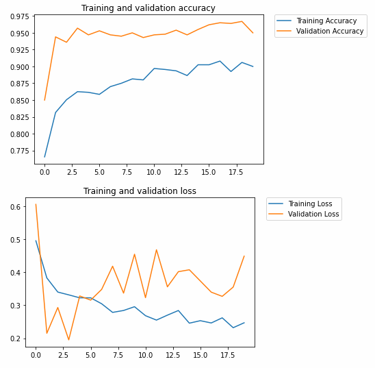
Acknowledgements:
Cats vs. Dogs in TensorFlow Part I
Introduction
Step 1: Explore the Example Data of Cats and Dogs
import os
import wget

url = 'https://storage.googleapis.com/mledu-datasets/cats_and_dogs_filtered.zip'
wget.download(url, out=f'{os.getcwd()}\\Data\\cats_and_dogs_filtered.zip')
import zipfile

local_zip = f'{os.getcwd()}\\Data\\cats_and_dogs_filtered.zip'

zip_ref = zipfile.ZipFile(local_zip, 'r')

zip_ref.extractall(f'{os.getcwd()}\\Data')
zip_ref.close()
base_dir = f'{os.getcwd()}\\Data\\cats_and_dogs_filtered'

train_dir = os.path.join(base_dir, 'train')
validation_dir = os.path.join(base_dir, 'validation')

# Directory with our training cat/dog pictures
train_cats_dir = os.path.join(train_dir, 'cats')
train_dogs_dir = os.path.join(train_dir, 'dogs')

# Directory with our validation cat/dog pictures
validation_cats_dir = os.path.join(validation_dir, 'cats')
validation_dogs_dir = os.path.join(validation_dir, 'dogs')
train_cat_fnames = os.listdir( train_cats_dir )
train_dog_fnames = os.listdir( train_dogs_dir )

print(train_cat_fnames[:10])
print(train_dog_fnames[:10])
['cat.0.jpg', 'cat.1.jpg', 'cat.10.jpg', 'cat.100.jpg', 'cat.101.jpg', 'cat.102.jpg', 'cat.103.jpg', 'cat.104.jpg', 'cat.105.jpg', 'cat.106.jpg']
['dog.0.jpg', 'dog.1.jpg', 'dog.10.jpg', 'dog.100.jpg', 'dog.101.jpg', 'dog.102.jpg', 'dog.103.jpg', 'dog.104.jpg', 'dog.105.jpg', 'dog.106.jpg']
print('total training cat images :', len(os.listdir(      train_cats_dir ) ))
print('total training dog images :', len(os.listdir(      train_dogs_dir ) ))

print('total validation cat images :', len(os.listdir( validation_cats_dir ) ))
print('total validation dog images :', len(os.listdir( validation_dogs_dir ) ))
total training cat images : 1000
total training dog images : 1000
total validation cat images : 500
total validation dog images : 500
%matplotlib inline

import matplotlib.image as mpimg
import matplotlib.pyplot as plt

# Parameters for our graph; we'll output images in a 4x4 configuration
nrows = 4
ncols = 4

pic_index = 0 # Index for iterating over images
# Set up matplotlib fig, and size it to fit 4x4 pics

fig = plt.gcf()
fig.set_size_inches(ncols*4, nrows*4)

pic_index+=8

next_cat_pix = [os.path.join(train_cats_dir, fname)
                for fname in train_cat_fnames[ pic_index-8:pic_index]
               ]

next_dog_pix = [os.path.join(train_dogs_dir, fname)
                for fname in train_dog_fnames[ pic_index-8:pic_index]
               ]

for i, img_path in enumerate(next_cat_pix+next_dog_pix):
  # Set up subplot; subplot indices start at 1
  sp = plt.subplot(nrows, ncols, i + 1)
  sp.axis('Off') # Don't show axes (or gridlines)

  img = mpimg.imread(img_path)
  plt.imshow(img)

plt.show()
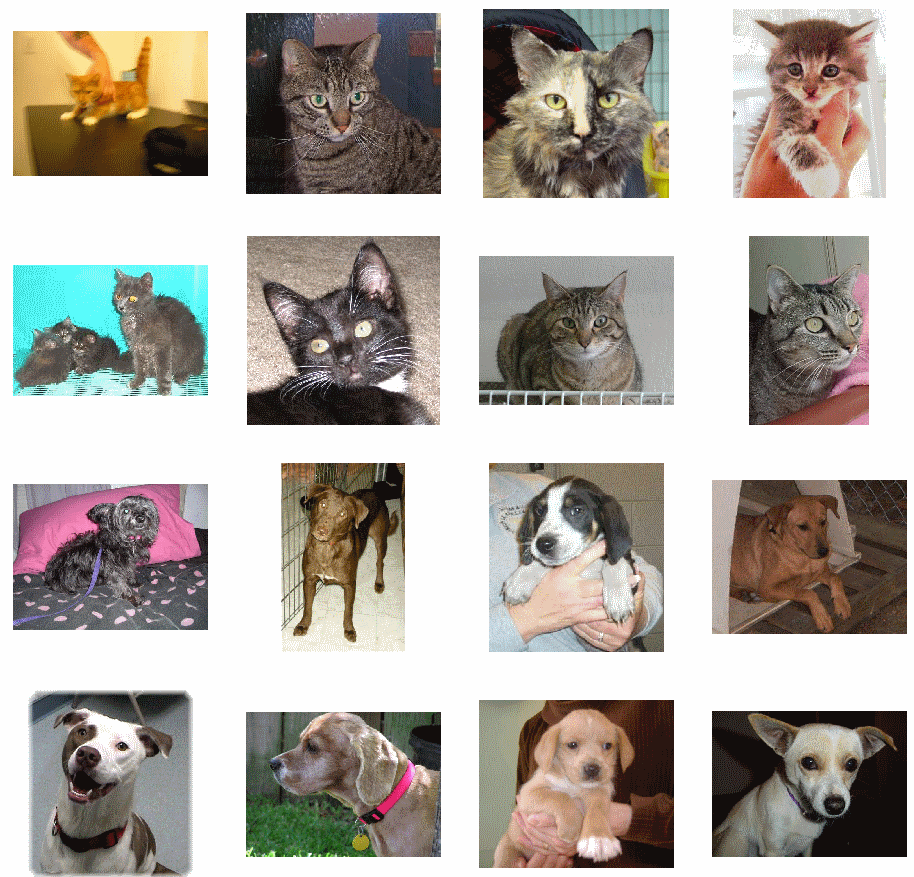
Step 2: Build a Convolutional Neural Network
import tensorflow as tf
print("TensorFlow version: ",tf.__version__)

model = tf.keras.models.Sequential([
	# Note the input shape is the desired size of the image 150x150 with 3 bytes color
	tf.keras.layers.Conv2D(16, (3,3), activation='relu', input_shape=(150, 150, 3)),
	tf.keras.layers.MaxPooling2D(2,2),

	tf.keras.layers.Conv2D(32, (3,3), activation='relu'),
	tf.keras.layers.MaxPooling2D(2,2),

	tf.keras.layers.Conv2D(64, (3,3), activation='relu'),
	tf.keras.layers.MaxPooling2D(2,2),

	# Flatten the results to feed into a DNN
	tf.keras.layers.Flatten(),

	# 512 neuron hidden layer
	tf.keras.layers.Dense(512, activation='relu'),

	# Only 1 output neuron. It will contain a value from 0-1 where 0 for 1 class ('cats') and 1 for the other ('dogs')
	tf.keras.layers.Dense(1, activation='sigmoid')
	])
model.summary()
Model: "sequential"
_________________________________________________________________
Layer (type)                 Output Shape              Param #
=================================================================
conv2d (Conv2D)              (None, 148, 148, 16)      448
_________________________________________________________________
max_pooling2d (MaxPooling2D) (None, 74, 74, 16)        0
_________________________________________________________________
conv2d_1 (Conv2D)            (None, 72, 72, 32)        4640
_________________________________________________________________
max_pooling2d_1 (MaxPooling2 (None, 36, 36, 32)        0
_________________________________________________________________
conv2d_2 (Conv2D)            (None, 34, 34, 64)        18496
_________________________________________________________________
max_pooling2d_2 (MaxPooling2 (None, 17, 17, 64)        0
_________________________________________________________________
flatten (Flatten)            (None, 18496)             0
_________________________________________________________________
dense (Dense)                (None, 512)               9470464
_________________________________________________________________
dense_1 (Dense)              (None, 1)                 513
=================================================================
Total params: 9,494,561
Trainable params: 9,494,561
Non-trainable params: 0
__________________________
from tensorflow.keras.optimizers import RMSprop

model.compile(optimizer=RMSprop(lr=0.001),
              loss='binary_crossentropy',
              metrics = ['accuracy'])
Step 3: Pre-Processing - Image Data Generator
keras.preprocessing.image.ImageDataGenerator class using the rescale parameter. This ImageDataGenerator class allows you to instantiate generators of augmented image batches (and their labels) via .flow(data, labels) or .flow_from_directory(directory). These generators can then be used with the Keras model methods that accept data generators as inputs: fit, evaluate_generator, and predict_generator.from tensorflow.keras.preprocessing.image import ImageDataGenerator
# All images will be rescaled by 1./255.
train_datagen = ImageDataGenerator( rescale = 1.0/255. )
test_datagen = ImageDataGenerator( rescale = 1.0/255. )
# --------------------
# Flow training images in batches of 20 using train_datagen generator
# --------------------
train_generator = train_datagen.flow_from_directory(train_dir,
batch_size=20,
class_mode='binary',
target_size=(150, 150))
# --------------------
# Flow validation images in batches of 20 using test_datagen generator
# --------------------
validation_generator = test_datagen.flow_from_directory(validation_dir,
batch_size=20,
class_mode = 'binary',
target_size = (150, 150))
Step 4: Training
history = model.fit(train_generator,
					validation_data=validation_generator,
					steps_per_epoch=100,
					epochs=15,
					validation_steps=50,
					verbose=2)
Epoch 1/15
100/100 - 17s - loss: 0.7927 - accuracy: 0.5525 - val_loss: 0.6704 - val_accuracy: 0.6120
Epoch 2/15
100/100 - 7s - loss: 0.6163 - accuracy: 0.6635 - val_loss: 0.6668 - val_accuracy: 0.6150
Epoch 3/15
100/100 - 7s - loss: 0.5260 - accuracy: 0.7415 - val_loss: 0.5673 - val_accuracy: 0.7150
Epoch 4/15
100/100 - 7s - loss: 0.4682 - accuracy: 0.7745 - val_loss: 0.5919 - val_accuracy: 0.7070
Epoch 5/15
100/100 - 7s - loss: 0.3799 - accuracy: 0.8245 - val_loss: 0.5949 - val_accuracy: 0.7080
Epoch 6/15
100/100 - 7s - loss: 0.2923 - accuracy: 0.8705 - val_loss: 0.6991 - val_accuracy: 0.7180
Epoch 7/15
100/100 - 7s - loss: 0.2027 - accuracy: 0.9250 - val_loss: 0.8081 - val_accuracy: 0.7170
Epoch 8/15
100/100 - 7s - loss: 0.1384 - accuracy: 0.9460 - val_loss: 1.1282 - val_accuracy: 0.6960
Epoch 9/15
100/100 - 7s - loss: 0.1163 - accuracy: 0.9585 - val_loss: 1.0216 - val_accuracy: 0.7030
Epoch 10/15
100/100 - 7s - loss: 0.0761 - accuracy: 0.9735 - val_loss: 1.4962 - val_accuracy: 0.7060
Epoch 11/15
100/100 - 8s - loss: 0.0565 - accuracy: 0.9825 - val_loss: 1.3429 - val_accuracy: 0.7210
Epoch 12/15
100/100 - 7s - loss: 0.0486 - accuracy: 0.9835 - val_loss: 1.5935 - val_accuracy: 0.7040
Epoch 13/15
100/100 - 7s - loss: 0.0420 - accuracy: 0.9850 - val_loss: 1.4677 - val_accuracy: 0.7290
Epoch 14/15
100/100 - 7s - loss: 0.0469 - accuracy: 0.9855 - val_loss: 1.7934 - val_accuracy: 0.7110
Epoch 15/15
100/100 - 7s - loss: 0.0430 - accuracy: 0.9890 - val_loss: 2.0219 - val_accuracy: 0.7080
Step 5: Visualizing Intermediate Representations (Optional)
import numpy as np
import random
from   tensorflow.keras.preprocessing.image import img_to_array, load_img

# Let's define a new Model that will take an image as input, and will output
# intermediate representations for all layers in the previous model after
# the first.
successive_outputs = [layer.output for layer in model.layers[1:]]

#visualization_model = Model(img_input, successive_outputs)
visualization_model = tf.keras.models.Model(inputs = model.input, outputs = successive_outputs)

# Let's prepare a random input image of a cat or dog from the training set.
cat_img_files = [os.path.join(train_cats_dir, f) for f in train_cat_fnames]
dog_img_files = [os.path.join(train_dogs_dir, f) for f in train_dog_fnames]

img_path = random.choice(cat_img_files + dog_img_files)
img = load_img(img_path, target_size=(150, 150))  # this is a PIL image

x   = img_to_array(img)                           # Numpy array with shape (150, 150, 3)
x   = x.reshape((1,) + x.shape)                   # Numpy array with shape (1, 150, 150, 3)

# Rescale by 1/255
x /= 255.0

# Let's run our image through our network, thus obtaining all
# intermediate representations for this image.
successive_feature_maps = visualization_model.predict(x)

# These are the names of the layers, so can have them as part of our plot
layer_names = [layer.name for layer in model.layers]

# -----------------------------------------------------------------------
# Now let's display our representations
# -----------------------------------------------------------------------
for layer_name, feature_map in zip(layer_names, successive_feature_maps):

  if len(feature_map.shape) == 4:

    #-------------------------------------------
    # Just do this for the conv / maxpool layers, not the fully-connected layers
    #-------------------------------------------
    n_features = feature_map.shape[-1]  # number of features in the feature map
    size       = feature_map.shape[ 1]  # feature map shape (1, size, size, n_features)

    # We will tile our images in this matrix
    display_grid = np.zeros((size, size * n_features))

    #-------------------------------------------------
    # Postprocess the feature to be visually palatable
    #-------------------------------------------------
    for i in range(n_features):
      x  = feature_map[0, :, :, i]
      x -= x.mean()
      x /= x.std ()
      x *=  64
      x += 128
      x  = np.clip(x, 0, 255).astype('uint8')
      display_grid[:, i * size : (i + 1) * size] = x # Tile each filter into a horizontal grid

    #-----------------
    # Display the grid
    #-----------------

    scale = 20. / n_features
    plt.figure( figsize=(scale * n_features, scale) )
    plt.title ( layer_name )
    plt.grid  ( False )
    plt.imshow( display_grid, aspect='auto', cmap='viridis' )
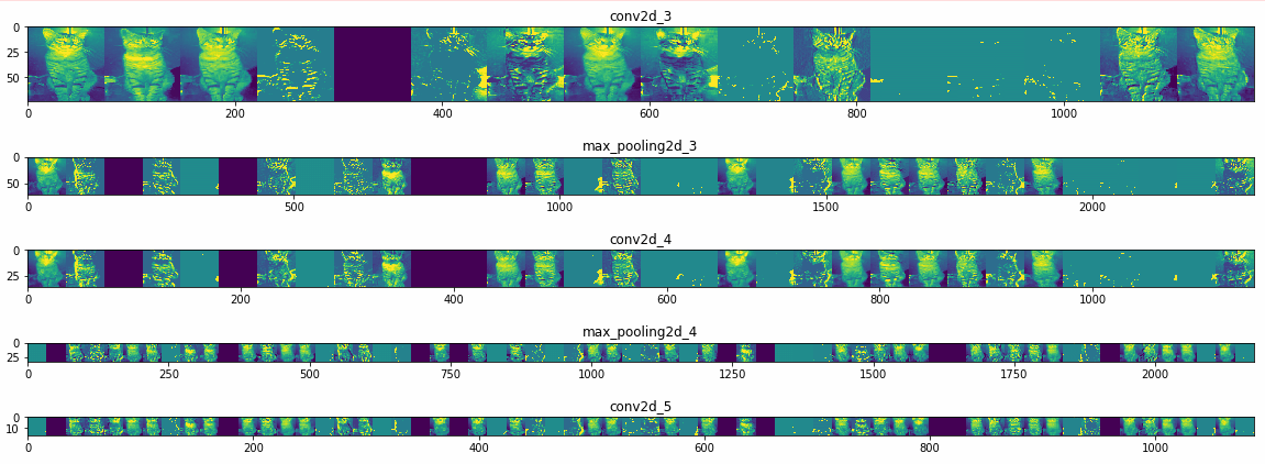
Step 6: Making predictions
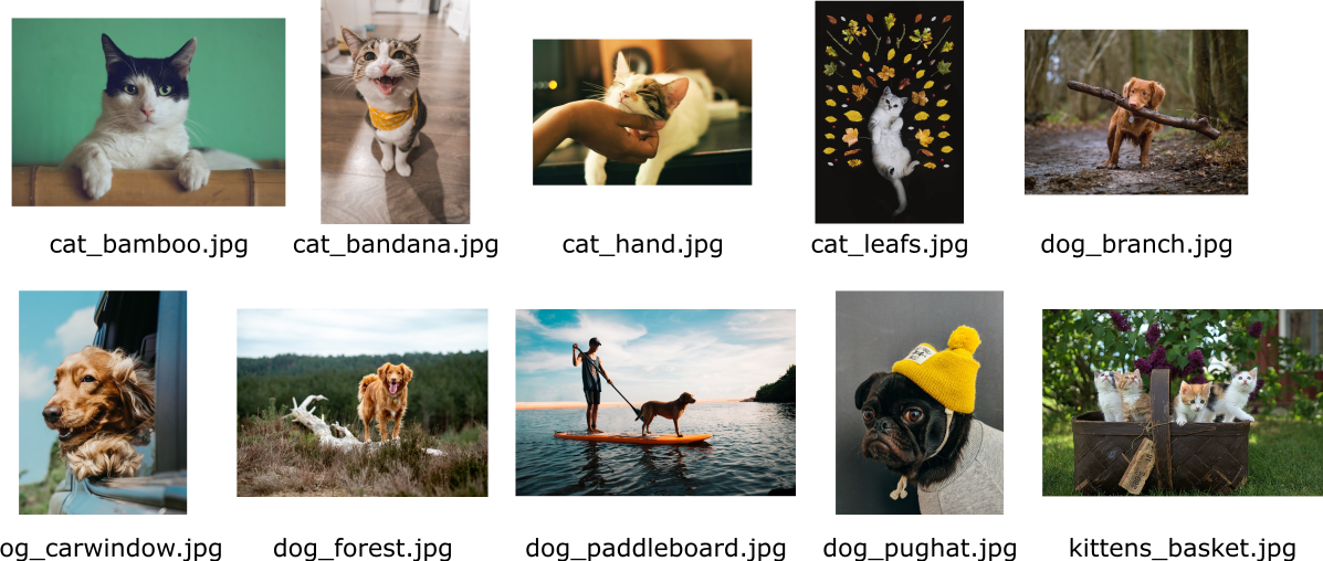
import numpy as np
from keras.preprocessing import image

#uploaded = files.upload()
uploaded_filenames = os.listdir(f'{os.getcwd()}\\Data\\upload_cats_and_dogs\\')

for fn in uploaded_filenames:

  # predicting images
  path = os.getcwd() + '\\Data\\upload_cats_and_dogs\\' + fn
  img = image.load_img(path, target_size=(150, 150))

  x = image.img_to_array(img)
  x = np.expand_dims(x, axis=0)
  images = np.vstack([x])

  classes = model.predict(images, batch_size=10)

  print(classes[0])

  if classes[0]>0:
    print(fn + " is a dog")

  else:
    print(fn + " is a cat")
[0.]
cat_bamboo.jpg is a cat (correct)
[1.]
cat_bandana.jpg is a dog (false)
[0.]
cat_hand.jpg is a cat (correct)
[1.]
cat_leafs.jpg is a dog (false)
[1.]
dog_branch.jpg is a dog (correct)
[2.29507e-14]
dog_carwindow.jpg is a dog (correct)
[1.]
dog_forest.jpg is a dog (correct)
[1.]
dog_paddleboard.jpg is a dog (correct)
[1.]
dog_pughat.jpg is a dog (correct)
[1.]
kittens_basket.jpg is a dog (false)
Step 7: Evaluate the Training and Validation accuracy
#-----------------------------------------------------------
# Retrieve a list of list results on training and test data
# sets for each training epoch
#-----------------------------------------------------------
acc      = history.history[     'accuracy' ]
val_acc  = history.history[ 'val_accuracy' ]
loss     = history.history[    'loss' ]
val_loss = history.history['val_loss' ]

epochs   = range(len(acc)) # Get number of epochs

#------------------------------------------------
# Plot training and validation accuracy per epoch
#------------------------------------------------
plt.plot  ( epochs,     acc )
plt.plot  ( epochs, val_acc )
plt.title ('Training and validation accuracy')
plt.figure()

#------------------------------------------------
# Plot training and validation loss per epoch
#------------------------------------------------
plt.plot  ( epochs,     loss )
plt.plot  ( epochs, val_loss )
plt.title ('Training and validation loss'   )
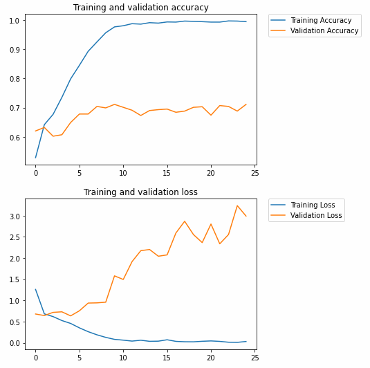
Acknowledgements:
Pagination