How big was paleo Lake Bonneville?
Reconstructing the Great Salt Lake’s giant ancestor
Introduction
The Western United States is home to several terminal lakes with no outflow and evaporite deposition such as carbonates and salts (Vennin et al., 2018, Harris et al., 2013). Approximately 15,000 years ago, lakes in the Great Basin of the western United States achieved their maximum late Pleistocene extents. Three of those lake systems stand out in terms of surface area: Lake Lahontan with a surface area of 22,300 km2, Lake Bonneville with a surface area of 51,300 km2, and Lake Missoula with 7,770 km2. These gigantic freshwater bodies, which had surface areas approximately 10 times their reconstructed mean-historical values, have been the subject of intensive scientific research since Russell’s seminal study of Lake Lahontan (Russell, 1885) and Gilbert’s seminal study of Lake Bonneville (Gilbert, 1890). Three main questions have occupied the minds of present-day paleoclimatologists working in these basins: (1) what caused the lakes to grow so large, (2) what was the record of lake-level change in each basin during the last glacial period, and (3) were lake-size changes linked to abrupt changes in the climate of the North Atlantic signaled by Dansgaard-Oeschgerand Heinrich events (Dansgaard, 1993).
It is assumed that the ice shield covering North America during that period placed ground moraine dams on the lakes, which led them to grow in area and depth (Bond, 1993). Melting of the ice sheets “pulled the plug” and rapidly lowered water levels in the basin. Bonneville reached its highstand level at 18.6 ka; it fluctuated near that level until 17.5 ka, at which time it incised its threshold at Red Rock Pass, Idaho, reaching the spillover level named “Red Rock Pass level” at 17.4 ka. Multiple research groups dated paleo-shorelines of Lake Bonneville and corroborated dates of lake levels using sediment cores (e.g., Benson et al. 2011).
This project’s goal is to explore the potential to use publicly Digital Elevation Models (DEMs) to calculate the water volumes in the Lake Bonneville system at different times during the last glacial. Specifically, it is to be answered whether spillover points and outflow locations can be detected using satellite imagery.
Objectives
a. What was the volume and area of glacial paleo-Lake Bonneville during different time intervals and how does it compare to the modern Great Salt Lake? How much of a difference in volume is represent by different shoreline levels?
b. Where were the spillover points/dams for ancestral Lake Bonneville for shoreline levels at various heights?
Data Sources
I will mainly use government-published GIS data for this project, which is a data source most reliable and best-documented.
- First, shapefiles for the maximum extent of Lake Bonneville provided by the The Utah Automated Geographic Reference Center (AGRC). Note that ARGC misuses the term “historic”, since something must have been on human records to be considered historic. They better refer to the “paleo Lake Bonneville” or “ancient Lake Bonneville”.
- Second, a feature containing three historic lake shorelines (1,285 m, 1,283 m, 1,282 m, 1,280 m). These shorelines were observed since the year 1850. The shoreline 1,283 m represents the historic average.
- Third, 1-arc second (30 m) DEMs provided by the USGS The National Map via the Utah ARGC. It has to be assumed that the geomorphology did not change dramatically since the last glacial maximum, which will be an error factoring into the model. Further, locations of dams/spillover points will need to be extracted from the literature and modeled.
Optionally, the USGS also provides 10 m DEMs but at a much larger size of the dataset, which would make processing unwieldy (time and memory).
Methods
The different ages and lake levels since the Late Pleistocene and historic times were gathered from the literature (Benson, 2011) and ARGC. As preparatory step, the ARGC feature containing the historic Great Salt Lake extents gets separated into four polygons.
Then, the relevant DEM tiles are merged to a continuous raster. For each published elevation, the DEMs are clipped to the Bonneville Highstand extent, since the lake never extended beyond this area. This avoids inclusion of low-lying valleys outside the maximum extent.
For each DEM, the elevations above lake level is set to null, which yields the extent and depth information of each lake in time. Following this, the DEMs are converted to a polygon feature, dissolved, and simplified. Using the tool Surface Volume and Zonal Statistics, detailed information about each extent is produced and merged. Based on surface area, volume, and time, fluxes as a time series are calculated on spreadsheet.
Results
Objective A: Volume and Area
Literature review yields eight significant lake levels, four recognized from chronologically dated paleo shorelines in the Late Pleistocene, and four historic levels recorded by various types of technology available at the time (Figure 1). Lake volumes and surface area changed significantly during the time Late Pleistocene (Table 1). The water levels at Great Salt Lake were gauged since 1850 and on average sat at 1,283 m, with a maximum water depth of 6 m. During the Bonneville Highstand, the lake was up to 275 m deep.
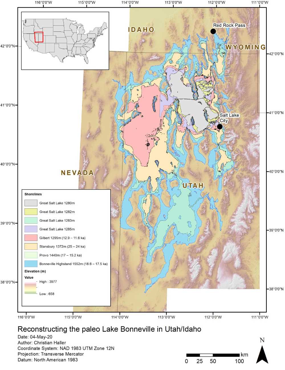
Figure 1 Extent of paleo lake levels recorded as shorelines and historic levels using gauges since 1850 (see Table 1).
Table 1 Processing results
| Name (elevation) | Time (ka) | Surface (km2) | Volume (km3) | Max. Depth (m) |
|---|---|---|---|---|
| Stansbury Oscillation (1,372 m) | 25 – 24 | 25,824.7 | 1,798.7 | 95 |
| Bonneville Highstand (1,552 m) | 18.6 – 17.5 | 49,030.4 | 8,601.6 | 275 |
| Provo (1,440 m) | 17 – 15.2 | 35,031.8 | 3,892.8 | 163 |
| Gilbert (1,295 m) | 12.9 – 11.6 | 15,216.1 | 143.9 | 18 |
| Great Salt Lake (1,285 m) | historic | 6,471.0 | 23.7 | 8 |
| Great Salt Lake (1,283 m) hist. avg. | historic | 5,154.8 | 11.5 | 6 |
| Great Salt Lake (1,282 m) | historic | 4,758.7 | 6.7 | 5 |
| Great Salt Lake (1,280 m) | historic | 1,445.6 | 0.9 | 3 |
Using the timing and the water volume data, the net water flux in and out of the lake was calculated (Figure 2). Major net influx occurred between 24 ka (Stansbury Oscillation) and 18.6 ka (Bonneville Highstand). The transitional periods after 17.5 ka are marked by outflow, most notably the flood event spilling over at Red Rock Pass, Idaho. The water level was stable at the Provo level between 17 and 15.2 ka, after which another rapid volume loss occurred. Coming to a halt at the level of the Gilbert shoreline (12.9 ka) relatively little volume loss occurred till modern day.
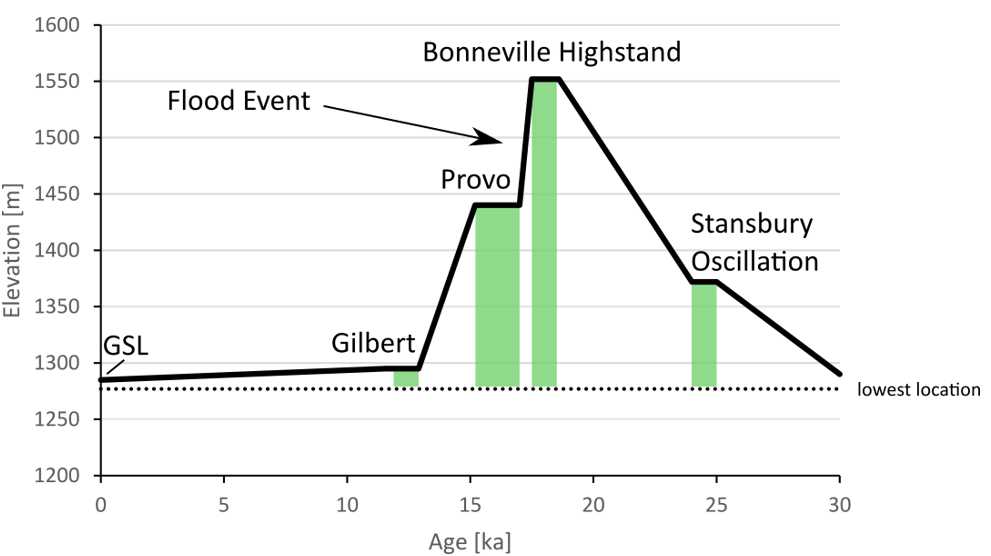
Figure 2 Water level above sea level.
Table 2 Flow rate comparison with similar modern waterfalls (Wikipedia, 2020)
| km3/a | m3/a | m3/s | |
|---|---|---|---|
| Niagara Falls | 75.91 | 75,907,152,000 | 2,407 |
| Bonneville Highstand Flood Event (0.1 kyrs) | 47.09 | 47,088,000,000 | 1,493 |
| Great Falls (Virginia, USA) | 14.95 | 14,948,064,000 | 474 |
| Bonneville Highstand Flood Event (0.5 kyrs) | 9.42 | 9,417,600,000 | 299 |
| Murchison Falls (Uganda) | 9.46 | 9,460,800,000 | 300 |
| Alexandra Falls (NW Territories, Canada) | 8.89 | 8,893,152,000 | 282 |
In summary, the lake changed in size massively and was significantly larger in surface area, volume, and water depth. During the Bonneville Highstand between 18.6 and 17.5 ka, the lake contained ~750 times the volume it does today and was at its deepest point ~45 times as deep compared to the historic average. During the great flood event following the Bonneville Highstand, 224 mm (0.224 m) were drained on average per year for a total of 0.5 kyrs (500 years) from the lake (Figure 3). This flow rate is a large number when compared for example with the current sea level rise of 3.3 mm per year (NASA, 2020). Proof of the flood event are deposited sediments north of Red Rock Pass draping the valleys and the Snake River Plain (Malde, 1968). Assuming that the majority of the water drained evenly and not evaporate this can be put in perspective by comparing with modern waterfalls (Table 2). However, some authors believe that the flood was much more intense and the lake reached Red Rock Pass-level within 0.1 kyrs (Oviatt, 1992), which would make the flood similar in scale to the Niagara Falls at the US/Canada border.
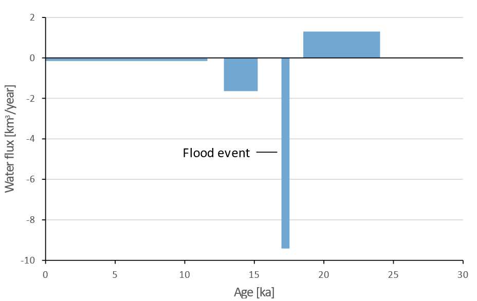
Figure 3 Net water flux between stable lake levels.
Objective B: Spillover points/dams
Bonneville reached its highstand level at 18.6 ka; it fluctuated near that level until 17.5 ka, at which time it incised its threshold. The location of the spillover point at Red Rock Pass, Idaho is apparent in the elevation data as a meandering incision in the glacial till sediments (Figure 4). Incision continued until the bedrock formation at Red Rock Pass was met. Red Rock Pass was likely the only spillover point of the lake as constrained by δ18O from sediment cores (Benson, 2011). Later decrease in water volume came about through a shift towards warmer temperatures and higher evaporation in the post glacial times.
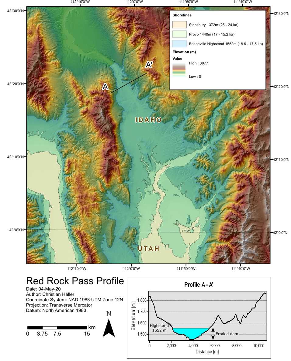
Figure 4 The spillover point at Red Rock Pass. After the erosion of the sediment dam, which caused the Flood Event at 17.5 ka, the lake receded to the Provo level.
Discussion
The results yielded detailed information on the Great Salt Lake and its ancient predecessors: The Great Salt Lake used to be significantly larger and saw periods of water-level rise and fall. With an influx of 1.26 km3/year and lake level rise of 180 m between 24 and 18.6 ka this transitional period was the only time recorded with net growth of the lake surface area. The lake level reached a maximum termed the “Bonneville Highstand” between 18.6 and 17.5 ka. The loss of 4,708.80 km3 between 17.5 and 17 ka is referred to as the Flood Event. Spilling through the Red Rock Pass, northeast of the lake in Idaho, the water level dropped 112 m at flowed at rates resembling modern waterfalls. Conservative estimates (slow drain over 0.5 kyrs) suggest a waterfall the size of the Murchison Falls (Nile, Uganda). Other estimates suggest a faster drainage in 0.1 kyrs, which means an outflow event similar to the size of the Niagara Falls (USA/Canada border). Between 17 and 15.2 ka the lake resided at the Provo shoreline, which is just below the bedrock level of the Red Rock Pass. The fall from the Provo level to the Gilbert level was a 145 m drop as a closed system. Likely causes are climate change coming out of the glacial such as warmer temperatures and melting glaciers. Decreased precipitation and increased evaporation resulted in a net loss of lake volume. From the Gilbert shoreline it was a 10 m drop to the historic Great Salt Lake levels. Water volume decreased slowly to a tenth. The historic Great Salt Lake had significant changes in water volume from 0.9 km3 (1,280 m elevation) to 23.7 km3 (1,285 m elevation). However, it is currently assumed that not climate exclusively influences the water level of the Great Salt Lake. Current studies making use of hydrological accounting to calculate the water balance of the basin suggest that human consumption such as by consuming streamwater before it replenishes the lake may be a major influence (Wurtsbaugh, 2017).
Limitations of the dataset
The USGS National Map 1-arc-second DEM is continuous and well updated. However, especially within the Great Salt Lake area the data seem inconsistent and not faithfully representing the bathymetry. This is visible through the rectangular blocks representing large parts of the bathymetry. This may be attributed to the difficulty for obtaining bathymetry data by boat from the in relatively shallow lake. The Utah Geological Survey and Utah Division of Forestry, Fire and State Land published a newer LIDAR dataset in 2016 (Link) covering the lake shores in 0.5 to 1 m resolution. However, this dataset spares out the submerged parts of the lake. This means that the volumes and depths for the historic lake extents may not be as accurate. Since the historic part is only a fraction of the ancient extents, this skew may be less significant for the reconstructions of these parameters.
References
- Benson, L. L., Lund, S. P., Smoot, J. P., Rhode, D. E., Spencer, R. J., Verosub, K. L., Louderback, L. A., Johnson, C. A., Rye, R. O., Negrini, R. M. (2011). The rise and fall of Lake Bonneville between 45 and 10.5 ka. Quaternary International, 235, 57-69. DOI: 10.1016/j.quaint.2010.12.014
- Bond, G., Broecker, W., Johnsen, S., McManus, J., Labeyrie, L., Jouzel, J., Bonani, G. (1993). Correlations between climate records from North Atlantic sediments and Greenland ice. Nature, 365, 143-147. DOI: 10.1038/365143a0
- Dansgaard, W., Johnsen, S., Clausen, H.B., Dahl-Jensen, E., Gudnestrup, N.S., Hammer, C.U., Hvidberg, C.S., Steffensen, J.P., Sveinbjornsdottir, A.E., Jouzel, J., Bond, G. (1993). Evidence for general instability of past climate from a 250-kyrice-core record. Nature, 364, 218-220. DOI: 10.1038/364218a0
- Gilbert, G. K. (1890). Lake Bonneville. U.S. Geological Survey Monograph. DOI: 10.3133/m1
- Harris, P. M., Ellis, J., Purkis, S. J. (2013). Assessing the extent of carbonate deposition in early rift settings. AAPG Bulletin, 97, 27-60. DOI: 10.1306/06121212003
- Malde, H. E. (1968). The Catastrophic Late Pleistocene Bonneville Flood in the Snake River Plain. U.S. Geological Survey Professional Paper, 52. DOI: 10.3133/pp596
- NASA. (2020, April). Global Climate Change - Vital Signs of the Planet. Retrieved from https://climate.nasa.gov/vital-signs/sea-level/
- Oviatt, C. C., Currey, D. R., Sack, D. (1992). Radiocarbon chronology of Lake Bonneville, Eastern Great Basin, USA. Palaeogeography, Palaeoclimatology, Palaeoecology, 99, 225-241. DOI: 10.1016/0031-0182(92)90017-Y
- Russell, I. (1885). Geological History of Lake Lahontan, A Quaternary Lake of Northwestern Nevada. U.S. Geological Survey Monograph. DOI: 10.3133/m11
- Vennin, E., Bouton, A., Bourillot, R., Pace, A., Roche, A., Brayard, A., Thomazo, C., Virgone, A., Gaucher, E. C., Desaubliaux, G., Visscher, P. T. (2018) The lacustrine microbial carbonate factory of the successive Lake Bonneville and Great Salt Lake, Utah, USA. Sedimentology, 66, 165-204. DOI: 10.1111/sed.12499
- Wikipedia. (2020, 4 28). List of Waterfalls by Flow Rate. Retrieved from https://en.wikipedia.org/wiki/List_of_waterfalls_by_flow_rate
Additional Media
Interactive Map on ArcGIS Online
Click “Open in Map Viewer”
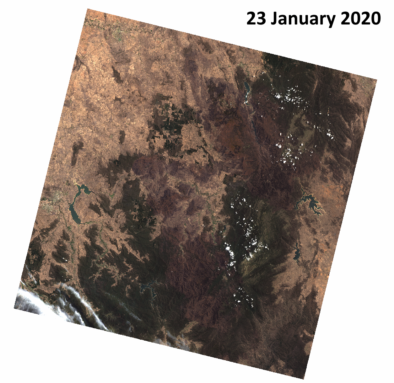
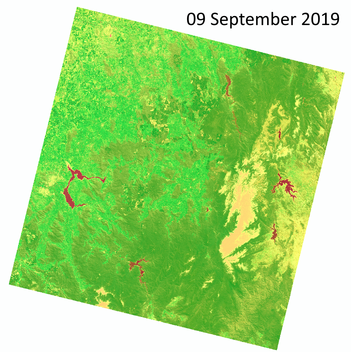
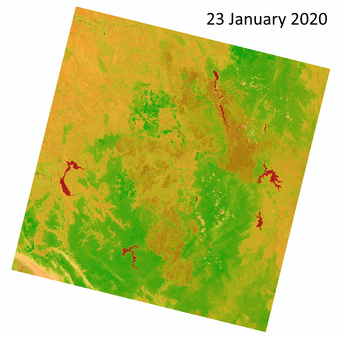
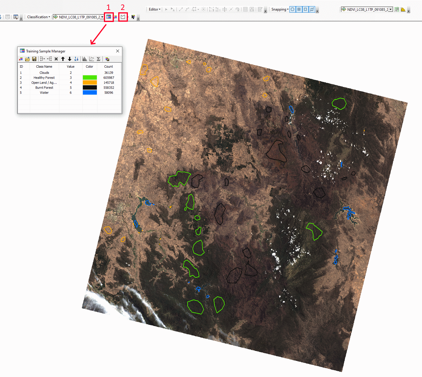
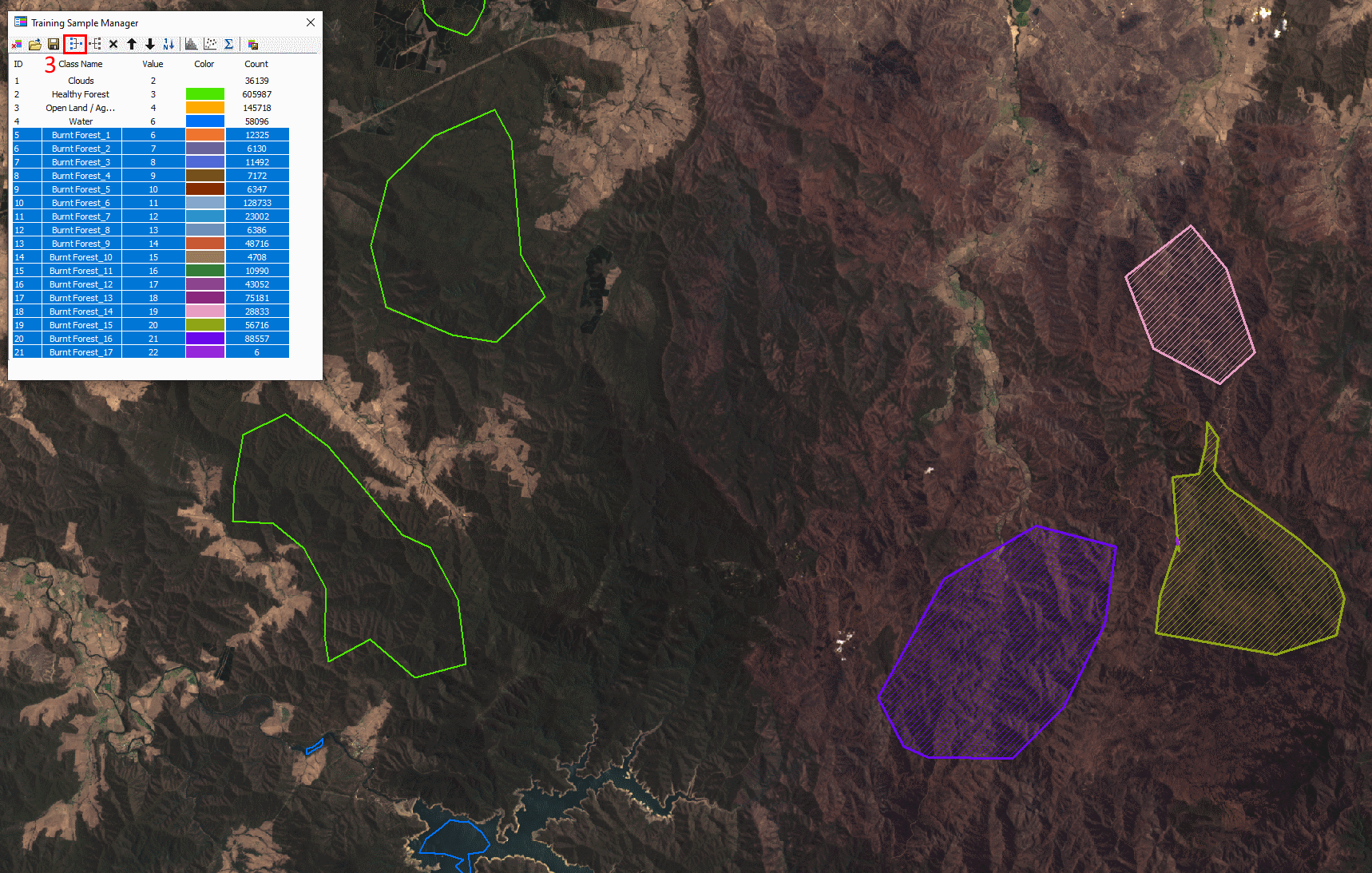
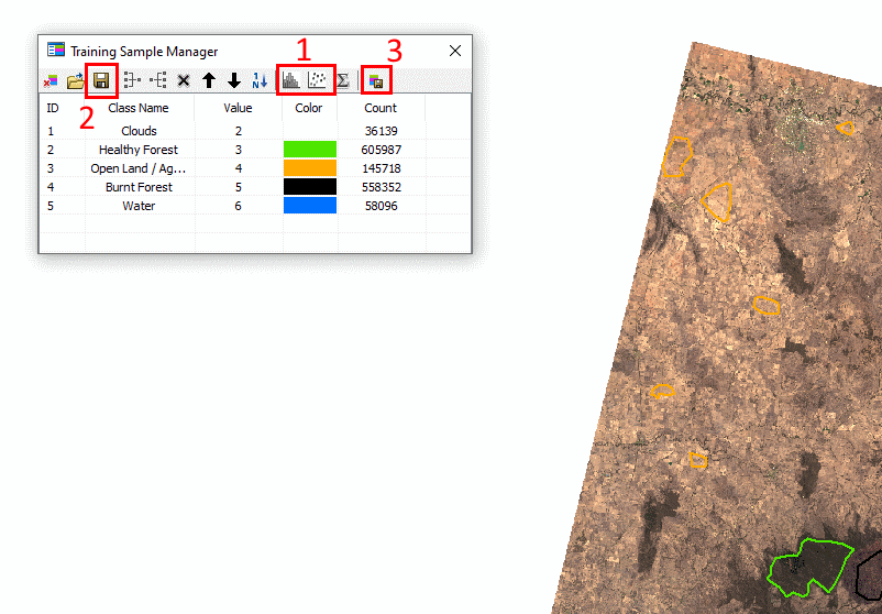
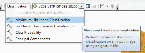
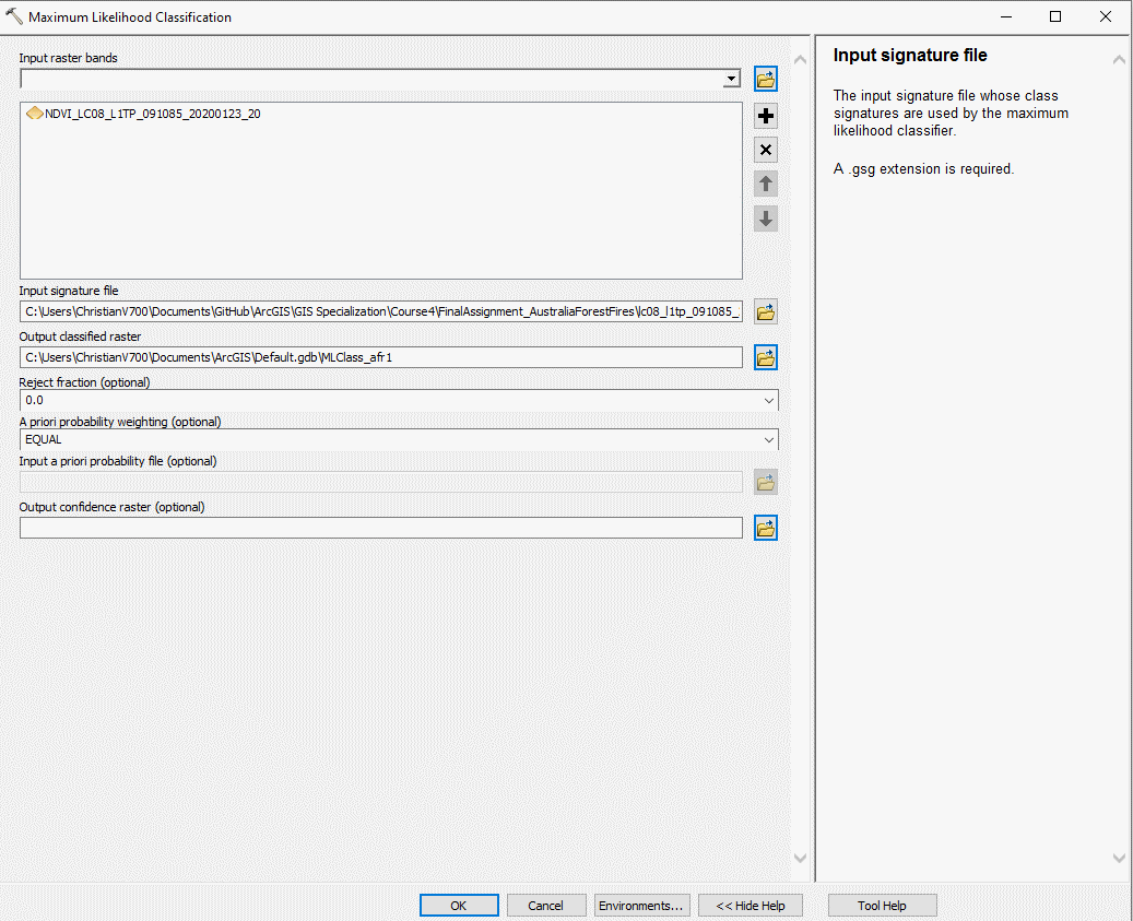
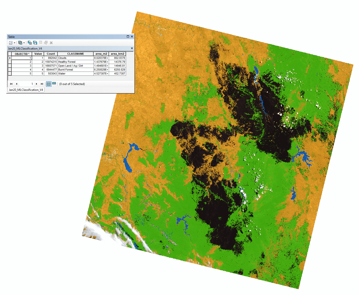
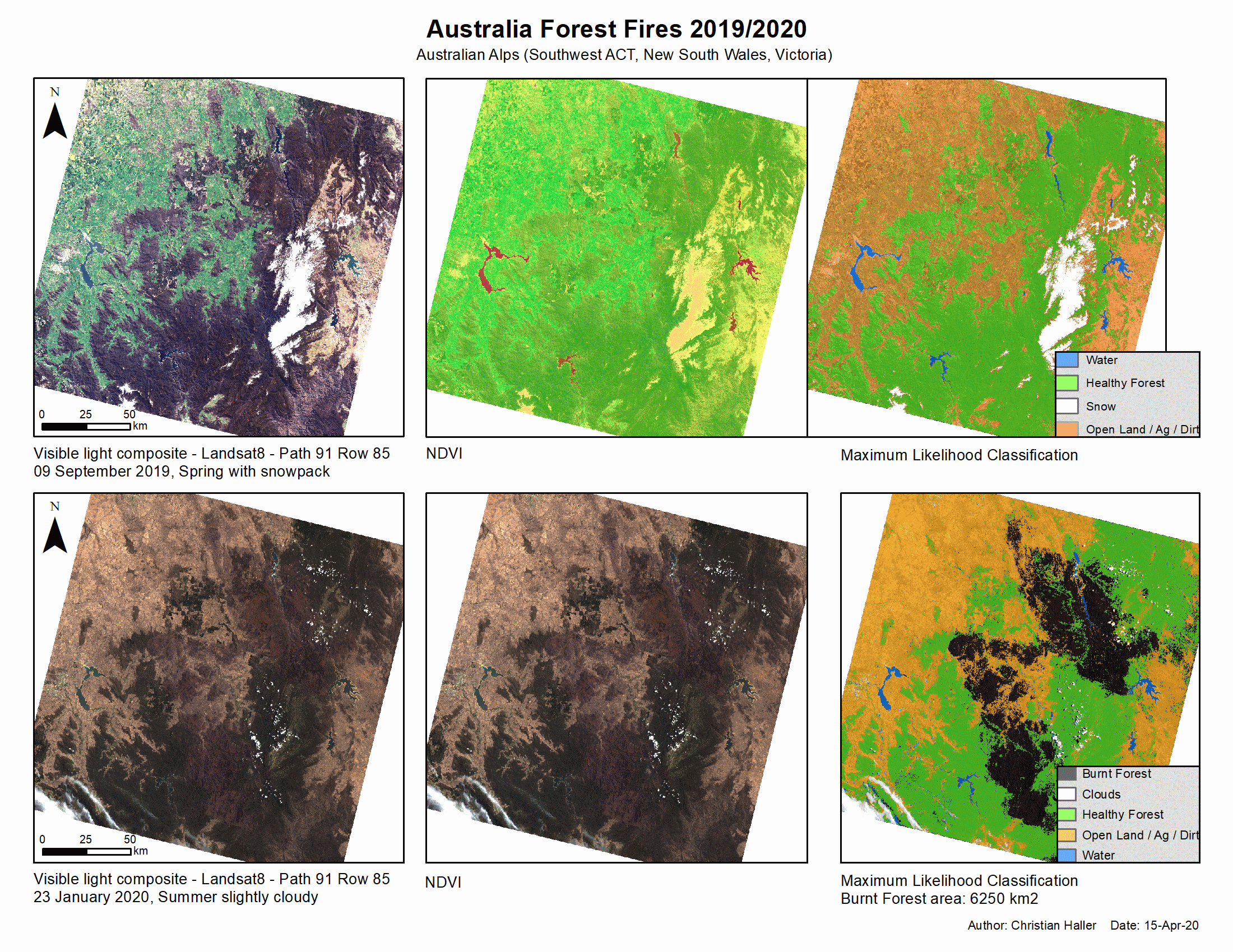
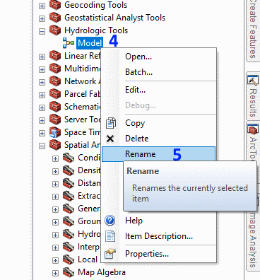
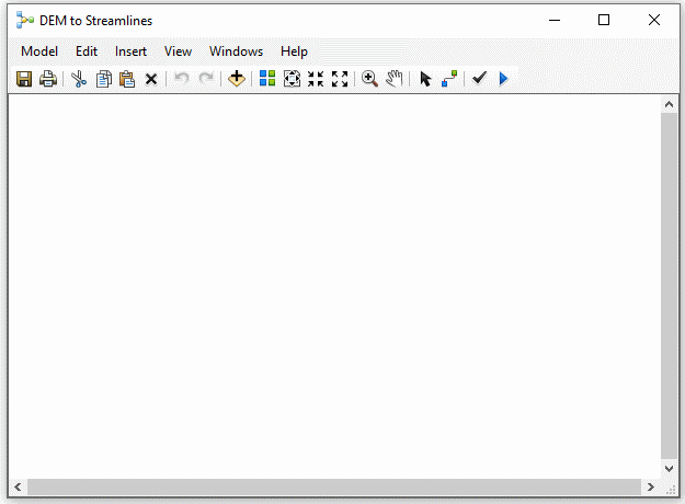
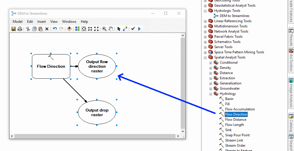
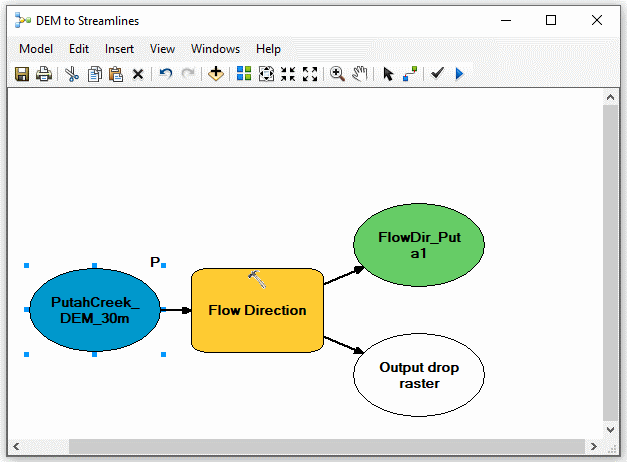
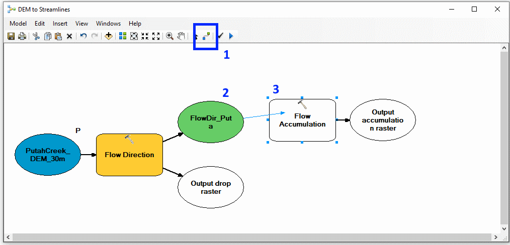
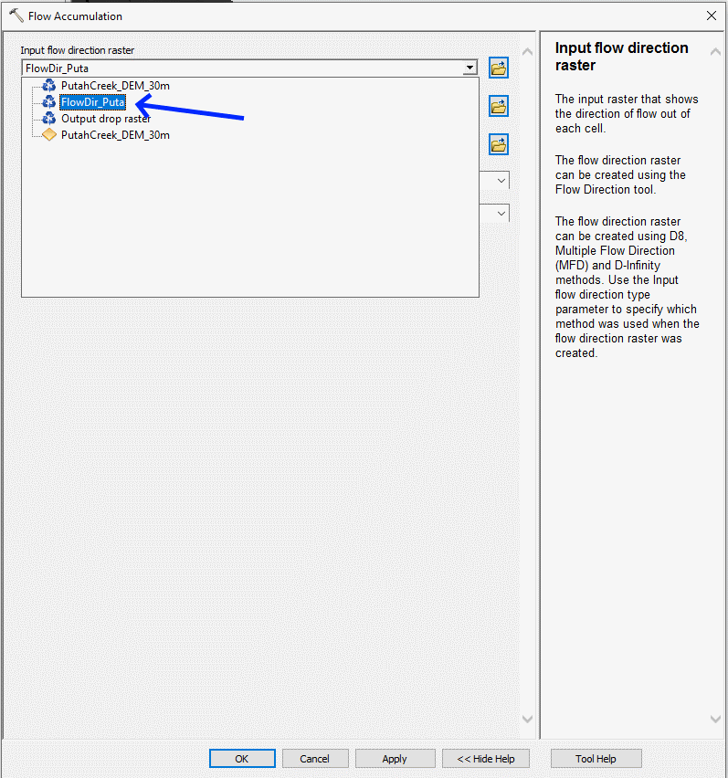
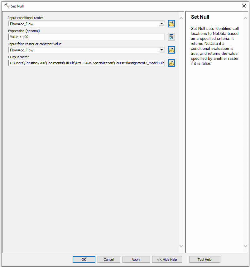
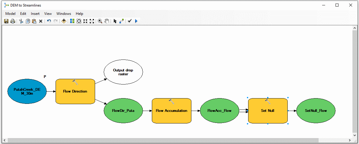
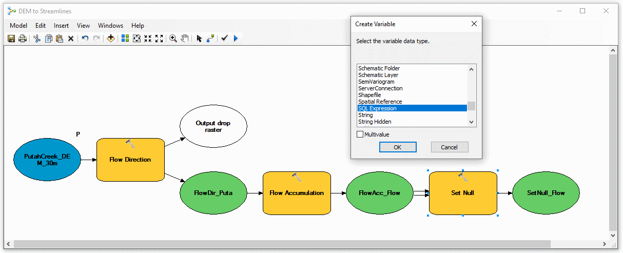
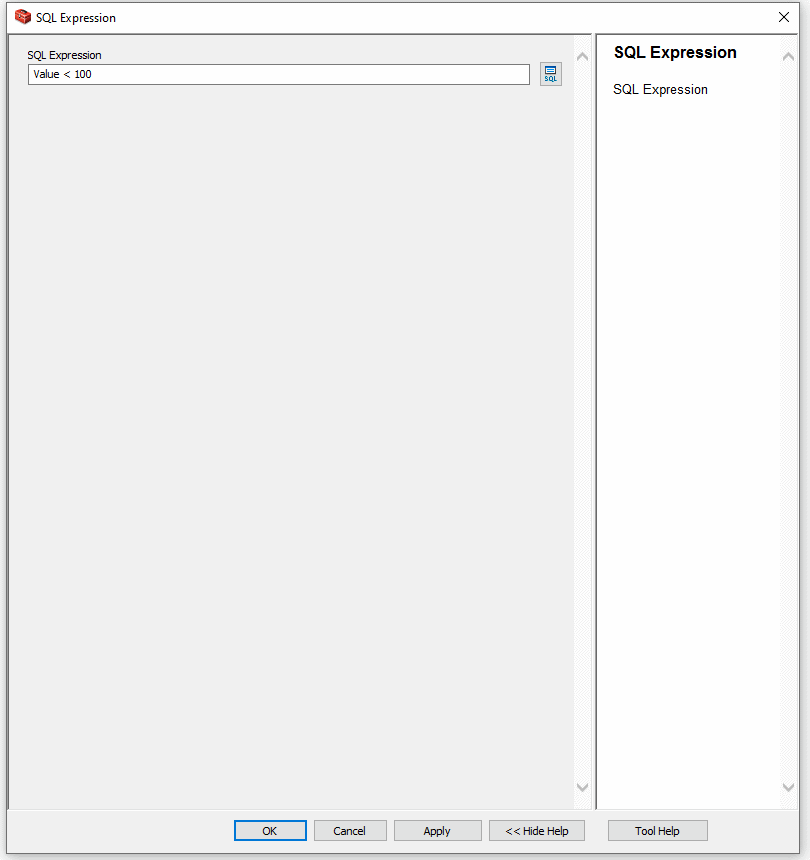
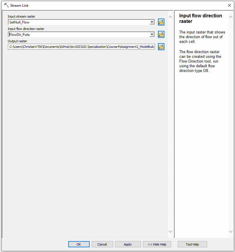
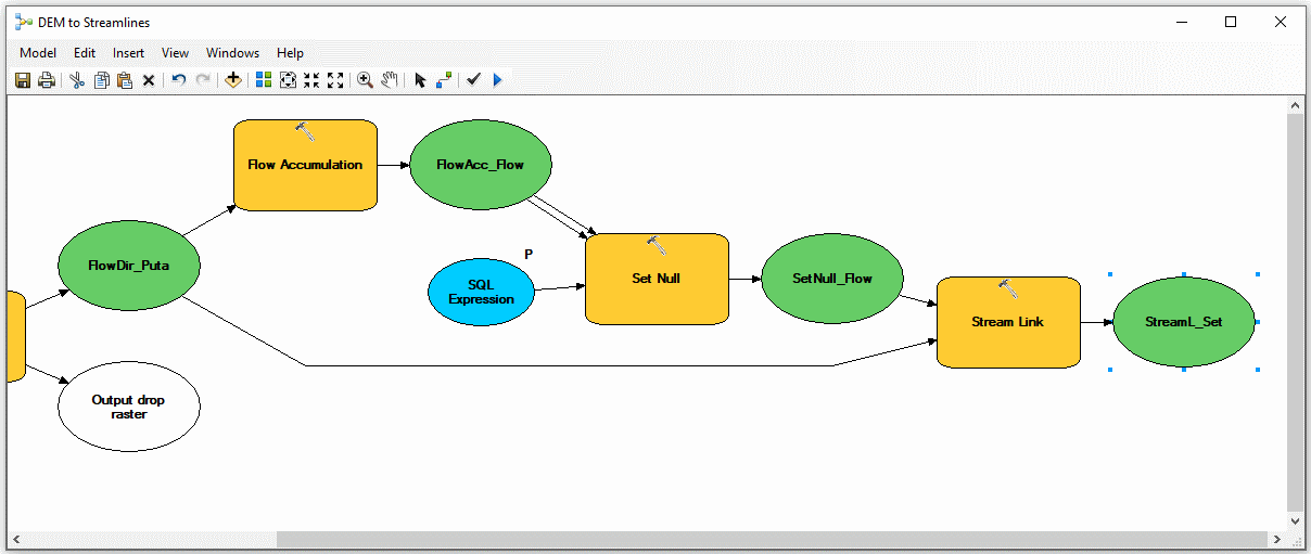
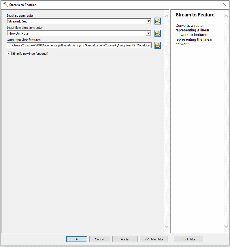
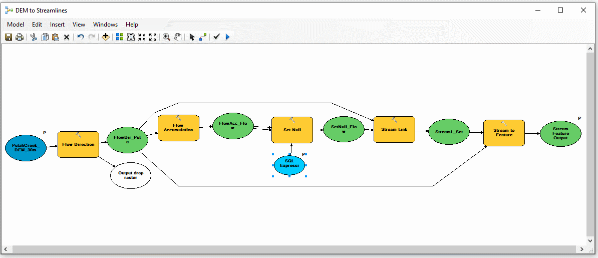
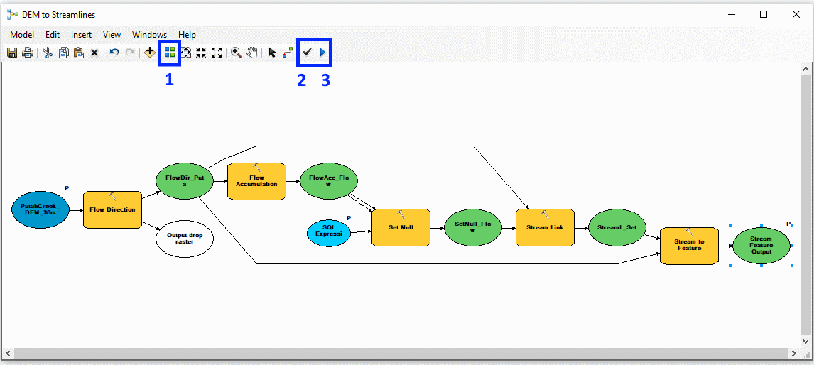
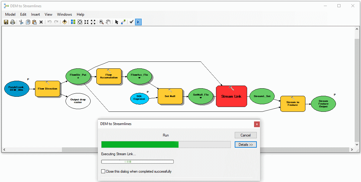
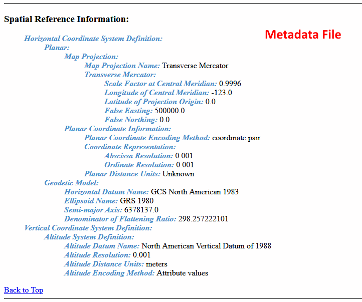
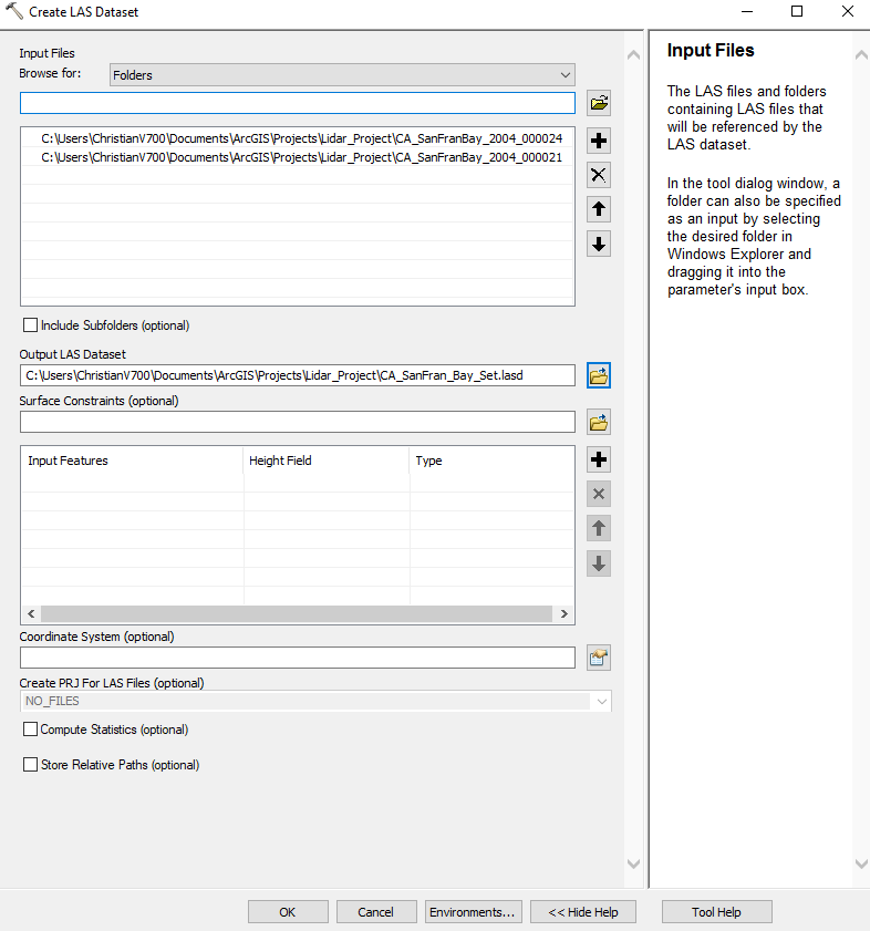
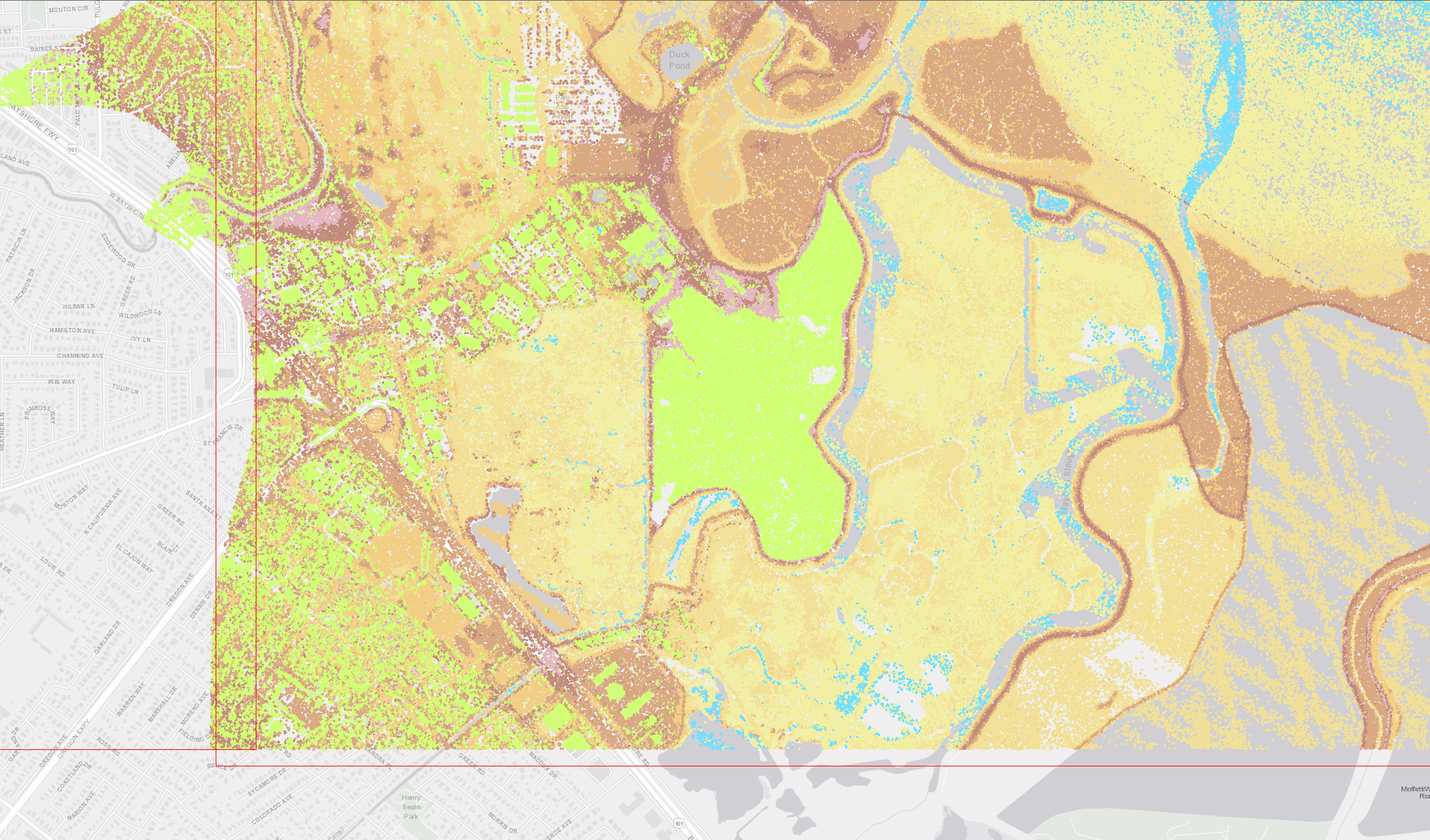
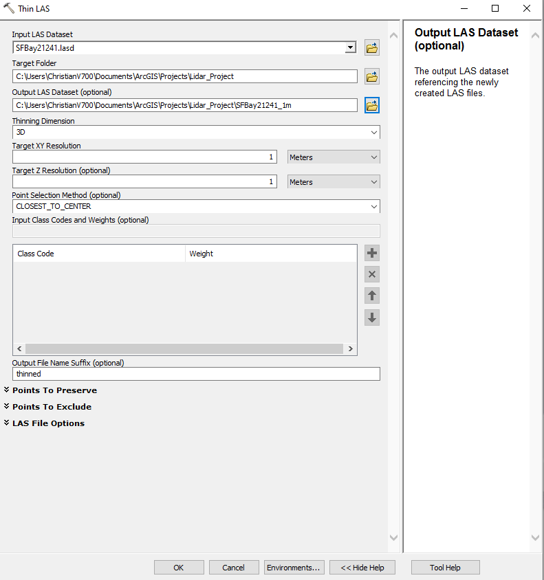
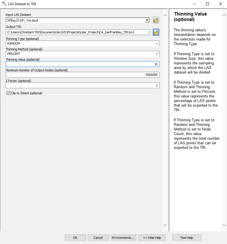
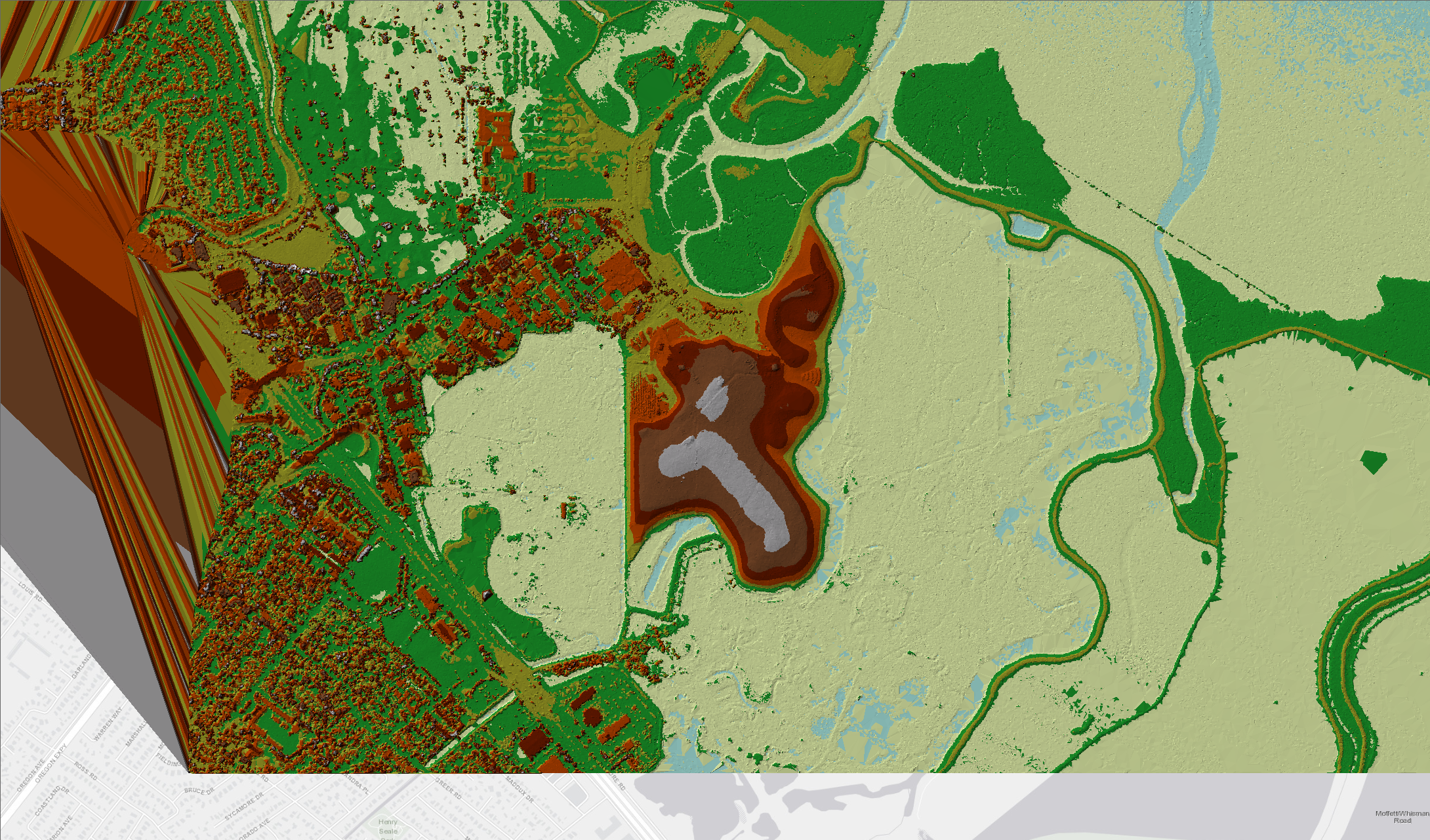
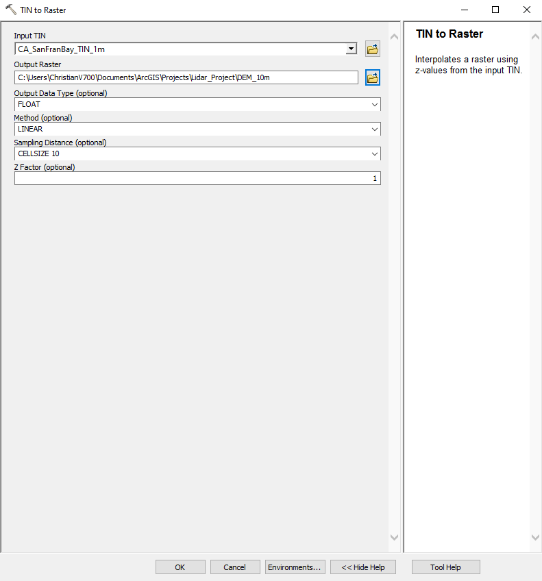
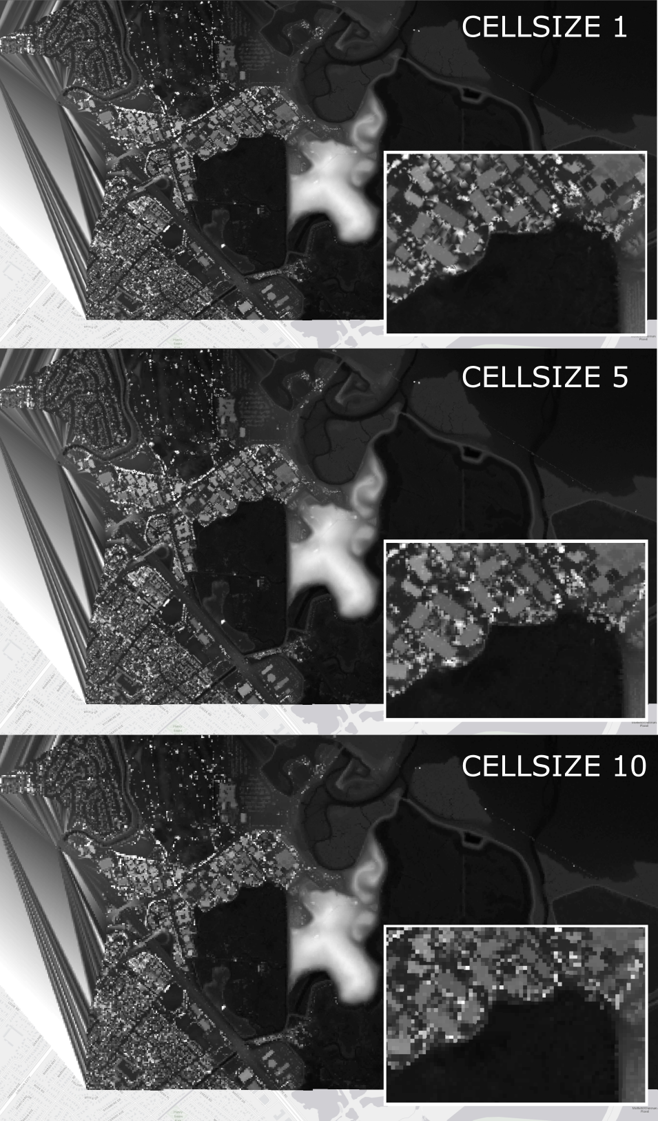
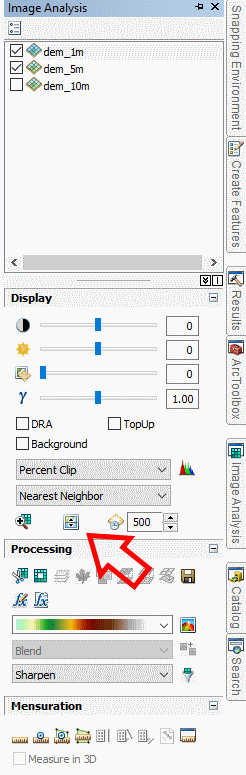
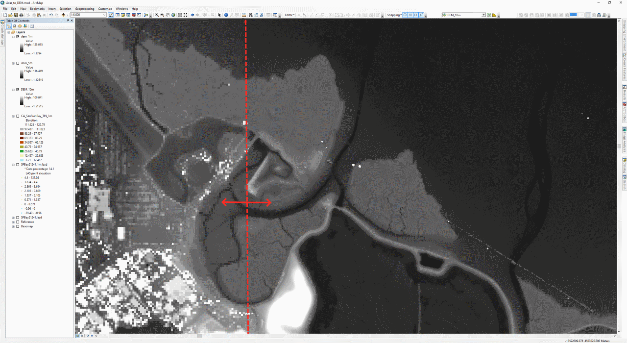
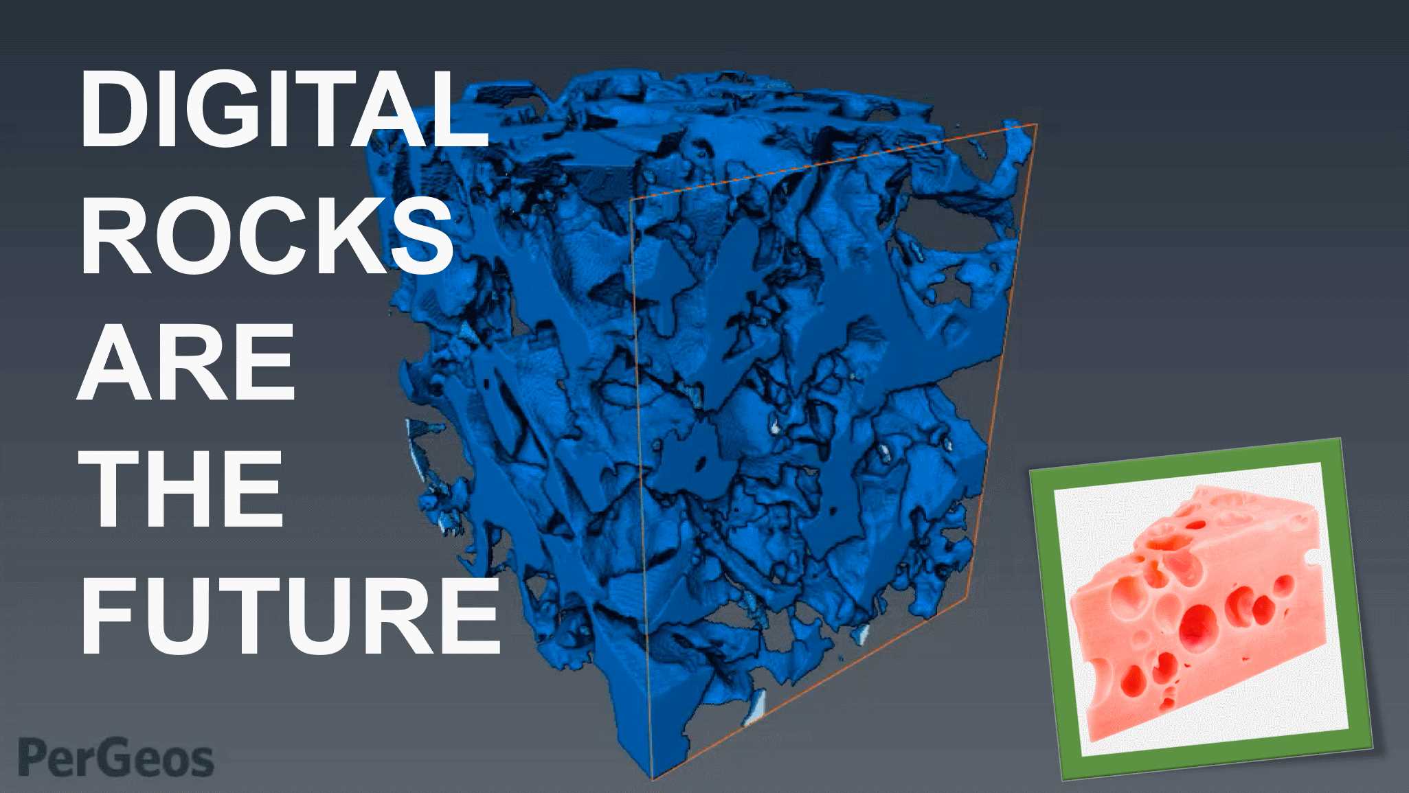
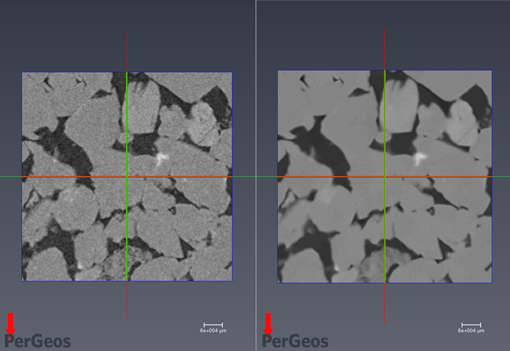
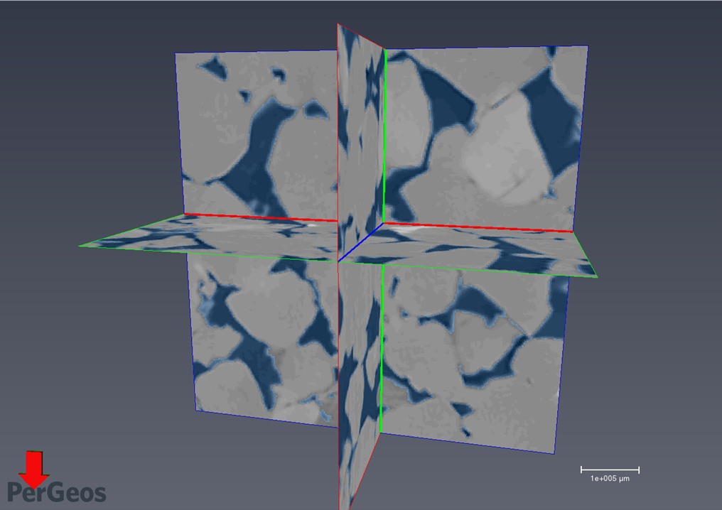
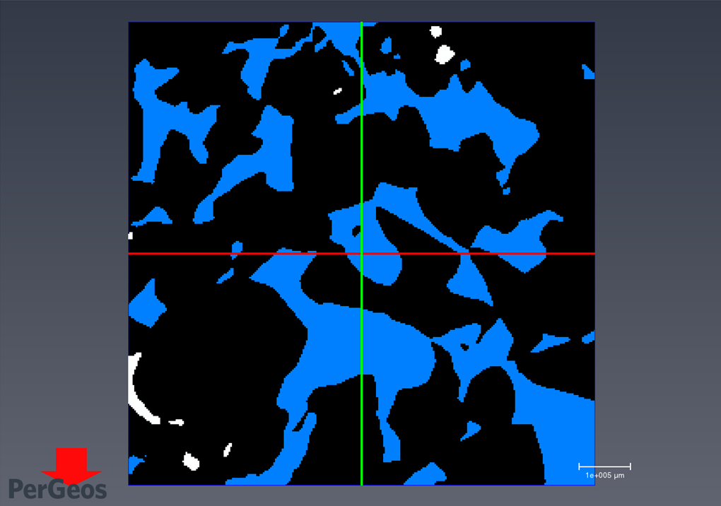
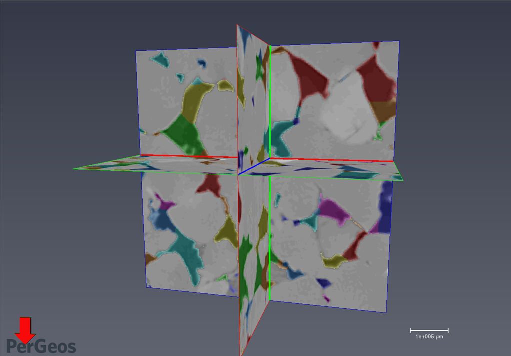
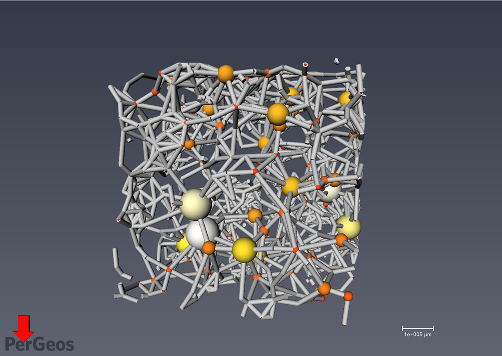
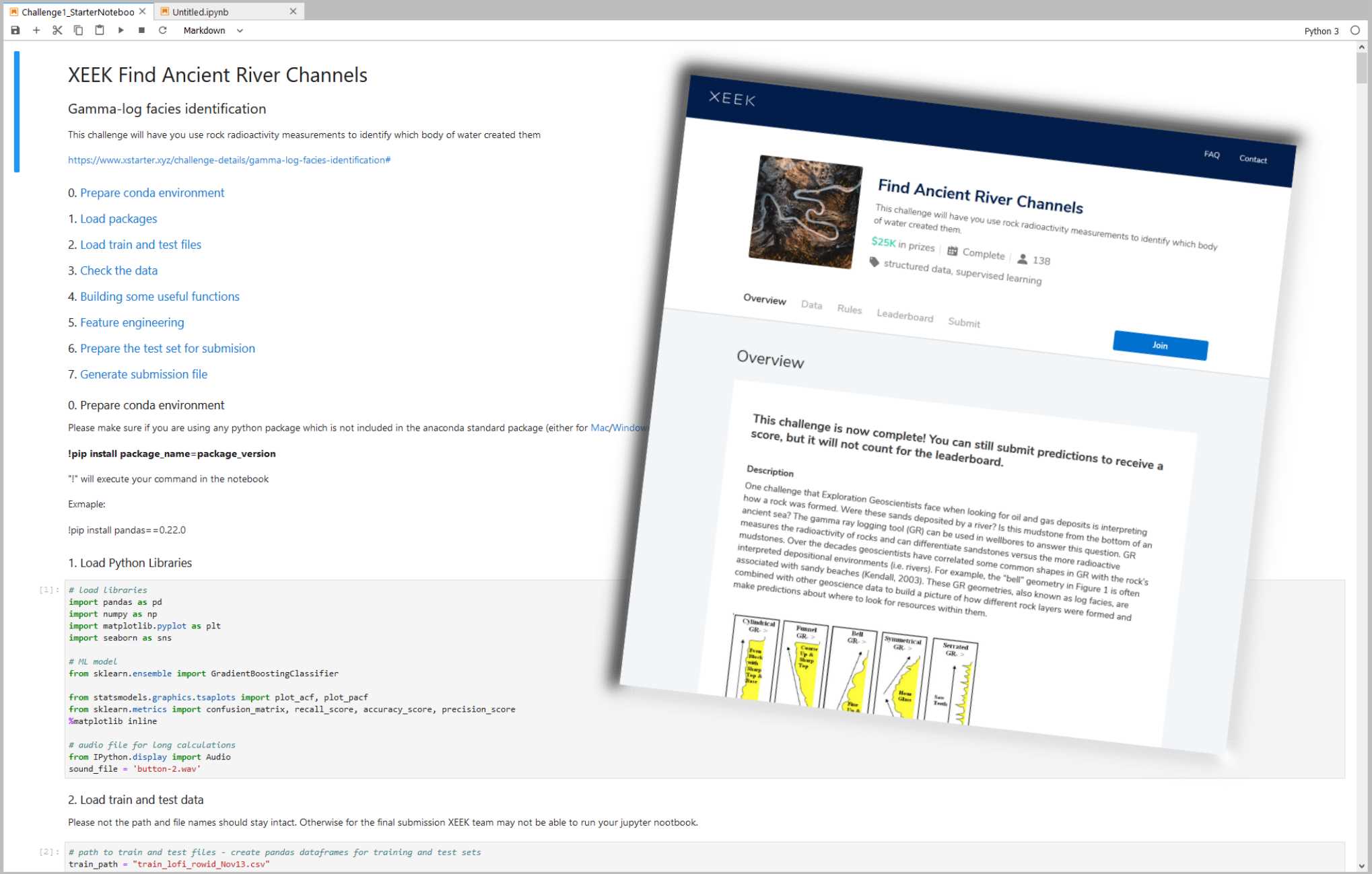
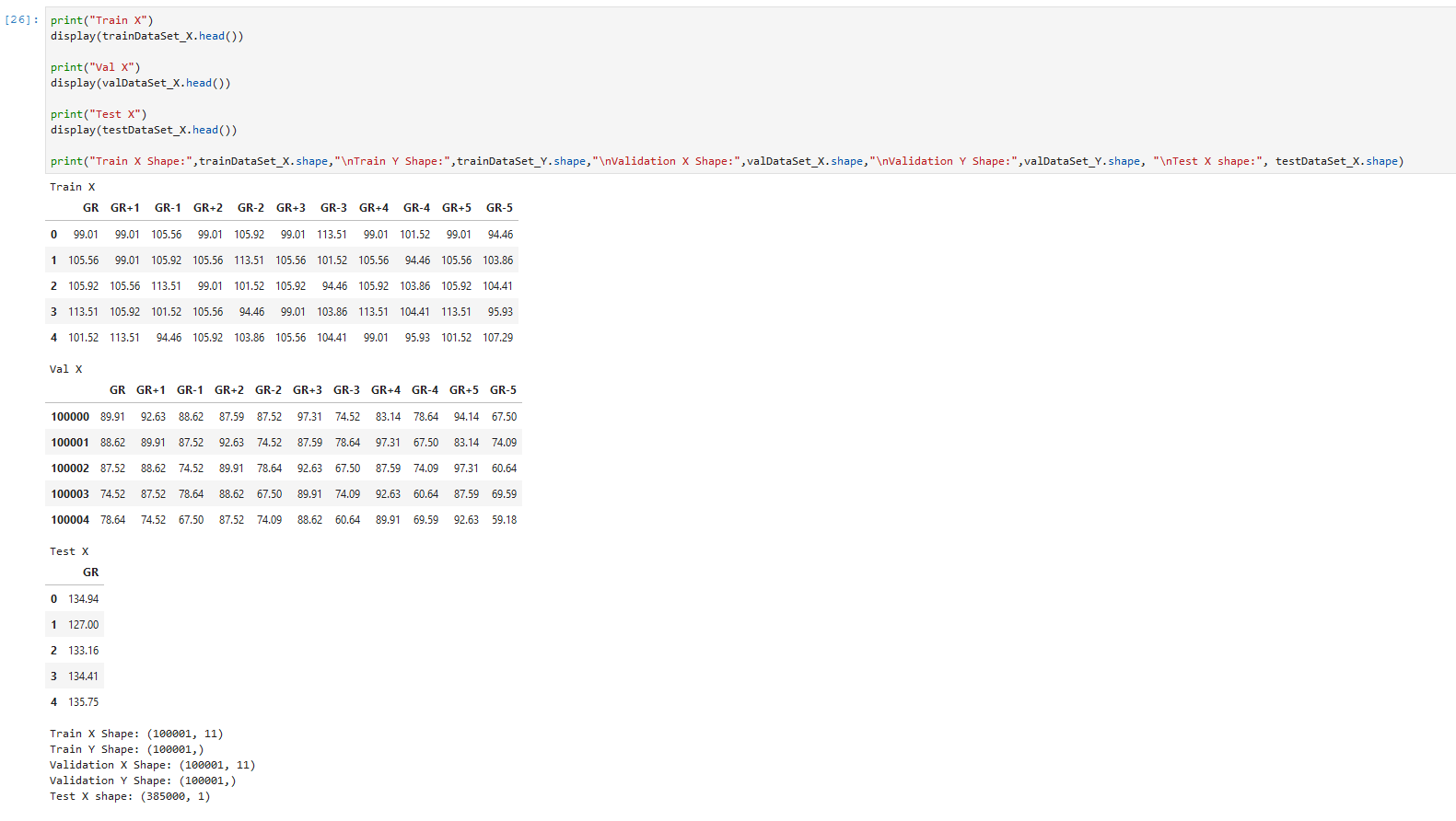
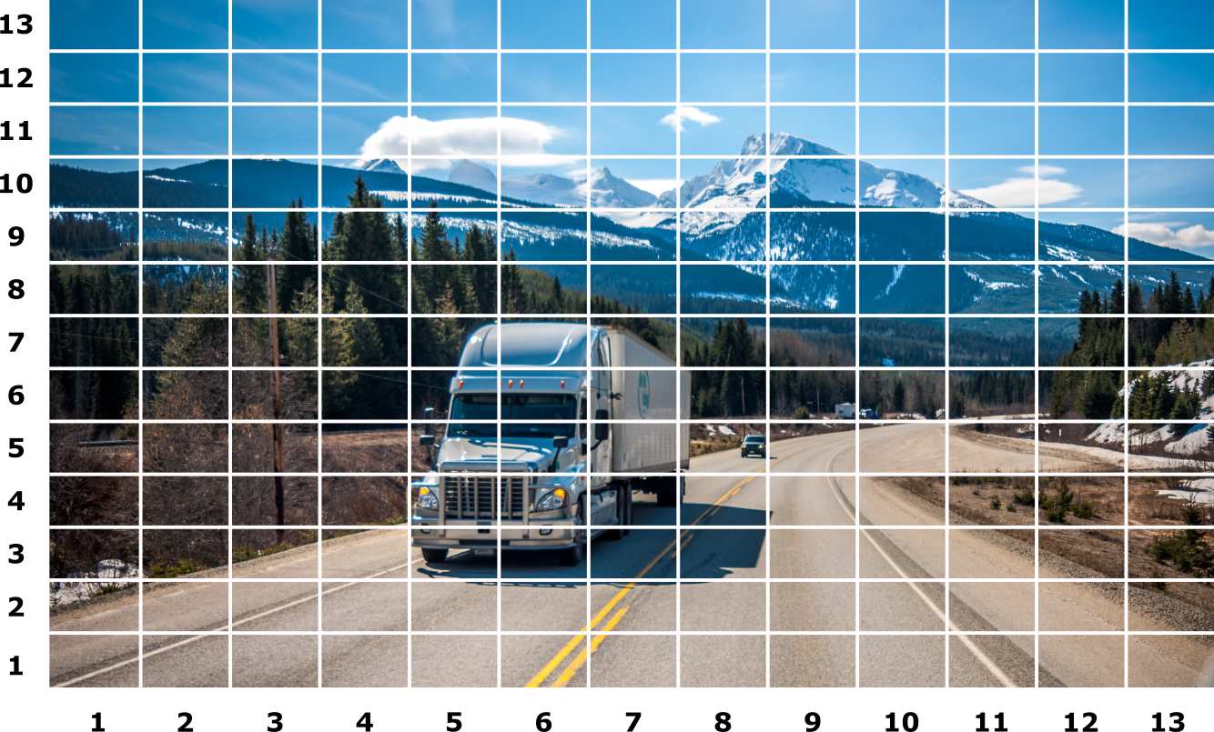
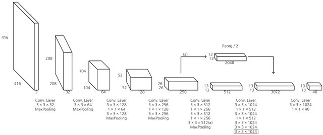
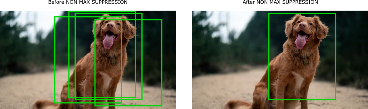
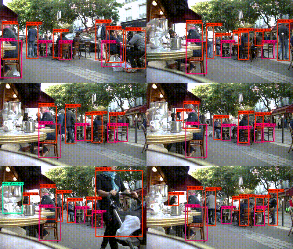
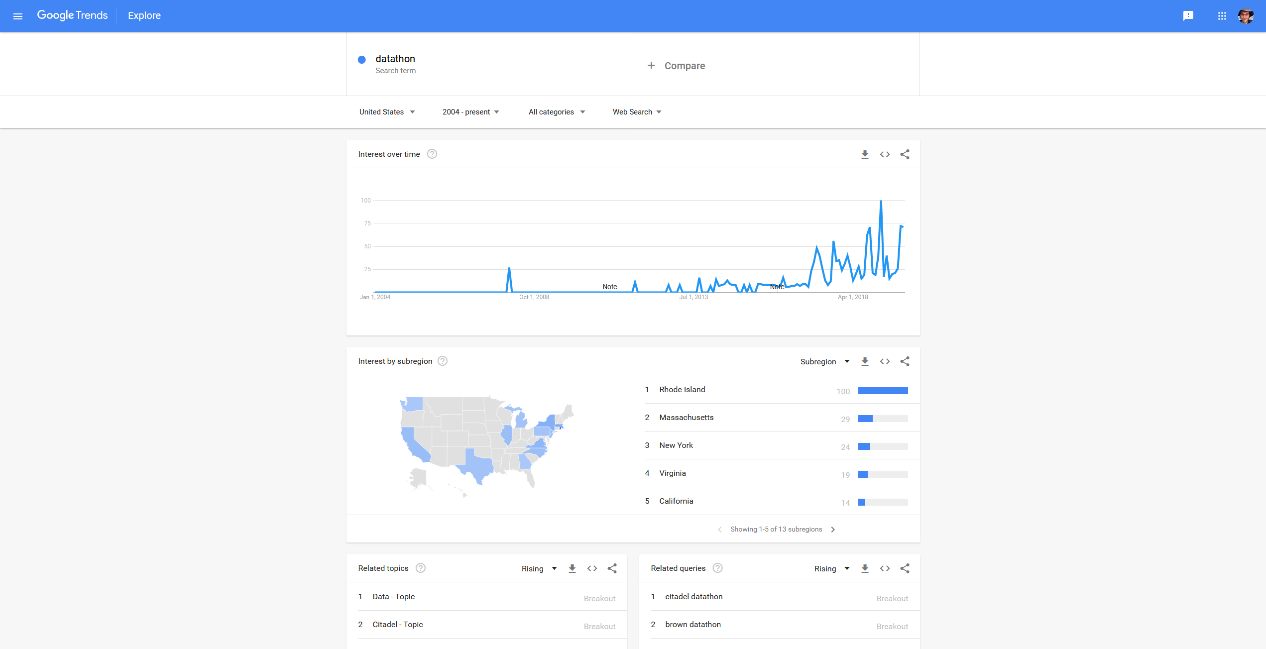
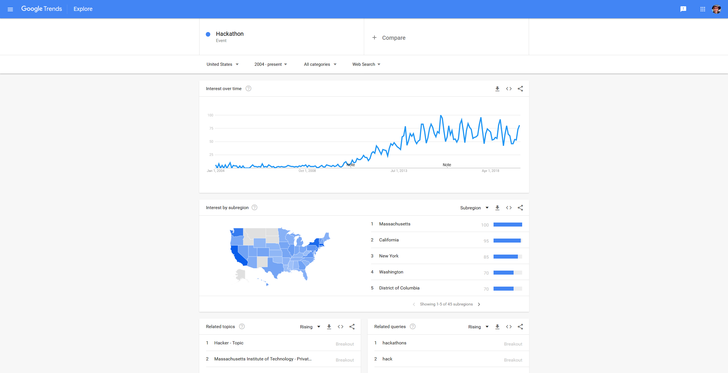
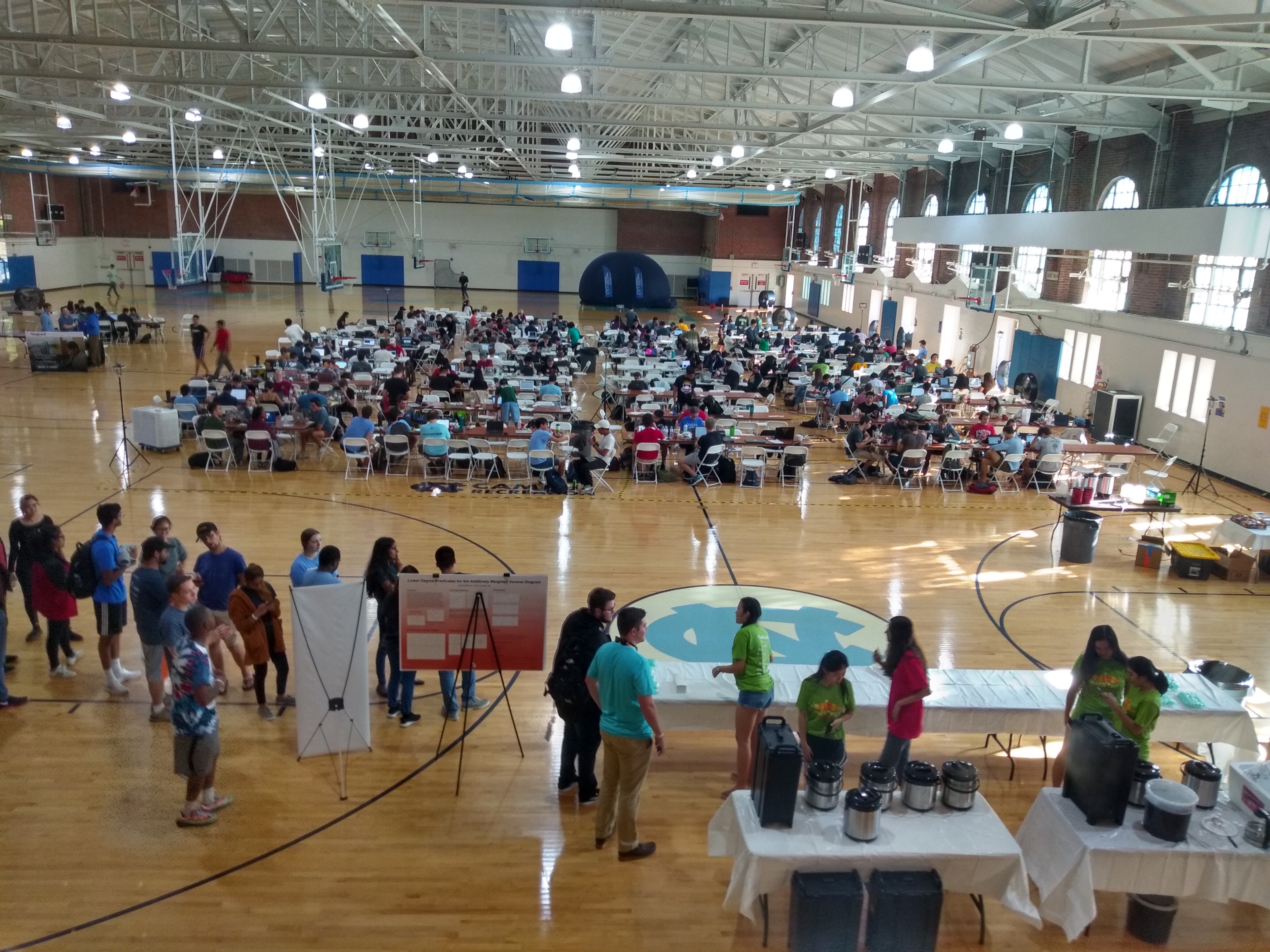
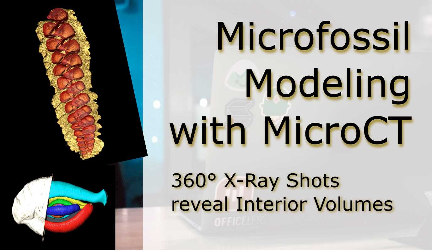
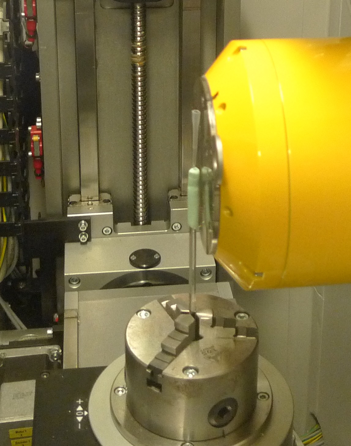
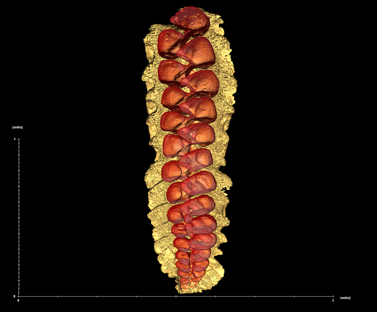
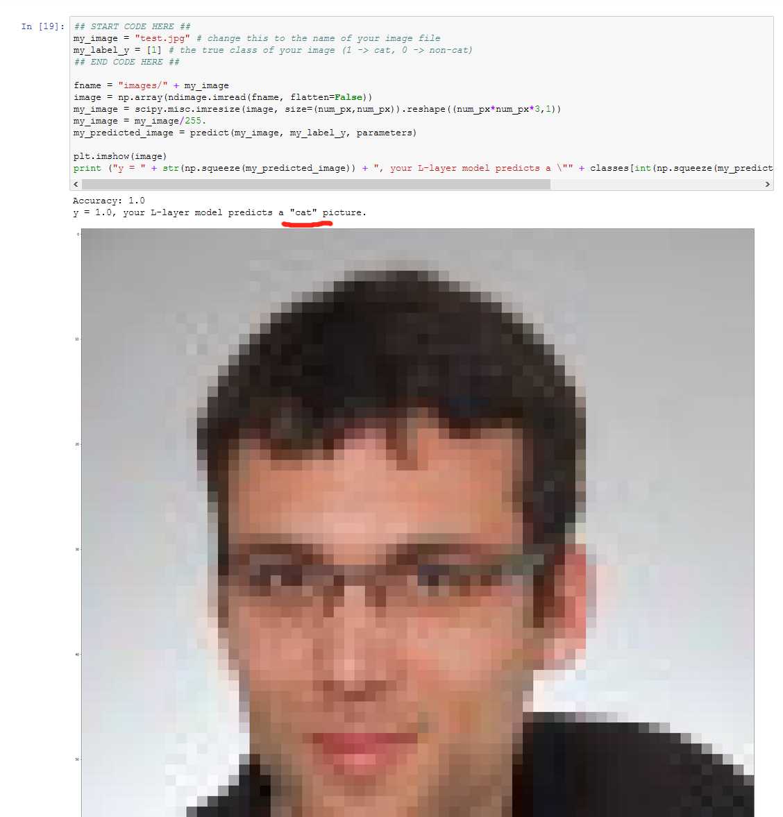
Quantify the Burned Forest Area in Australia Fires ravaged the forested south of Australia in the past dry season and made global headlines in January 2020. I chose to compare Landsat imagery of the Australian Alps from last Spring and Summer, i.e. pre and post fire to assess the area of burnt forest. The selected tile Path 91 Row 85 covers the southwestern corner of the Australian Capital Territory (ACT) and the New South Wales/Victoria territory border. To achieve such an analysis, ca. 10 time slices of Landsat 8 imagery were requested from USGS EarthExplorer covering September 2019 and April 2020. Many slices were discarded due to high cloud coverage, smoke, and haze that would make classification ambiguous. Selected time slices were 09 September 2019 (Spring / pre-burn) and 23 January 2020 (Summer / post-burn). In the following I show how to train a classification model that quantifies the burnt area. The nexts steps will have to be completed twice, once for each seasonal image. Step 1 Unpack the Landsat8 files and use the tool “Composite Bands” in ArcGIS that combines multiple wavelength band images into a single image. Landsat8’s band assignment can be taken from the metadata in each compressed file. Step 2 Create an NDVI raster. NDVI is an acronym for Normalized Difference Vegetation Index and uses the Red and the Near Infrared bands The burn scars in the mountains should be visible as broad areas of low NDVI, ranging from northwest to southeast. Step 3 Enable the “Image Classification” Toolbar. On the Image Classification Toolbar click on the Sample Manager (1). Here you can add polygons that represent color values of your classes (2) by clicking into the raster image. Add a minimum of 10 samples for each class you want to record to cover as much variability across the image as possible. In the forest fire case we should take samples of “Water” (lakes, rivers), “Open Land” (dirt, grassland etc.), “Healthy Forest”, “Burnt Forest” and if applicable “Snow” or “Clouds”. I suggest you do not classify towns and other human infrastructure, since it is harder to distinguish from other classes and beyond the scope of this project. When you are done, click “Merge Training Samples” (3), rename the class name, and select an intuitive color. The training samples of your first classification can potentially be reused in the second classification by clicking the “Load Training Samples” button, but make sure all classes are still well represented and make adjustments when necessary. Step 4 Next step is the assessment the samples. Ideally, all classes are well separated and do not have overlapping colors. Click on the Histogram and Scatterplot icons (1) and judge how much overlap exists. When you are satisfied with your work, save the classification shapes (2) and then train the model by clicking on “Create a Signature File” (3). Step 5 Using the signature file we can make predictions for the entire image in a classification raster. In the “Image Classification Toolbar” click “Classification”, in the menue then select the “Maximum Likelihood Classification” Tool. This new raster contains the count of cells for each class, but not the real area we want. So either add a field to the Attribute Table and use the “Field Calculator” (Landsat8 cells are 30 m edge length = 900 m2 per cell) or convert the classification raster to a feature, which pre-calculates the area values (“Raster to Polygon” tool, tick “multipart features”). No Burnt Forests were visible in September 2019’s NDVI, hence no training shapes were used for classifying Burnt Forests and it has to be assumed 0 km2 were charred. A total of 6250 km2 were measured in January 2020 few days to weeks after the forest fires in the selected Landsat8 imagery. The burnt forest areas of southeast Australia are reliably located using NDVI and quantified using the Maximum Likelihood Classification tool, which is a proof-of-concept. Future research may include: Automate the Boring Stuff Many tasks in ArcGIS can be tedious, time-consuming, and require repeated execution. Here I show how streamlines can be calculated from a DEM model that could for example have been created previously from LIDAR data (Part I). Series of different geoprocessing tools can be run automatically by stringing them together in the Model Builder, and save the Model for future execution. Building re-usable models for geoprocessing tasks will save time and eliminate human error. Any chain of tasks can be automated, however in the following we will build a DEM to Streamlines model step by step. Starting point is a DEM raster layer. The example I will use is a hydrologically conditioned DEM in which sinks that not exist in nature (bugs in the DEM) are filled, streams are “burned”, and ridges are “fenced”. See for information on this processing here in a slideshow by ESRI. Let’s get right into the creation of the streamlines with the Model Builder and create a new custom toolbox. Open the Geoprocessing pane called ArcToolbox (1). Right click on the top entry also called “ArcToolbox” (2) and then select “Add Toolbox” (3). The toolbox will be like a folder for models we will create soon. Select the folder you want to save the toolbox and then click the small icon of a red toolbox with a star in the top right corner (4) and give it a descriptive name such as “Hydrologic Tools”. Now we will add the newly created toolbox, hence repeat steps 1-3, select the new toolbox, and click “Open”. The “Hydrologic Tools” will now appear among with all the other ArcGIS built-in toolboxes. Great. Create the model. Right click on the new toolbox (1) and select “New” (2) and “Model” (3). Ignore the popup for a moment and close it we will get back to it in the next step. Right click on the new model (4) and then “Rename” (5) to change the name from the default to “DEM to Streamlines”. Everything is set now to get going. Double clicking will start the model like any other tool, but we first have to customoze our model. Hence, right click and click “Edit” and we are back at the empty Model Builder screen from last step. We will fill this empty screen with tools that we are going to chain together. The first process will be the “Flow Direction” tool, which creates a new raster flow direction from each cell to its downslope neighbors. Drag the “Flow Direction” tool rom the ArcToolbox into the Model Builder (“Spatial Analyst” and then “Hydrology”). Notice that tools are rectangular shapes and inputs / outputs are oval shapes. Not that in this state all the shapes are white. Double click on the “Flow Direction” tool to set Input Surface Raster to your DEM and then click OK. If everything went right, the tool will now be colored, which means it is ready to run. In future, we want that we can define the input raster for the model. To achieve that, we can right click on the Input oval and select “Model Parameter”. A little P should appear on the top right of the oval. Great. Next, let’s add the second tool, the “Flow Accumulation” tool, which is in the same sub-category as the “Flow Direction” tool before. Drag it into the Model Builder as before and drop it to the right of the “Flow Direction”. What does it do? It creates a raster of accumulated flow into each cell. Connecting the two can be done two ways: The first way is using the “Connect” tool (1) and first click on the previous output (2) and then on the “Flow Accumulation” box (3). Select Input Flow Direction Raster when the selection pops up. The second way to make the connection is by double clicking on the “Flow Accumulation” tool and selecting the FlowDir ouptput from the dropdown. If everything went right, all boxes should be colored once again. And do not worry about neatness in arranging the objects. We will use the Model Builder’s tidy-up feature in the end. In this step we are going to define how large the accumulation will be to generate a streamline based on a condition we define. Go in the ArcToolbox to “SpatialAnalyst”, “Conditional” and then “SetNull”. Again, drag it to the right hand side of the output and then connect the output to the tool shape in your preferred way. In the settings to “SetNull” we have two more things to define. First, the Expression, which is SQL based. Enter “Value < 100” without quotation marks. This expression is going to be evalued, and all accumulation values below 100 will be TRUE and set to null. Second under “Input false raster or constant value” set the Accumulation output raster. That means if the expression is evalued FALSE, and the value is larger than 100, the original value remains. Click OK, and all boxes should be colored again. The “SetNull” Expression we set in the previous step has larger influence on the Streamline length and how far they reach up into the mountains. Thus we want them to be a modifiable parameter in the model. However, if we simply made the entrie “SetNull” expression a Model Parameter, all the other settings would also appear. To make only the Expression available, we have to do something else. In the Model Builder top row, click “Insert”, “Create Variable”, and then “SQL Expression”. Connect the new object with the “SetNull” tool and enter into the “SQL Expression” what we had before “Value < 100”. Click “OK”. Lastly, right click on the “SQL Expression” and make it a “Model Parameter” so that the little P appears. In the this step we create a new object that assigns values to stream sections between intersections. Drag the tool named “Stream Links” from the Spatial Analyst, Hydrology toolbox into the Model Builder. Once in the builder we need to double click on the tool object to set two inputs. First, for “Input Stream Raster” select the output of the “SetNull” tool. Second, “Input flow direction raster”, select the “FlowDir” output from the first processing tool in the chain. Two arrows should now point at the “Stream Link” tool. The last processing tool will be the “Streams to Feature” tool, also in the same toolbox as the previous tools. This is going to be a real vector feature. “Stream to Feature” also needs two inputs. First: “Input Stream Raster” is going to be the “Stream Link” output. Second: “Input flow direction raster” is the output from the first tool, same as in the previous step. Click “OK”. The last output is what we our principal goal was. Rename the output by right cklicking and then “Rename…” to the new name “Stream Feature Output”. Since we want the model to be versatile and determine each time what the name of the last output is going to be, let’s make it a Model Parameter by right clicking and making the tick in the right place. Also it would be interesting to see the result without extra steps, so right click on the output again and make a tick at “Add To Display”. Finally, save the model We decide which intermediate outputs we want to store separately in the selected folder or (default) geodatabase. By default, all intermediate outputs are stored and nothing is lost. However, we can make the intermediates temporary by right clicking on the output ovals and selecting “Managed”. Cleaning up the Model Builder screen will help making the diagram look neat and easy to read. Click in icon row on the icon with the green and blue squares (1). We validate the model by having the Model Builder check if all the inputs, outputs, and options are set and taken care of by clicking on the little tick mark icon (2). Time to test the model. Click the “Play” icon to test-run the model (3). The tool currently processing will fill with red color and after completion it will receive a shadow effect. For testing and diagnosing of parts of the chain you can also select a tool and start the test-run from there. Click the tick icon (2) to reset the model and remove the shadows. If everything ran fine, delete the DEM path in the first input object on the left, so each time you start the model you do not have the path pre-populated. The coloration will fade except for the SQL statement. Time to save the model and close it. Time to run a real-world test of the model. Double click on “DEM to Streamlines” in the ArcToolbox, plug in your raster, modify the SQL Expression for accumulation control if you want to, define the output path and name for the streamlines feature, and then go have a coffee while the computer is working. Environmental analysis in ArcGIS Digital Elevation Models (DEMs) are often the most basic data available about the land surface elevation and are base for many following analysis products. DEMs come in form of greyscale raster files with the elevation (Z) direction encoded in the color value. From many parts of the world these DEM datasets are already available as georeferenced raster files. However, how are they generated? First step is recording point clouds through remote sensing techniques such as Light Detection and Ranging. The LIDAR sensor records a point where the laser is reflected from the ground together encoded elevation and spatial information. This reflection may come from a wall, a tree, water, roads, and so on. When mounted on a plane, LIDAR is a very convenient tool to get large numbers of sample points (clouds) symbolizing surface elevation. Let’s go through the steps of creating a DEM from LIDAR point clouds. State and federal agencies of many countries provide high-quality datasets that researchers and analysts can utilize for their purposes. Online portals present the coverage of such public dataset. For example: GISgeography.com “Top 6 Free LiDAR Data Sources”. I really like The Interagency Elevation Inventory for the U.S.A. Zoom to the location in the world where you need the data from. In my example, I will use two sections from the “USGS Lidar Point Cloud (LPC) CA_SanFranBay_2004” project. The important files to download are the .LAS and the metadata (.txt or .xml). Many larger LIDAR projects are subdivided into sections for easier downloading. Download and unzip all the required sections to a project folder. Open ArcMap and then click on the Catalog, browse to the project folder, right click on one of the .LAS and open the file properties. Check if the provider saved the coordinate system, projection, and measurement units to the .LAS file. If the field says “Unknown”, then information has to be added manually. Skip this step if your coordinate system and projection are saved in the .LAS properties. Adding the coordinate system and projection to the .LAS is not as straight forward as using the “Define Projection” tool for other features. Esri offers a separate toolbox on their website for creating a .PRJ file that contains the projection for each .LAS. Refer to this article for how to install and use the LAS Custom GP Tools for ArcGIS 10.2 toolbox that will generate .PRJ files. Make sure to follow the information given in the metadata exactly or else the point cloud may be some meters off in the best case or displayed on the other end of the world. Equipped with correct .PRJ we can run tool “Create LAS Dataset”. Click “Geoprocessing” and “Search For Tools”, then enter “Create LAS Dataset”. In the “Input Files” field select all the files or folders, define an output file name with meaningful name, and activate “Store Relative Paths”. Run the tool. Then drag the new .LASD file into the Layer on the screen to display it. Red bounding boxes should show the dimensions of the LAS sections in the LAS Dataset. If no LAS points are being rendered then the zoom is too far out. My two sections combined contain a total of 82,879,066 LAS points. Is the point cloud where it belongs in the world? We can check by comparing with a basemap. Click “Add Data”, “Add Basemap”. Which map design is up to you. If the basemap does not show, we need to set the Layer’s projection to “WGS 1984”, which is the correct one for ArcGIS’ online basempas. The LAS Dataset will be projected on-the-fly to the WGS 1984. If everything went right, the sections will be in the same place as seen on the online portal. When you zoom to the layer, it may happen that nothing is going to be displayed on the map except for the red bounding frames of the .LAS dataset(s). This may be if the datasets are so detailed that ArcGiS cannot display all of them at the same time. Nothing is wrong with the data itself. First, right click the .LAS dataset in the Table of Contents and click “Properties” and then “Display”. The point limit is by defailt at 800,000. You can increase to a maximum of 5,000,000 and click “OK”. If nothing is showing, try zooming into the extent. as soon as less than five million points are on the screen, they will be displayed. You may have to do a lot of zooming and the computer will be slow. Here is another approach: my .LAS dataset contains ~83 million points. That’s huge. Use the “Thin LAS” tool to create a new downsampled point cloud. It works on both .LAS and .LASD. Define your input .LAS(D), Target Folder, and name of the new .LASD (if you use a .LASD as input). For the Target XY Resolution and Target Z Resolution enter a reasonable number such as 1 m. Run the tool and new .LAS and .LASD files will be calculated. My new dataset consists now of ~25 million points. ##Step 7: Build a TIN Next, we create a Triangular Irregular Network (TIN), which is a 3D surface defined by nodes connected by triangles. This is an intermediate product on the way to the DEM. This method of DEM generation is nice because it is simple to understand and does not try to do anything to fancy. Return to “Search” to find the toolbox called “LAS Dataset To TIN”. Select your .LASD in the “Input LAS Dataset” input, select your project folder and name the new file accordingly. Alternatively, if you use only a single .LAS file, use the “Create TIN” tool. You may get the error “Too many points have been chosen to build a TIN. Either increase the amount of thinning or increase the maximum allowed output size”. In that case utilize the Thinning option, and Random Thinning Method. Try reducing the Thinning Value (in percent, 100 = no thinning) until the tool runs and creats a TIN. My new TIN was thinned to 10% and contains ~2.5 million nodes. The TIN is converted to a raster, the final product. Again, return to Search and type in “TIN to Raster”. Select the TIN for input, and specify ouptut folder and name. The option “Sampling Distance” will contain precalculated values for the resolution of the DEM. Try hardcoding the cellsize (in your map unit). Assess the DEM. The more detailed your TIN is, the smaller you can select the cellsize (DEM resolution) without introducing artefacts. Tweak the parameters (including the Output Raster name) in order to get your desired results. You should create a set of DEMs. Use the Image Analysis sidebar (from the Windows menu) to compare your different DEMs. Turn on the layers for two that you would want to compare, and use the Slider Tool (red arrow) to drag across the images and compare them. For the final product select the DEM with smallest cellsize and minimal artefacts. Note that the 1m-DEM contains many artefacts especially visible near the houses, which was introduced by reducing the TIN size down from the 1m LAS dataset. The 5m DEM is a better compromise. Rock analysis is not only an analog process in the laboratory anymore. The need for small-scale analysis of rocks is a common necessity in academia and industry. Digital analysis is precise and manipulation in a computer is non-destructive to the sample. This is an important consideration if the sample is rare or was expensive to obtain. Benefits of digital analysis are the easy measurement of desired volumina and subsequent use in simulations. Digitalisation is realized with X-ray computed tomography (CT or MicroCT) or Focused Ion Beam in a Scanning Electron Microscope (FIB/SEM, which is technically destructive in a small area, since the ion beam removes layer after layer). In either case, a stack of equidistant 2d slices is created and can be used to reconstruct a 3d volume. When sample is to be characterized it is a common task to segment and visualize and quantify pores, pore throats, post-depositional crystalizations, pore shapes etc. I want to describe how geologists go about quantifying porosity and then model permeability from digital rocks. Take a hand sample, whole core, core plug, sidewall core in the field. Scan the sample with the appropriate device for the size of the sample and required resolution. The CT device will scan the sample, create a virtual model, and then export a stack of black-and-white images (so-called “slices”). Import stack of slices into a digital rock analysis suite. In my case, I used ThermoFisher PerGeos. Preprocess noisy images. Segment objects into classes. For example mask only the pores and assign them to class “pore space”, then mask the mineral grains etc. Various segmentation techniques exist: manual selection, magic wand, thresholding by color value, watershed. To avoid operator bias, a completely automatic routine such as wathershed should be used that delivers repeatable results. Remove disconnected porosity (that has no permeability) from the total porosity and obtain the connected pore space. Divide the total pore space into separate pores and give each an identification. Generate a pore-network model. Model the pressure field and permeability/hydraulic conductivity (K) by setting fluid viscosity and other boundary conditions. Watch the vectorized flow pattern Single-Phase Flow Simulation through Sandstone. Basically, this analysis pathway can also be applied to single thin sections, which were photographed under the optical microscope. In that case, no valid stack of equidistant slices is available. Some software suites can model the 3d stacking pattern of the grains if the type of rock is known. However, this is a much less quantitative approach. The software used is ThermoFisher PerGeos 2019.4 with the freely available MicroCT dataset “Berea Sandstone Mini Plug”. More info about the Berea Sandstone and how it can be digitally processed in ThermoFisher PerGeos. MicroCT Sandstone Porosity Segmentation Single-Phase Flow Simulation through Sandstone Data Scientists and ML Researchers compete for the best geo-statistics algorithms on new competition platform. The Shell International Exploration and Production Inc. recently (November 2019) started a new webiste named XEEK (https://xeek.ai/challenges) with contests to predict facies from wireline logs via machine learning amongst many others. In many ways it is similar to Kaggle, but solution ways are not made public. Third-party, business-hosted, competitions for Machine Learning (ML) solutions have been around for a while on https://www.kaggle.com/, but geology-related problems used to be relatively rare. This is changing now with XEEK. Kaggle is known as not only hosting ML challenges, but also practice material. Experience Data Scientists share their solutions to competitions in notebooks called “kernels”. ConocoPhillips, Equinor (formerly Statoil), and many big tech companies have hosted challenges on Kaggle with large prizes. Why should you consider this except for the prize money? Well, Data Science and Machine Learning is a relatively new field with limited formal degrees available from universities. Few people have experience and most wearing that hat are cross-trained. That makes it much more important to show what you really can do and present a portfolio of problems you have worked with. If you are having trouple getting started, in addition to the problem description on the contest site, there is a file already available that explains how we can use machine learning to label Gamma Ray geometries from gamma ray logging tool (GR). The tutorial notebooks set you up to give you hands-on material to try it for yourself and at the end define the process to get the desired output file that you will submit. The main job for the participant is to try out their own approach and iteratively hone it for the duration of the contest. As I have not worked with a lot of demographic or IoT data, but not necessarily had access to large data sets of proprietary borehole data, I would like to take you on a journey how I dug my way into the topic. Taking workshops, courses and reading up on anything Data Scinece e.g., on https://towardsdatascience.com/ amongst many others will inevitably expose you to a Jupyter Notebook. It revolutionized the Python experience and makes sharing and developing code so much easier by viewing the results of an operation in a separate window or just next to the code. In fact, the concept is not unique to Python anymore as Jupyter also runs Ruby, Julia, Spark, R, and many more. Matlab has a similar feature with their “Live Script”, and of course R is now best used in R Studio. You may think this could take a long time to assemble such an environmernt with a lot of optional open source addons to tweak the experience - a huge hassle for a newcomer. Turns out, it is not. An easy way is installing the Anaconda suite, which comes with Jupyter built in. Start Jupyter Labs with one click and done. The coding work is done in a Jupyter notebook, with the file extension “.ipynb”, where you can select your pogramming language kernel. Another amenity is the documentation’s superior formatting in Markdown language and having code snippets called “cells” by which only selected parts of the notebook can be executed and debugged at a time (instead of running the entire notebook over and over and wasting your time). Once you get into the notebooks and start tweaking your code, you will realize that a notebook is not just an expanded documentation, but it is a truly interactive programming environment. Need to take a quick look at your dataframe? One line of code and hit Shift and Enter and it will appear right under your cell. No extra popup windows required. The beauty of creating code cells is that you do not need to re-run the entire notebook if you make a small change and wan to see the outcome. To be clear, Jupyter Notebooks are not only necessary and useful for XEEK or Kaggle work, but are also the every day environment for Data Scientists. Jupyter notebooks are used for prototyping of ML models. However, for deployment, the code is typically written in a .py file or translated into Java Script with less eye-candy. GitHub is a social integration of the git-versioning software. Think of it as the Facebook of programmers where a lot of open source projects are hosted with for collaborative coding and distribution. The central hosting and versioning aspect of it helps groups of programmers to share their code contributions in project repositories (“repos”) and manage and merge updates without having to keep track who now got the latest version of the files on their hard drive. Visitors can “fork” the repository (i.e., taking a copy) and modify the contents after their own liking. Source: https://myoctocat.com/ Before getting started, I recommend reading through the rules and regulations on the contest. Find out what you can do with the data and how your solution will be treated, what rights the competitor has, and what is legally required of the participant to succeed. Read the Rules! . Next step is downloading the competition’s starter notebook and the accompanying .csv files, which contain the actual data. In the starter notebook XEEK used a “Gradient Boosting” algorithm utilizing multiple decision trees. Gradient Boosting is a specific machine learning algorithm that in each stage of regression fits trees on the negative gradient of the binomial or multinomial deviance loss function. This is an interesting choice, since it is a complex algorithm harder to understand, for example than the Support Vector Machine with its hyperspace used to separate different classes. The Gradient Boosting example with all default values yielded a precision of 0.788772 on the Validation Set, which you now got to beat. Your actual score will be published on the website when you make predictions on the Test Set. But you do not have the ground truth answers for the Test Set to score your own model yourself. The XEEK administrators will compare your Test Set predictions against the secret ground truth and publish your result on the contest’s scoreboard website. The data set available for the contest includes thousands of wells all containing exactly 1,100 measurements each (no indications of sampling resolution) does not sound like something you would necessarily get in the real world and seems somewhat synthetic. The starter notebook contains already some exploration including a procedure for smoothing, and splitting off a chunk of the original Train Set as Validation Set. The whole proceedure to step through will look like this: Train a model on Train Set (100,000 samples) Predict on Validation Set (100,000 samples, score optimized for generalization) Predict on on Test Set, save to .csv, send to XEEK (385,000 samples, scored by XEEK) The task at hand is a classification problem where the algorithm is learning to associate measured gamma ray values (the input X) to their assigned geometriy classes (the Y output), which tell the expert the facies and hence hydrocarbon reservoir potential. Here, the challenge is matching a pre-defined class label to gamma ray data. Since there are already labels for the gamma ray data available, we can use supervised learning algorithms. That means the selected algorithm will look for similarities in the labels and during inference use the model to match unlabeled data. If you are not yet that comfortable with Machine Learning algorithms, I can recommend this course, which can be audited for free and delivers deeper insights into the mathematical background than many other courses on the market. After getting more insight in the basics of the algorithms, you may want to get deeper into popular Python libraries such as Sci-Kit Learn, XGBoost, or Keras. All of them come with great documentation and examples. No need to re-invent the wheel. You’re back from the books? Splendid! Now you should have a better grasp on the concept of “training a model”, “generalization”, and “overfitting”. Those are the most important concepts you need for starters on the ML journey. A big question is which algorithm will perform best with what kind of data and how to tune its hyperparameters. All these choices, knobs, and buttons seem a little bit like black magic and requires a lot of experience. However, it is something that can be learned and exercised with a systematic approache plugging in different values in a random search or grid search! Alas, grid search is somewhat a brute force method and requires a powerful computer (multithreading and high core count is king). I wanted some more information in the beginning to find the best algorithm to do the job. At that point I did not know about the importance of feature engineering yet. The most used algorithms in this challenge are: Most Data Science articles talking about “winning Kaggle competitions” will point out that an ensemble method will most likely outperform other methods. Furthermore, it is commonly accepted that the best results are achieved through “Feature Engineering”. A “feature” in the context of ML is something like a column of data. As is, the data is not best conditioned yet for a competitive result. Smart feature engineering can make all the difference and provide large accuracy gains. Machine Learning algorithms are only as good as the data fed to them. The saying that comes to mind is “garbage in, garbage out” or for short GIGO. Feature Engineering augments the original data and means making the data easier readable for the algorithm, which is supposed to improve model accuracy. This may be achieved by combining multiple features mathematically, or modifying a feature. In the starter notebook, the gamma ray data was smoothed in order to get rid of noise, and multiple new feature columns were created for each sample. As stated above, it is very useful to practice and hone your skills. It is paramount to go beyond course material and try yourself. While doing so, it is always important to see how other, more experienced people have tackled a certain problem and take the approach into the own repertoire. It is imprtant to build up a portfolio of projects and keeping at it. I myself have not submitted a notebook in time, having seen the call too late. Nevertheless, only because the prizes and fame are gone, there is no reason not to take the challenge. My current Validaton Set accuracy is not near the top ten on the score board and I believe I have to step up my Feature Engineering game to make some substantial progress Link to Notebook. This entire exercise is iterative and I will keep at it. And you should too. This brief introductiction should cover some basics to participate in the future geo-ML challenges, grow intellectually, and only perhaps make it amongst the top three. Keep at it! Thanks to Michael Lis for giving me pointers to the competition and giveing me helpful advice. Competition Website https://www.xstarter.xyz/ Articles on new Developments in Data Science and Machine Learning https://towardsdatascience.com/ Anaconda Programming Environment https://www.anaconda.com/ Coursera/Stanford University Machine Learning Course by Dr. Andrew Ng https://www.coursera.org/learn/machine-learning Identify objects in your images with computer vision algorithm YOLO. You only look once (YOLO, empahsis on once) is an object detection system using Convolutional Neural Networks (CNN) targeted for real-time processing of camera feeds of all sorts. YOLO is faster than previous algorithm since it does two steps in one. The algorithm divides the image into tiles (e.g. 13x13) and runs the inference for object bounding boxes and object classification on all image tiles simultaneously through the CNN. For example, self-driving cars heavily rely on reliable and fast algorithms, since they need to identify other cars on the street with a camera mounted in the grille. YOLOv2 can be run repeatedly over the input of a camera (30 frames/s) but can make inferences at a speed of 40 times/s! A total of 80 classes are detected in YOLOv2. Only recently YOLO9000 was trained using transfer learning from ImageNet to detect >9000 classes! Prediction on stock photos: Source: Photos from https://unsplash.com/, with own inferences. As you see in the video above, YOLOv2 is not perfect at all yet. Many objects were misclassified, or were not seen because they were too small, or were no class in the first place. But how does YOLOv2 work in detail? The input image is divided into nH x nW grid (for example 13×13 in the architectureal diagram). Each grid cell predicts a fixed number of anchor boxes and confidence scores for those anchor boxes. Each anchor box consists of 5 predictions bx, by, bw, bh and pc (bx,by coordinates of box center; bw, bh lengths of box dimensions, pc confidence) added to the number of classes. The confidence pc here is only for binary classification that those bounding box contains an object or not. With m being the number of input images, the encoded output vector looks the following: (m, nH, nW, anchors, classes), in the case of YOLOv2 that is (m, 13, 13, 5, 85) tensor. Source: Modified after https://unsplash.com/ The architecture of the YOLOv2 CNN is typical for most CNNs, where the height and width of the image shrinks through un-padded convolutions, but get deeper through increasing filers: Source: Seong et al., 2019 The image is resized to 416×416 pixels for training and run through numerous convolutional layers of which many are 1x1 in size to reduce the number of parameters (computational complexity). YOLOv2 removed the 2 fully connected layers and uses anchor boxes to predict bounding boxes. In inference phase, the YOLOv2 algorithm can output multiple bounding boxes for the same object in adjacent tiles and non-max suppression is a technique to resolve it. What non-max suppression do is to keep only the bounding box having maximum confidence score among all boxes that have same classification and have an IoU value (Intersect over Union) >0.5. All boxes that do not meet criteria are eliminated, only the remaining bounding boxes will be displayed. Source: Modified after https://unsplash.com/ If you wanted to run YOLO, that will not be that easy, since it was originally implemented in C language with a neural network framework called Darknet. Running it in Python and Keras does not require you to do the conversion work yourself. Multiple projects have already done that conversion work for you: for example Allan Zelener - YAD2K: Yet Another Darknet 2 Keras. However, I encourage you to try out the deeplearning.ai implementation. Download the contents of this folder. Copy your images for inference into the folder “images”. Make sure all images are exactly 1280x720 resolution. Read through the notebook and runn all cells and look into the “out” folder what your computer’s vision is. YOLO was trained on for some epochs on the pre-trained ImageNet using high-power GPUs. Hence, it is not recommendable to train it yourself. Be advised to download the pre-trained values to make inferences only! The algorithm is continuously optimized by various computer scientists. For example the new iteration YOLO9000, which vastly inceased the number of classes. Have a read of the links given below on how the different versions of YOLO stack up against other computer vision neural networks. Prediction on video feed: Source: Sik-Ho Tsang 2018 Jupyter Notebook deeplearning.ai Jonathan Hui 2018: Real-time Object Detection with YOLO, YOLOv2 and now YOLOv3 Sik-Ho Tsang 2018 Review: YOLOv2 & YOLO9000 — You Only Look Once (Object Detection) Regardless of your skill level, you can only benefit. Photo Credit: TAMU Datathon organizers. In the last couple of weeks, I attended two Hackathons and one Datathon. I recieved a lot of feedback on my endeavours and I want to share my experience with you. As an aspiring Data Scientist, you may have heard of such events and may be curious what they are all about. First off, they are both very similar and present you with different tasks. They are usually hosted by university departments and organized by their students for other students. They are typically held on weekends in Spring and Fall and run for exactly 24 hours from Saturday morning till the same time on Sunday. Hackathon events have now been around for about ten years and often times incorporate Data Science and Machine Learning aspects. But within the last year a new type of -thon was created focusing specifically on Data Science challenges: the DATAthon. Google Trends for search term “datathon”. Takeoff in 2017. Google Trends for event “Hackathon”. Takeoff in 2010. First of all, you should not think that you HAVE to win this competition and need to be an expert to be even considered when you apply for it. Especially if it is your first time. All backgrounds and experience levels are accepted and will be present, from first semester Bachelor’s level to last year PhD. You will benefit a lot in any case, just make the jump. As an (aspiring) Data Scientist you have likely have diverse backgrounds but not necessarily pure coding experience as many Computer Science majors may have. But that is not an issue, since many challenges will require specialists that know the types of data very intimately. And someone needs to know how to interpret the input and what questions to ask! You can form a team with people who complement your knowledge. In order to prepare: Photo Credit: TAMU Datathon organizers Hackathons have relatively open-ended tasks and give you a lot of freedom to what exactly you solve. Hackathon problems will require your creativity to create a solution. This means you have to be cognizant of problems society and individuals may have and an idea how to solve them with technology and software. However, Datathon and Data Science challenges are different. Often times sponsoring companies will contribute with their own data sets that pertain to their everyday business. Find out which companies are participating and you can estimate what kind of problems they want you to solve. For example, if a company that works with business contracts and a lot of text in general, then you might expect a Natural Language Processing challenge. Or an engineering company might present a problem involving predictive maintenance, and data received from IoT sensors. In any case, all challenges are hard enough that you will have time for only a single one. So choose wisely! Hackathons and Datathons allow you to form teams of up to four members. Few participants will work alone and teamwork helps to train your organizational skills, work division, and communication. Make use of this opportunity and communicate with other participants in advance. If you already have someone for your team – good. If not, don’t worry either. You will have chances to find team members on the day of the event, between registration and the start of hacking. However, if you have formed your team in advance, it will save you time on the competition day that you may want to use for actual work. Commonly the organizers will set up a Slack channel where members can communicate starting right after acceptance into the event. Make use of this opportunity and find a team balanced in experience and speciality. Photo Credit: TAMU Datathon organizers I reiterate: It does not matter how much or how little experience you have. You will learn new things regardless and you will be a worthwhile addition to your team. Joining a team that does NOT do what you already know will actually be an opportunity to expand your horizon. If you are not enrolled in a newly minted Data Science program at a university and are starting out from zero, I can recommend the following: When judging time comes, your team will have to present their project to a judge from the hosting university and sometimes professional mentors. You will have 4-5 minutes to present what you did. Summarize what the business question your project tackled and why it is relevant. Why is your solution innovative and how does it benefit the organization? Learn how to make effective (Powerpoint) slides and sum up a project without getting bogged down in details. Judges may be less interested in the exact technical details, but will focus on results and interpretation. It is likely that the organizers will announce on the event website/slack what the exact judging criteria are. Discuss which team member presents what and communicate confidently. Now graphing skills will come in handy because they are distilling your findings into something easy to grasp. If your team did not succeed in finishing the project, that is okay. Explain what your approaches were, how far you got, and what you found challenging. Photo Credit: Christian Haller The Data Science subject is by no means exclusively tractable for Computer Science majors, and actually requires people with domain knowledge to pose the right questions and interpret data. That is true for your team as well. A Hackathon or Datathon is a chance to learn, enrich yourself with this new skillset, and learn new approaches. You do not have to be an expert to have your application approved. A Hackathon or Datathon may just be your way to embark on the journey towards Data Science. If you have more questions, feel free to send me an E-Mail or message on LinkedIn. 360° X-Ray Shots reveal Interior Volumes The MicroCT housed at the Steinmann Institut für Geowissenschaften can scan specimens from large to small (think Brachiosaur skull and friends). With a lower resolution limit of 2 micrometers, it is possible to get satisfactory details on microfossils, such as foraminifera in the size range 1-2 millimeters. The Langer Lab deviced a new mounting technique to successfuly scan foraminifera and reconstruct digital 3D models from tomography images. Goal is measuring structures and volumes of foraminiferal shells without destroying precious specimens. In the figure above the yellow cylinder on the right hand side is the X-Ray source. The specimen is mounted in the hollow plastic cone (pipette tip) directly in front of the opening of the source. The single foraminifera (~1 millimeter) is too small to be seen from this distance. Recorded are the images on a CCD sensor on the left (not pictured) similar to the device in a digital camera, but much larger. The specimen is rotaded 360 degrees in front of the source and images taken at each degree. After the recording is finished, the computer will calculate a black-and-white image stack that is imported into a modeling suite (“reconstruction”). The 3D model can be manipulated and specific materials and volumes marked and measured (see linked materials below). Könen & Langer 2016 Neural Networks can be used to effectifely classify images - unless… Image classification is nowadays a common job for neural networks. The RGB values of a photo are unrolled into a feature vector and the neurons will learn the label given to it. Cat photos are an all-time favorite. Can the computer learn how to distinguish cat photos from non-cat photos? While the Neural Network had a Train Accuracy of 0.986 and a Test Accuracy of 0.8, this does not the trained network will make perfect perfect predictions. Especially the test accuracy is very high high that means that the Neural Network most overfit to the Training Set (i.e., learns it too well), which compromises accuracy for the Test Set. Most likely a regularization technique would have prevented some overfitting and adding training data would be another way. In the meantime, I have to live with the fact that my computer thinks I am a cat. You are invited to download the Jupyter Notebook and run it with you own photo. Let me know what happens.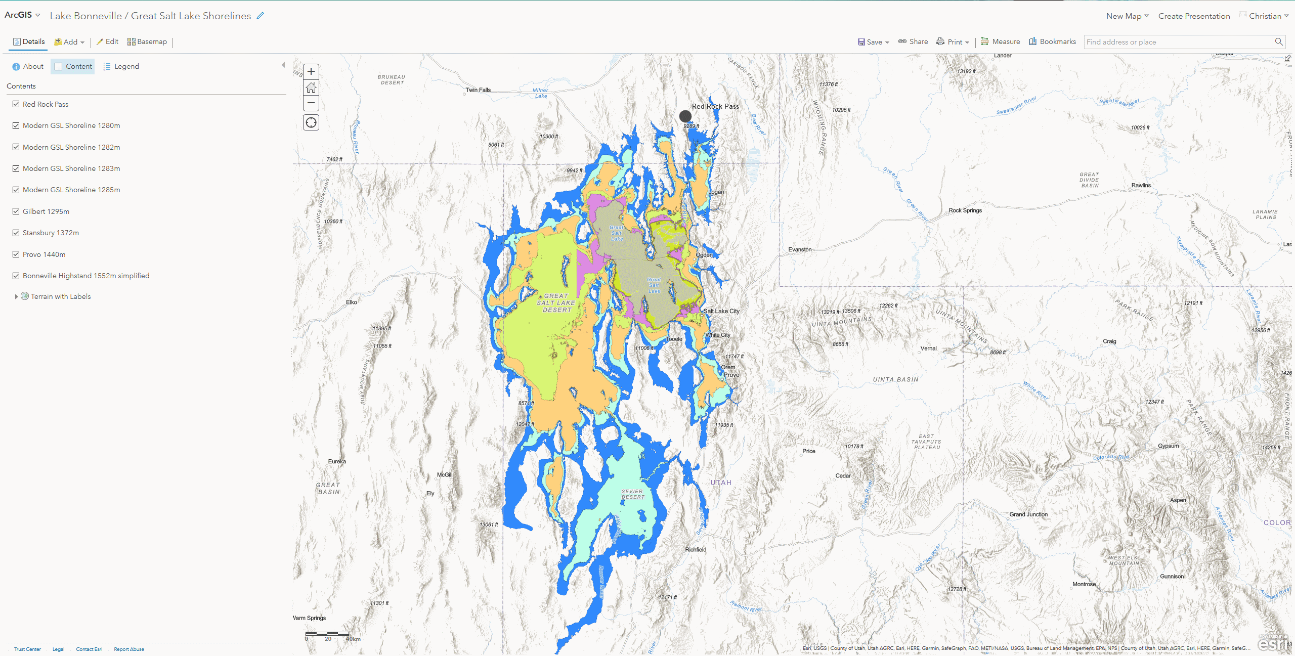
Landsat Imagery Classification
Introduction
Analysis
Red = Band 4, Green = Band 3, Blue = Band 2.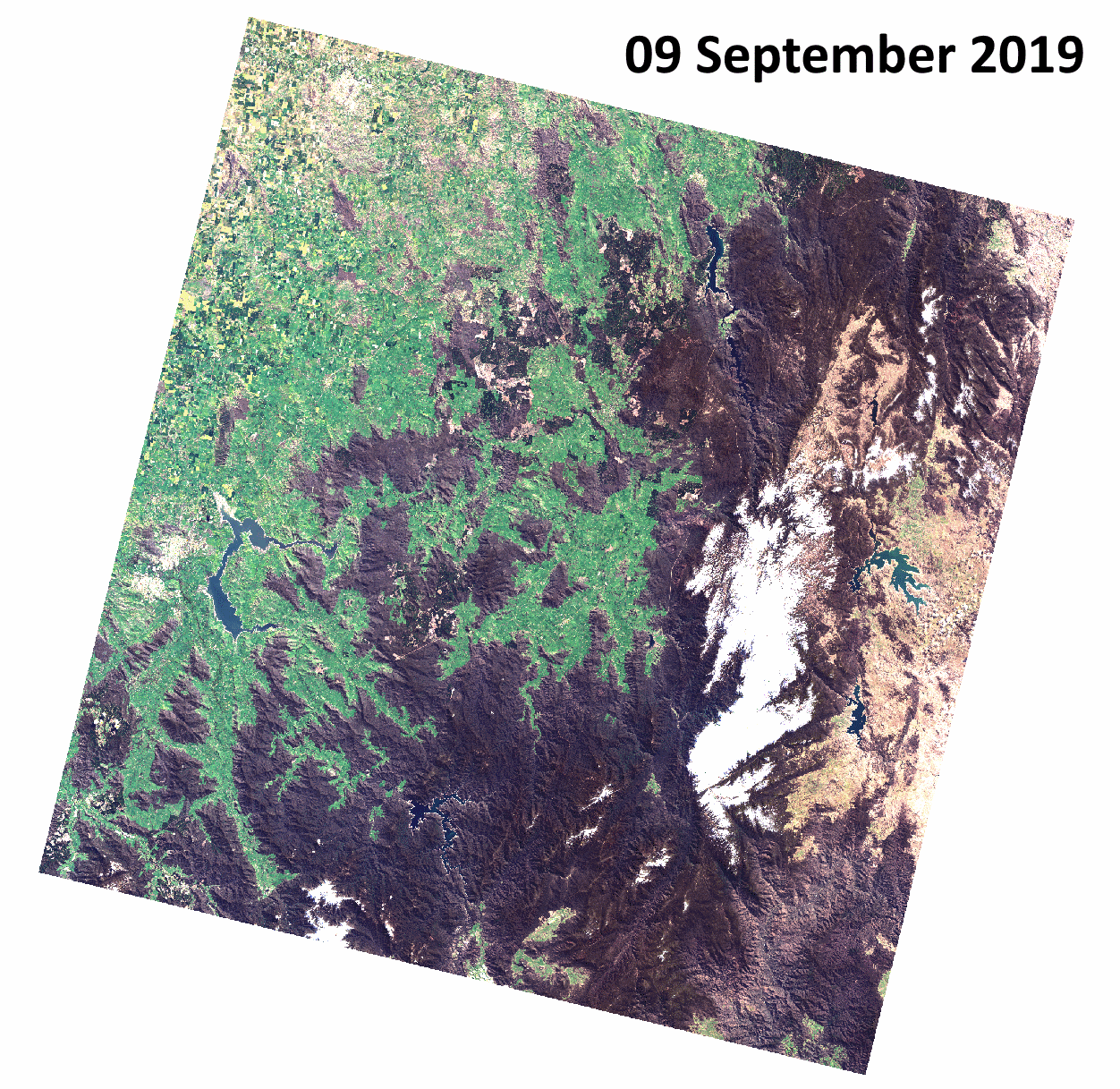
NDVI = (NIR - Red)/(NIR + Red). Higher values of the index indicate light reflected by vegetation, low values indicate the absence of vegetation. We could use the Raster Calculator, but ArcGIS has an integrated feature for quck and reliable creaton of such a raster. Activate the “Image Analysis” from the “Windows” menue. Click on the little leaf icon. Assess the image and if you want, change the color ramp. For example from red to green and add some transparency.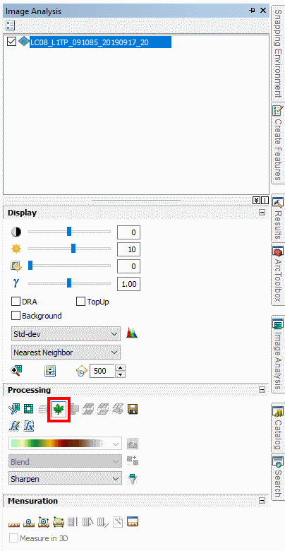
Results
Conclusions
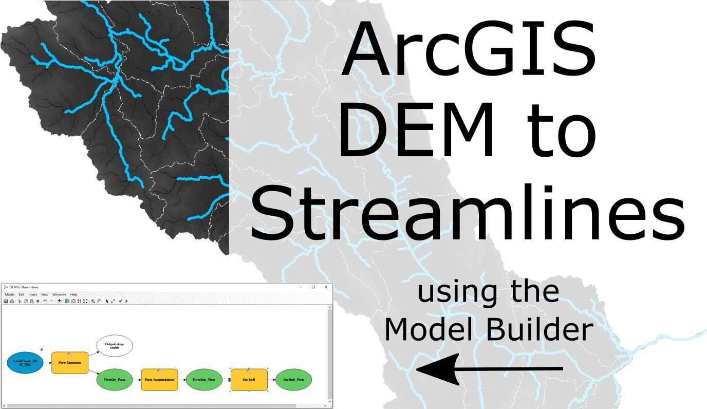
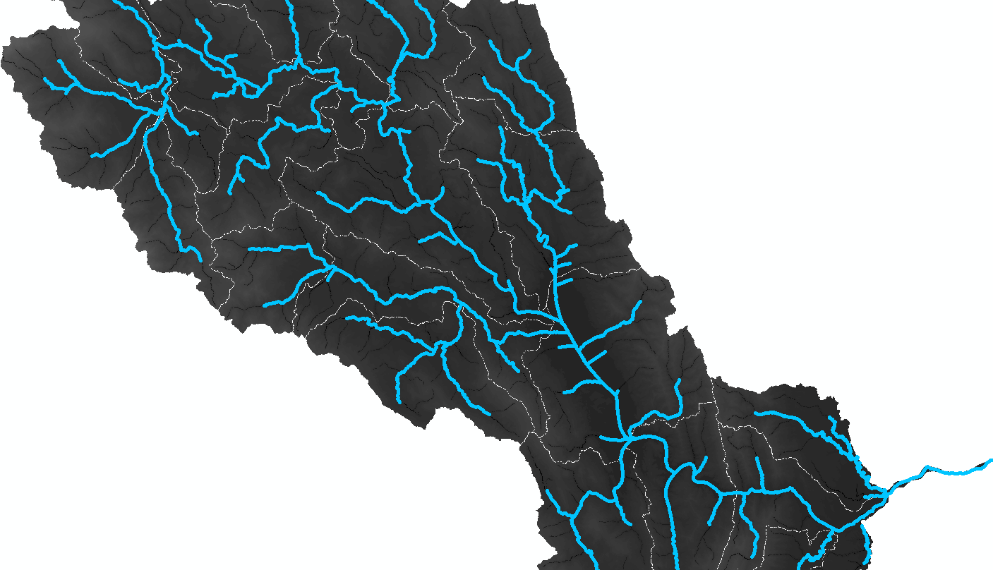
NBR = (NIR - SWIR) / (NIR + SWIR). This proof-of-concept study confirms that classification can be feasible and automated using the Model Builder. DEM to Streamlines using the Model Builder
Introduction
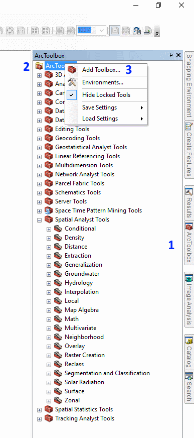
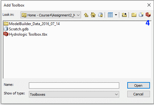
Step 1: New Toolbox
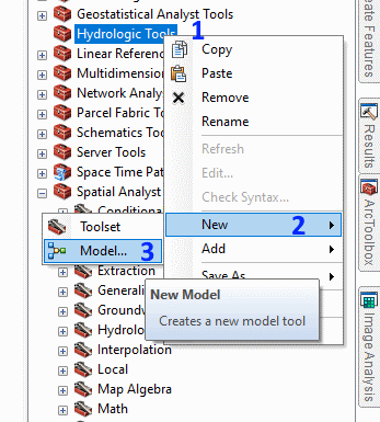
Step 2: New Model
Step 3: Raster Flow Direction
Step 4: Flow Accumulation
Step 5: Generating Streamlines
Step 6: Add SQL Expression
Step 7: Stream Link
Step 8: Create a Feature
Step 9: Finishing Touches and Trial Run
Step 10: Validation
LIDAR to Digtital Elevation Models
Introduction
Step 1: Data Sourcing
Step 2: Loading
Step 3: Coordinate System
Step 4: Create LAS Dataset
Step 5: Assure geolocation
Step 6: Display Threshold
Step 8: Convert to Raster/DEM
Step 9: Find the right DEM Resolution
Step 10: Compare Multipe DEMs
Digital Rocks
Introduction
Step 1: Sampling
Step 2: Scanning -> Slice Stack
Step 3: Loading
Step 4: Noise Removal
Step 5: Image Segmentation
Step 6: Disconnected Pores
Step 7: Separate Unique Pores
Step 8: Network Model
Step 9: Flow Modeling
Videos
Getting started with the XEEK Machine Learning contest
Introduction
The Basic Tools
Jupyter Notebooks

“Git” ready with GitHub

The Contest
Machine Learning

Trying out algorithms
Feature Engineering
Why would anyone want to participate in a competition after it was completed?
Further Reading
Neural Networks for object detection and classification

Introduction

How it works
1. Intuition
2. Network Design
3. Non-Max Suppression
Outlook
Further Reading
How to be successful at Hackathons and Datathons for Data Scientists

Introduction
Approach

Types of Challenges
Teams

Technical Knowledge
Presentation
Summary
Hackathons are a great place to learn and get your feet wet. Microfossil Modeling with MicroCT
Introduction
Videos
ResearchGate
Cat Prediction
Introduction

GitHub
Pagination